You are using an out of date browser. It may not display this or other websites correctly.
You should upgrade or use an alternative browser.
You should upgrade or use an alternative browser.
Metrolinx: Other Items (catch all)
- Thread starter TheTigerMaster
- Start date
Allandale25
Senior Member

Thales : Invision AI and Metrolinx Successfully Advance Autonomous Rail
Thales, Invision AI and Metrolinx announce the successful completion of the 18-month WinterTech Development Program, developing advanced autonomous technologies for rail systems with support from the...
SaugeenJunction
Senior Member
Yuck.

11th
Senior Member
At the least they need to include a train and bus symbol.
Bureaucromancer
Active Member
In all seriousness they need to do something.At the least they need to include a train and bus symbol.
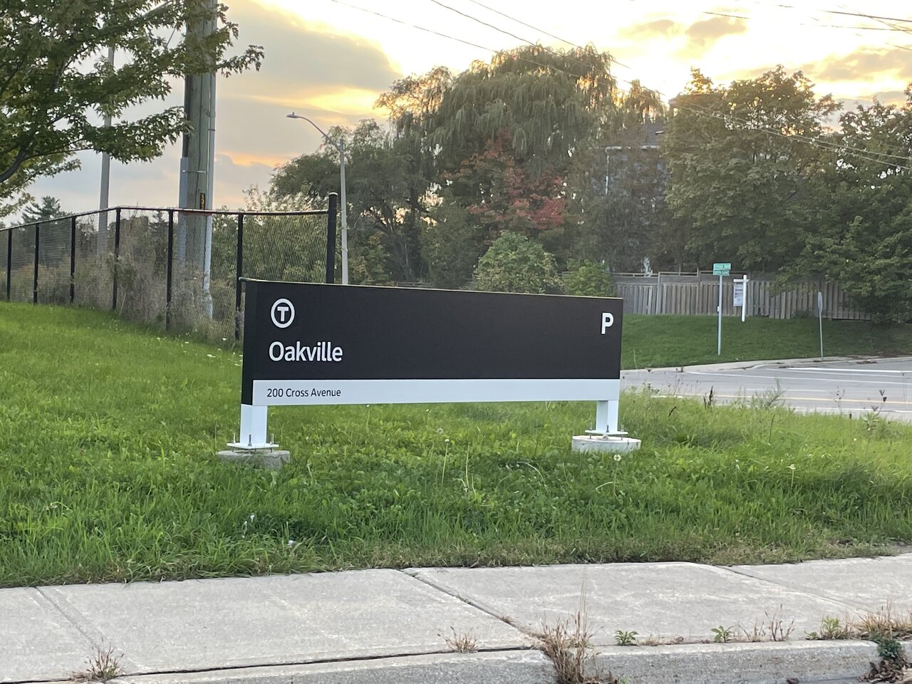
My first thought was that this must be for a maintenance facility.
allengeorge
Senior Member
I know a lot has been written in support of this new wayfinding/signage change, but I think this is ridiculous. Great - it's a transit facility: what stops there? GO, VIA? Oakville Transit? What mode types (local? regional?) This sign is devoid of useful information.
H4F33Z
Active Member
If you squint hard enough. It's just another secret ministry office.
Amare
Senior Member
Thats money well wasted, congrats on finding a way to make your signage much worse than it was before Metrolinx!
chinesehorse
New Member
I would expect more signage to accompany it in the near future with additional information about transit services.
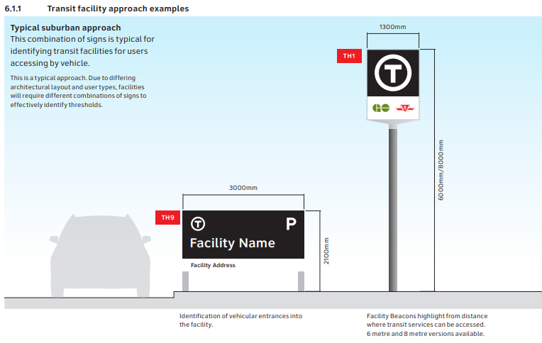
From Metrolinx's Wayfinding manual:

From Metrolinx's Wayfinding manual:
ARG1
Senior Member
I tried to be reasonable, I tried to say "Maybe this won't be that bad" and I used to defend this wayfinding and called it good, but no I hate this, I really really hate this.
The TTC just redid their entire wayfinding, and while it is bland in some areas, in terms of functionality and usability its a SLAM DUNK, especially when you compare it to... this.
This font Metrolinx chose, I don't know where they got the idea this is "legible", I feel like if I stood 100m away from this sign I'd have to squint in order to make out any of the letters. The letters are crunched so closely together, and the choice of regular capitalization makes it so much more difficult to distinguish the individual letters. It is so much easier (at least for me) to read the TTC signage, and I know this is true for many other people (people with a large variance in eyesight quality).

Metrolinx' signage is also so bland, its the simple modernist style that has no originality and has nothing that allows it to stand out from any other city. People compare the T to Boston, and while the final T looks somewhat different from Boston, your average person isn't going to be able to tell the difference, and the T just looks like 90% of other transit agencies within the US.
chinesehorse
New Member
Funnily enough, Metrolinx settled on the T roundel only after almost selecting a double chevron symbol, which, well, looks a lot like SEPTA's traditional and recently revamped transit symbol:People compare the T to Boston, and while the final T looks somewhat different from Boston, your average person isn't going to be able to tell the difference, and the T just looks like 90% of other transit agencies within the US.
From KerrSmith Design
From SEPTA
DirectionNorth
Senior Member
Would've been more eye-catching and less boring too.Funnily enough, Metrolinx settled on the T roundel only after almost selecting a double chevron symbol, which, well, looks a lot like SEPTA's traditional and recently revamped transit symbol:
View attachment 355652
From KerrSmith Design
View attachment 355651
From SEPTA
crs1026
Superstar
(Shaking Head)
... because the traditional "Sideways T" was just so hard to spot or comprehend.....
- Paul
... because the traditional "Sideways T" was just so hard to spot or comprehend.....
- Paul
ARG1
Senior Member
Context?(Shaking Head)
... because the traditional "Sideways T" was just so hard to spot or comprehend.....
- Paul
Amare
Senior Member
So in other words, they paid consultants hundreds of thousands (potentially millions), only to come up with generic designs that are already used and exist in North America?Funnily enough, Metrolinx settled on the T roundel only after almost selecting a double chevron symbol, which, well, looks a lot like SEPTA's traditional and recently revamped transit symbol:
View attachment 355652
From KerrSmith Design
View attachment 355651
From SEPTA
Your tax dollars are hard at work ladies and gentlemen.


