unimaginative2
Senior Member
In Plans for Railyards, a Mix of Towers and Parks
Link to Article
New York Times
By NICOLAI OUROUSSOFF
Published: November 24, 2007
The West Side railyards are the kind of urban development project that makes builders dance in the streets. A footprint bigger than Rockefeller Center’s and the potential for more commercial and residential space than ground zero: what more could an urban visionary want?
So the five proposals recently unveiled by the Metropolitan Transportation Authority to develop the 26-acre Manhattan railyards are not just a disappointment for their lack of imagination, they are also a grim referendum on the state of large-scale planning in New York City.
With the possible exception of a design for the Extell Development Company, the proposals embody the kind of tired, generic planning formulas that appear wherever big development money is at stake. When thoughtful architecture surfaces at all, it is mostly a superficial gloss of culture, rather than a sincere effort to come to terms with the complex social and economic changes the city has been undergoing for the last decade or so.
Located on six square blocks between 30th and 33rd Streets and 10th Avenue and the West Side Highway, the yards are one of the few remaining testaments to New York’s industrial past. Dozens of tracks leading in and out of Pennsylvania Station carve through the site. A string of parking lots and old industrial buildings flanks the tracks to the south; the Jacob K. Javits Convention Center is a block to the north. To build, developers first will have to create a platform over the tracks, at an estimated cost of $1.5 billion; construction of the platform and towers has to take place without interrupting train service.
City officials and the transportation authority, which owns the railyards, have entertained various proposals for the site in recent years, including an ill-conceived stadium for the Jets. The current guidelines would allow up to 13 million square feet of commercial, retail and residential space; a building to house a cultural group yet to be named; and a public park.
All five of the development teams chose to arrange the bulk of the towers at the northern and southern edges of the site, to minimize disruption of the tracks below, and concentrated the majority of the commercial towers to the east, and the residential towers to the west, where they would have views of the Hudson River.
But none of the teams have fully explored the potentially rich relationship between the railyards and the development above them, an approach that could have added substance to the plans. Nor did any find a successful way to come to terms with the project’s gargantuan scale.
The proposal by the Related Companies would transform the site into a virtual theme park for Rupert Murdoch’s News Corporation, the developer’s main tenant. The design, by a team of architects that includes Kohn Pedersen Fox, Arquitectonica and Robert A. M. Stern, would be anchored at its eastern end by a 74-story tower. Three slightly smaller towers would flank it, creating an imposing barrier between the public park and the rest of the city to the east.
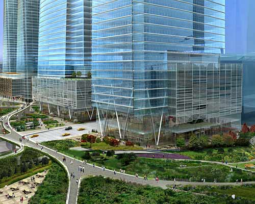
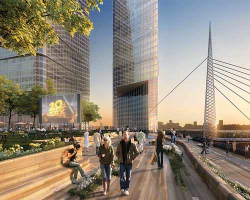
The plan also includes a vast retail mall and plaza between 10th and 11th Avenues, which could be used by News Corporation for advertising, video projections and outdoor film and concert events — a concept that would essentially transform what is being hailed as a public space into a platform for corporate self-promotion. A proposal by FXFowle and Pelli Clarke Pelli for the Durst Organization and Vornado Realty Trust is slightly less disturbing. Following a similar plan, it would be anchored by a new tower for Condé Nast Publications to the north, and a row of residential towers extending to the west. Sinuous, elevated pedestrian walkways would wind their way through the site just above the proposed public park. The walkways are meant to evoke a contemporary version of the High Line, the raised tracks being converted into a public garden just to the south. But their real precedents are the deadening elevated streets found in late Modernist housing complexes.
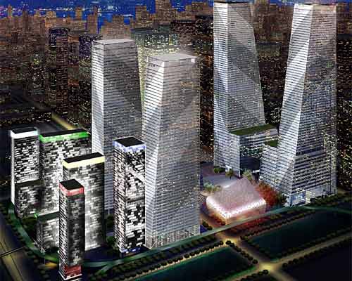
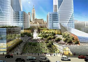
By comparison, the proposal by Tishman Speyer Properties, designed by Helmut Jahn, at least seems more honest. The site is anchored by four huge towers that taper slightly as they rise, exaggerating their sense of weight and recalling more primitive, authoritarian forms: you might call it architecture of intimidation. As you move west, a grand staircase leads down to a circular plaza that would link the park to a pedestrian boulevard the city plans to construct from the site north toward 42nd Street.
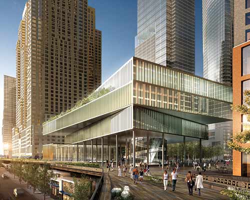
Mr. Jahn built his reputation in the 1980s and ’90s, when many modern architects were struggling to pump energy into work that had become cold and alienating. Over all, the design looks like a conventional 1980s mega-development: an oddly retro vision of uniform glass towers set around a vast plaza decorated with a few scattered cafes. (In a rare nice touch, Mr. Jahn allows some of his towers to cantilever out over the deck of the High Line, playing up the violent clash between new and old.)
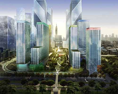
Another proposal, by Brookfield Properties, is an example of how real architectural talent can be used to give a plan an air of sophistication without adding much substance. Brookfield has included a few preliminary sketches of buildings by architectural luminaries like Diller Scofidio & Renfro and the Japanese firm Kazuyo Sejima & Ryue Nishizawa, but the sketches are nothing more than window dressing. The proposal includes a retail mall and commercial towers along 10th Avenue, which gives the public park an isolated feel. A hotel and retail complex cuts the park in two, so that you lose the full impact of its sweep.
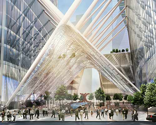
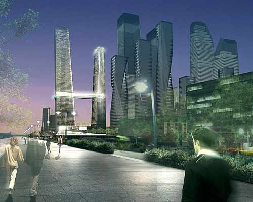
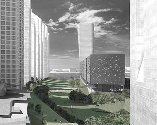
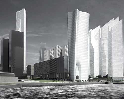
For those who place urban-planning issues above dollars and cents, the Extell Development Company’s proposal is the only one worth serious consideration. Designed by Steven Holl Architects of New York, the plan tries to minimize the impact of the development’s immense scale. Most of the commercial space would be concentrated in three interconnecting towers on the northeast corner of the site. The towers’ forms pull apart and join together as they rise — an effort to break down their mass in the skyline. Smaller towers flank the site’s southern edge, their delicate, shardlike forms designed to allow sunlight to spill into the park area. A low, 10-story commercial building to the north is lifted off the ground on columns to allow the park to slip underneath and connect to 33rd Street.
The plan’s most original feature is a bridgelike cable structure that would span the existing tracks and support a 19-acre public park. According to the developer, the cable system would reduce the cost of building over the tracks significantly, allowing the density to be reduced to 11.3 million square feet from 13 million and still make a profit. The result would be both a more generous public space and a less brutal assault on the skyline. It is a sensitive effort to blend the development into the city’s existing fabric.
But what is really at issue here is putting the importance of profit margins above architecture and planning. The Metropolitan Transportation Authority could have pushed for more ambitious proposals. For decades now cities like Barcelona have insisted on a high level of design in large-scale urban-planning projects, and they have done so without economic ruin.
By contrast, the authority is more likely to focus on potential tenants like News Corporation and Condé Nast and the profits they can generate than on the quality of the design. A development company like Extell is likely to be rejected outright as too small to handle a project of this scale, however original its proposal. (In New York dark horse candidates often find that ambitious architectural proposals are one of the few ways to compete with bigger rivals.)
This is not how to build healthy cities. It is a model for their ruin, one that has led to a parade of soulless developments typically dressed up with a bit of parkland, a few commercial galleries and a token cultural institution — the superficial gloss of civilization. As an ideal of urbanism, it is hollow to its core.
Link to Designs
