You are using an out of date browser. It may not display this or other websites correctly.
You should upgrade or use an alternative browser.
You should upgrade or use an alternative browser.
Bayer
Senior Member
They mostly carry stuff made in China, India, Vietnam, etc.Montreal-based furniture company Bois & Cuir is opening in Yorkville Village beside Jean-Paul Fortin.
pw20
Senior Member
Huge Boss is not renewing their lease.
JasonParis
Moderator
Attachments
pw20
Senior Member
I deserve that for my typo. Hugo Boss !!!
vatche
Senior Member
Bloor is not doing well from the looks of it
narduch
Senior Member
Bloor is not doing well from the looks of it
Getting destroyed by Yorkdale.
ADRM
Senior Member
Bloor is not doing well from the looks of it
How so? From everything I hear, it's booming.
pw20
Senior Member
Different clients. Also migration of stores to Yorkville where there is purpose built space. Mid tier luxury (Michael Kors, Boss) does better at Yorkdale. But stores like Dior, Hermes etc are opening giant flagships on Bloor and Yorkville.
ardwold1
Active Member
A couple of impending closures to note:
M0851 in the Prince Arthur on Avenue (filed for bankruptcy a few months ago I believe)
Marcello Tarantino on Hazelton
M0851 in the Prince Arthur on Avenue (filed for bankruptcy a few months ago I believe)
Marcello Tarantino on Hazelton
ADRM
Senior Member
Neat little CoA application in for 162 Cumberland; the owner of 162 has engaged SvN to make a few minor updates to improve the pedestrian experience and retail environment. Looks and sounds great; hope the City isn't obstinate.
THE PROPERTY & PROPOSAL
162 Cumberland Street is a lawfully existing 7-storey building with three floors of underground parking. The building currently holds retail space on ground floor with open courtyard and through passageways (from Cumberland St. to Yorkville Ave., and to Four Seasons Plaza), office spaces on 2nd-3rd floors, and residential units on 4th-7th floors. Our client owns part of the property from parking levels up to third floor. This project aims to renew the exterior parts of the building especially the paving between Cumberland St. and Yorkville Ave., upgrading store frontage and exterior landscape with sensitivity to existing site scale and context as well as recently constructed buildings. As we are renovating we are introducing a canopy on Cumberland St, currently the entry is not visible from Cumberland Street and it appears to be a private entrance, we want to emphasize that this is a public passageway to Yorkville Avenue, to the Four Season Plaza and a public courtyard where people can spend time while in the area.
Attachments
Northern Light
Superstar
Neat little CoA application in for 162 Cumberland; the owner of 162 has engaged SvN to make a few minor updates to improve the pedestrian experience and retail environment. Looks and sounds great; hope the City isn't obstinate.
THE PROPERTY & PROPOSAL
162 Cumberland Street is a lawfully existing 7-storey building with three floors of underground parking. The building currently holds retail space on ground floor with open courtyard and through passageways (from Cumberland St. to Yorkville Ave., and to Four Seasons Plaza), office spaces on 2nd-3rd floors, and residential units on 4th-7th floors. Our client owns part of the property from parking levels up to third floor. This project aims to renew the exterior parts of the building especially the paving between Cumberland St. and Yorkville Ave., upgrading store frontage and exterior landscape with sensitivity to existing site scale and context as well as recently constructed buildings. As we are renovating we are introducing a canopy on Cumberland St, currently the entry is not visible from Cumberland Street and it appears to be a private entrance, we want to emphasize that this is a public passageway to Yorkville Avenue, to the Four Season Plaza and a public courtyard where people can spend time while in the area.
View attachment 139768
View attachment 139769
ADRM and I often agree, but not this time.
I don't care for the renders.
To me the paving material goes from trying to speak 'old village of Yorkville' (brick paving) to Bloor Street posh (granite). *they used a concrete and brick mix closer to Yorkville)
The style is extremely modern as is that of the seating in a way that doesn't blend w/the surrounding architecture.
I also very much dislike the absence of a tree in the courtyard space, it makes it feel sterile and sparse to me.
The change in ceiling cladding in the archway isn't flattering either, at least to my taste.
The canopy is equally incongruous to its surroundings.
What is/was needed in this space is some state-of-good-repair, a modest refresh, some effort to make the lane seem more public, to me this would be best done by placing a restaurant at each end and then using patios and/or over-sized openable windows that extend animation and public invitation. That along w/some clear directional signage would be welcome.
I could live w/changing the colour palette of the paving, but would suggest that if one does so, it ought to match the grey brick used along Yorkville Ave in this section.
A small amount of weather protection wouldn't be bad, but it should either be more subtle and less obtrusive, or should seek to fit in w/the Yorkville character better (or both).
ardwold1
Active Member
Capezio on Bloor is having a closing sale. I believe the Eaton Centre location is closing as well.
Benito
Senior Member
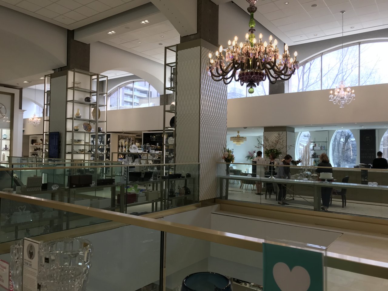
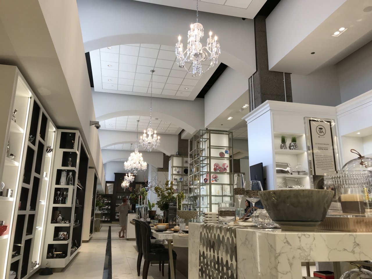
William Ashley is open!


Attachments
-
 71B077B9-58DA-4607-940C-92F962928DD4.jpeg171.9 KB · Views: 811
 -
 3419D3BF-79B8-4640-8BC7-05355A379D04.jpeg133.4 KB · Views: 777
 -
 D3DA54B1-0BE8-4C2F-9D78-FDF340E6EABA.jpeg144.9 KB · Views: 799
 -
 A31922DF-751D-45F2-B86E-E87302E0D56F.jpeg189.2 KB · Views: 795
 -
 ABD5679F-F13B-4C13-BBB9-05D72333266B.jpeg177.6 KB · Views: 805
 -
 67BBABCD-A90C-4247-96E8-57504D683EAA.jpeg187.1 KB · Views: 798
 -
 880FBE0D-31C8-4F42-B89B-DFDB2A7981FF.jpeg235.2 KB · Views: 774
prosperegal
Senior Member
Hate the new entrance at 151 Bloor.....it feels so closed up now. I hope La Societe would be able to survive.
Any clue what's going on at the old Hermes spot? I saw people clearing the place out last night.
Any clue what's going on at the old Hermes spot? I saw people clearing the place out last night.


