|
|
|


Search results
-

Toronto Canary House | 50.3m | 13s | Dream | BDP Quadrangle
Oof, that is awful. What a letdown. -
Toronto GO Transit: Davenport Diamond Grade Separation | ?m | ?s | Metrolinx
oh, no! my grey wall! my precious, precious grey wall! someone got evidence of human life on it! c-c-call the police- adHominem
- Post #2,876
- Forum: Transportation and Infrastructure
-
Toronto Catalyst at 77 Wade | 43.72m | 7s | Seeker Labs | DIALOG
Junction, Junction West Triangle, Bloordale, parts in between, what's the difference? -
Toronto 160 Front West | 239.87m | 46s | Cadillac Fairview | AS + GG
Heyyyyy youuuuu guyyyyyyys -
Toronto 12 Ossington | 19.81m | 4s | Hullmark | Hariri Pontarini
I was thinking "gosh, this looks even sharper than in real life" and then realized they photoshopped out a hydro pole & the wires in the first pic -
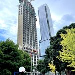
Toronto The One | 328.4m | 91s | Mizrahi Developments | Foster + Partners
"How Much Does Your Building Weigh, Mr Foster?" -
Toronto The Diamond | 101.14m | 36s | Neudorfer | Gabriel Bodor
UT: we want more colour in buildings! Gabriel Bodor: here ya go! UT: -
Goyeau Green Towers (?, 21s, Passa Architects) (Windsor)
Love a "green" tower with a three-storey parking garage for a podium. -
Toronto Love Park | 3m | 1s | City of Toronto
I walked through for the first time yesterday evening, and it all looks lovely. Yes, the reflecting pool was green, but the park was packed full of people enjoying the space. It'll get sorted out. Folks need to chill out. -
Finch West Line 6 LRT
I am never going to defend metrolinx's aesthetic choices, but black-and-white is the optimal choice for legibility, it maximizes contrast for legibility at a distance and for the visually impaired. Obviously, more goes into it than that (typeface selection, letter- and line-spacing, size of...- adHominem
- Post #5,534
- Forum: Transportation and Infrastructure
-
Post your pictures of Toronto here!
I believe this is looking south from the SE corner of College & Spadina. The large brick building on the left is the CampusOne residence; the pointed roof just to the right of it is the Cecil Street community centre; the tall buildings in the far background are CityPlace.- adHominem
- Post #1,484
- Forum: Photos and Videos
-
Oshawa Genosha (Phase 2) | 67.1m | 21s | Summers&Co | Smart Density
Maybe Magneto will take over and make it a haven for mutants. -
Toronto Catalyst at 77 Wade | 43.72m | 7s | Seeker Labs | DIALOG
Oddly enough, i walked up Wade yesterday and noticed the hoarding around this site – previously adorned with marketing for this project – was now just unadorned plywood. -
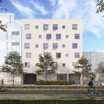
Toronto 200 Russell Hill | 30.5m | 5s | Hirsh Development Group | Rafael + Bigauskas
Nothing like a little high camp to start your day -
Toronto Galleria 01 & 02 | 92.65m | 29s | Almadev | Core Architects
Yeah, IIRC the whole Galleria development was supposed to be phased such that the area won't be without a rec centre, a drugstore and a supermarket, ie, those spaces wouldn't close until their replacements were ready. (I also will deeply miss the rec centre, not that I work out there, but it's... -
Toronto T3 Sterling Road | 52.52m | 11s | Hines | DLR
Agreed, it always smells delicious when I'm out for a run on the railpath. Those are also good jobs (i assume!) and this is a form of manufacturing that can peacefully exist side-by-side with office and residential, it would be good to keep it around -
Toronto GO Transit: Davenport Diamond Grade Separation | ?m | ?s | Metrolinx
If memory serves, there will be a tunnel entrance from the east via Randolph Avenue (i think it's to connect to the current tunnel that exits behind the FreshCo on the west)- adHominem
- Post #2,550
- Forum: Transportation and Infrastructure
-
Toronto AGO: Dani Reiss Modern and Contemporary Gallery | 48.35m | 6s | AGO | Diamond Schmitt
It's a perfectly cromulent word. -
Toronto 88 Bathurst | 68.3m | 17s | Hines | 3XN
Parker, what is this crap, BRING ME PICTURES OF SPIDER-MAN