Toronto Union Station Revitalization | ?m | ?s | City of Toronto | NORR

Wow. It's been a long time coming, but Union is finally coming together. Even without the Bay concourse that already looks like an upgrade on what we had. Amazing to think of what the Union experience c.2016 will be like compared to the Union experience c.2001
 
Wow. It's been a long time coming, but Union is finally coming together. Even without the Bay concourse that already looks like an upgrade on what we had. Amazing to think of what the Union experience c.2016 will be like compared to the Union experience c.2001
2017. The delays pushes Bay completion to 2017.
 
I was in the new concourse as 12:04. :)

There seems to be need for a shortcut from the Skywalk to the York concourse; perhaps that will be added.

Just East of the UPX station there is a GO Transit doorway that is pretty unmarked (no platform number or any info, just a couple of small departure screens by it)--that door is for platform 3. If you walk for about 30 seconds west on platform 3, there's an elevator and stairs down to the York concourse. If you look at this map of Union, you'll actually see it labelled there, on the south side of the Skywalk as a ramp just east of UPX. Similarly, if you come up from the York concourse or even the Bus Terminal, you can walk all the way down 3 to get in the skywalk.

On that note, while walking west on platform 3, just after that door to the skywalk I could see a single door that was attached to the UPX station itself--it looked, as best as I could tell, like a customer-usable door for all intents and purposes, save the small folding barrier blocking it as of course the station isn't open yet...I hope that door does end up being usable, would be nice to be able to hop up to 3 from the bus terminal, subway, one of the teamways, or any concourse and get all the way straight into UPX without needing to go into the skywalk.
 
I arrived on a Lakeshore West train this morning on platform 24. I took the York East stairs down to access the new concourse. I'd say less than 10% opted to go through it. This is probably because it was partly blocked by workers doing last second construction, and the fact there was no announcement on the train about it. I walked through and accessed the new PATH extension which was much busier. Many people appear to have used the York East teamway. People on University seemed confused by the sight of people streaming out the tunnel exit. It was a perfect weather day to open it; light drizzle, cold, and windy.
 
Just walked through the York concourse today! It definitely is quiet initially; commuters are a bit perplexed by it -- the typical average Torontian doesn't realize what Union Revitalization involves!

This will be very different by 2023 with the extra GO RER services, fully open retail level, and commuters now familiar with the concourse. Today looks like a notched-up version of yesterday's 'soft' launch, so they can continue to debug problems with the concourse and keep plenty of space for construction crew, before putting more wayfinding up (like "New Concourse Open!" signs on the new stairwells on the platforms).

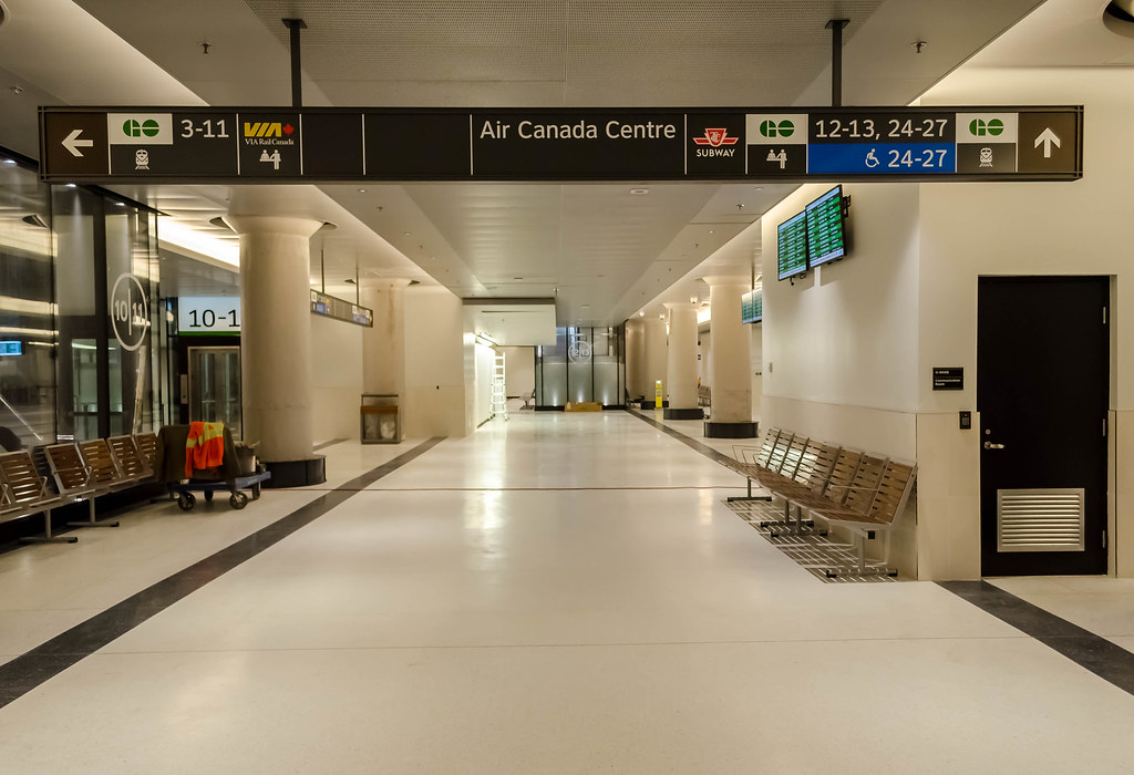
It's nice to find platforms much more easily -- it's very logically ascending as you go North-South, especially in the eastmost hallway of the York concourse, and the lines on the floor matching the tracks. It is a bit sterile and utilitarian looking without the food open yet (in a future-bustling food pit at the escalator floor) but so is other commuter stations like New York Penn Station (But ours finally looks much better now -- nyah, nyah!) and vastly preferable to the 1979 abomination on Bay street. If you're tired of the Bay nightmare crowds -- this is your concourse. For a few years until it becomes crowded.

What I think is a semi-abomination about the new concourse, is the signage:

The wayfinding is somewhat of a clutter, in my opinion. But if they have to keep the clutter, please color the empty black space between the left side / right side, as white color. That will make the left side / right side separation MUCH clearer.

But overall, this is an overall easily-fixable nitpick. Hopefully they debug the wayfinding over time. The signage appears to be mainly stickers on a solid piece of black, so fortunately should be cheap to fix (with new stickers) with improved wayfinding. I'm going to tweet to Metrolinx with that suggestion.
 
Last edited:
There was one sign in the concourse where I couldn't even tell where the division was at all between left and right.

I'd think using Rogers Centre instead (or in addition) to SkyWalk may be more useful to people as well. Especially if the ACC is to be highlighted.
 
Considering how much information there is to cover, the new signage isn't that bad. Certainly better than the hodgepodge they have in the old GO concourse.
 
Considering how much information there is to cover, the new signage isn't that bad. Certainly better than the hodgepodge they have in the old GO concourse.

If they could just have a clear divisional indicator between directions, it'd help a lot. For example, that white line in the above photo that is hanging between VIA (on the left) and Air Canada Centre (on the right) would be much better if it were a wider line.
 
Yes, it also seems the wayfinding is still under construction -- I saw a few places where there looked like sign mounts but weren't installed yet. Probably also Metrolinx didn't want to overload the concourse right away, as they still need to clean/debug it.

As a stranger, walking into the unfamiliar 1979 concourse, versus walking into the new concourse, it's certainly a massive improvement. Quick, which direction do you go to, to go to Platform 11? Platform 25? Platform 3? Platform 10? Platform 4? Within a couple minutes, it becomes obvious which direction you walk (north or south) as it's now pretty clear of sequential numbering of platforms in the new York concourse (Even to this date, I don't know how to get to Platform 3 from the old 1979 GO concourse! And it took me a long time before I figured out there were THREE different ways to get to Platform 25/27 from the Bay concourse: via VIA, via grand hall, and via Bay west teamway).

If you're new to Union, the new concourse is a massive improvement in figuring out which direction to go to, to go to a higher-numbered platform. This will be increasingly important as time passes, it will guide commuter flows more efficiently as it is no longer a maze of walkways.

Some further wayfinding improvements are needed (e.g. how to get to Platform 8-9 via the York east teamways -- there should be small "8-9 ⇧" sign on the entrance into York Concourse on the doors between stairways 6-7 and 10-11, since you can't access platform 8-9 directly from the York East teamway (because of space limitations for new stairways). But accessing 8-9 from York East teamway is quite easy if you memorize where just a few feet inside the entrance, so it just needs additional wayfinding signs. Hopefully Metrolinx fills in the wayfinding "holes" as time passes.

Looking forward to an open food court so there's ambience glowing from below.
 
Last edited:
Yesterday I almost missed my train because I was reading and didn't notice the time. I was in the new concourse, and had three minutes to make it to Platform 27. Fortunately, I knew where the elevator and stairs to Platform 27 were because of some exploring a month ago when I had hurt my knee and needed the elevator. And I'd looked at the new map.

I was able to run over to the left side of the new ticket booths, through a short corridor, and into the south end of the VIA concourse, and I made it to the train with a minute to spare. But if I hadn't already known that, I wouldn't have been able to find it in time. There was no reassurance signage on the way.

Also, the sign in the picture above has no indication of what direction to go to get to the GO buses! If I was in the station for the first time, and wanted to get to "Platform 44", there is no indication of those platforms either.

So yes, a thicker white area between clusters of symbols pointing in different directions. More indications to buses, too.

If Platform 3 is going to be this great accessible 'spine' across the whole station, it needs more indication and access as well. Megaton327, I noticed that almost-invisible door leading to Platform 3 off the bridge part of the Skywalk, and wasn't sure where it went. Next time I'm there, I'll have to see where the elevator and stairs down to York concourse are.
 
Last edited:
Part of the reason why the wayfinding may be such a mess right now is because the reno is only ~1/3rd completed. A lot of the access points between the concourses are either the old ones (likely in inconvenient locations for easy wayfinding and passenger flow), or temporary ones. I'm sure when getting somewhere doesn't involve going through two hallways that are boarded up and then making a left up a set of temporary stairs, the wayfinding signage will improve as a result.
 
Part of the reason why the wayfinding may be such a mess right now is because the reno is only ~1/3rd completed. A lot of the access points between the concourses are either the old ones (likely in inconvenient locations for easy wayfinding and passenger flow), or temporary ones. I'm sure when getting somewhere doesn't involve going through two hallways that are boarded up and then making a left up a set of temporary stairs, the wayfinding signage will improve as a result.

Platform 27 is always a bit of an oddball in terms of access - and I think one it's a remaining sore spot in the redone concourse. In any case nothing can beat the current unholy mess that is the Bay Concourse in terms of poor wayfinding.

AoD
 
Here's a suggestion I am tweeting to @Metrolinx and @GO_Transit:

ConcourseSuggestion.jpg


Also:
- Ideally, add small "8-9" wayfinding sign on the concourse entrance doors between Platform "6-7" and "10-11" entrances in York East teamway.
- Vertically-center all single-line text like "Air Canada Centre". There's inconsistency in other signs -- some single-line-text is vertically centered.

EDIT: Additional suggestion idea, one of using white-background arrows instead:
I whipped this up quickly just to show what a mess the original is and to give an idea of how it could be cleaned up.
attachment.php
 

Attachments

  • ConcourseSuggestion.jpg
    ConcourseSuggestion.jpg
    195.3 KB · Views: 1,919
Last edited:

Back
Top