Toronto Market Wharf | 110.33m | 33s | Context Development | a—A

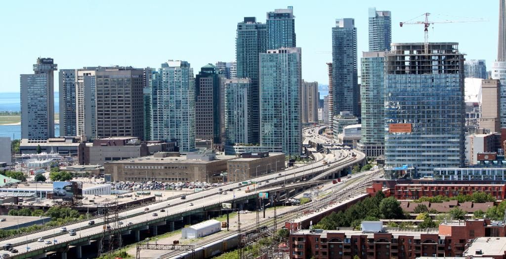
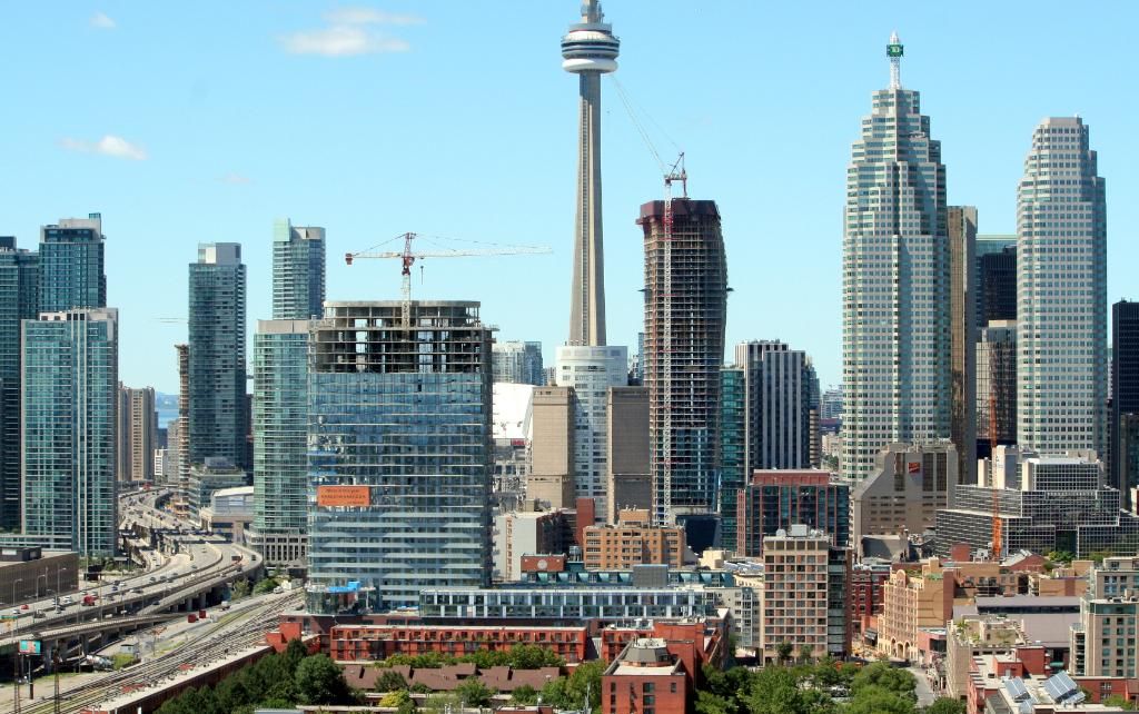
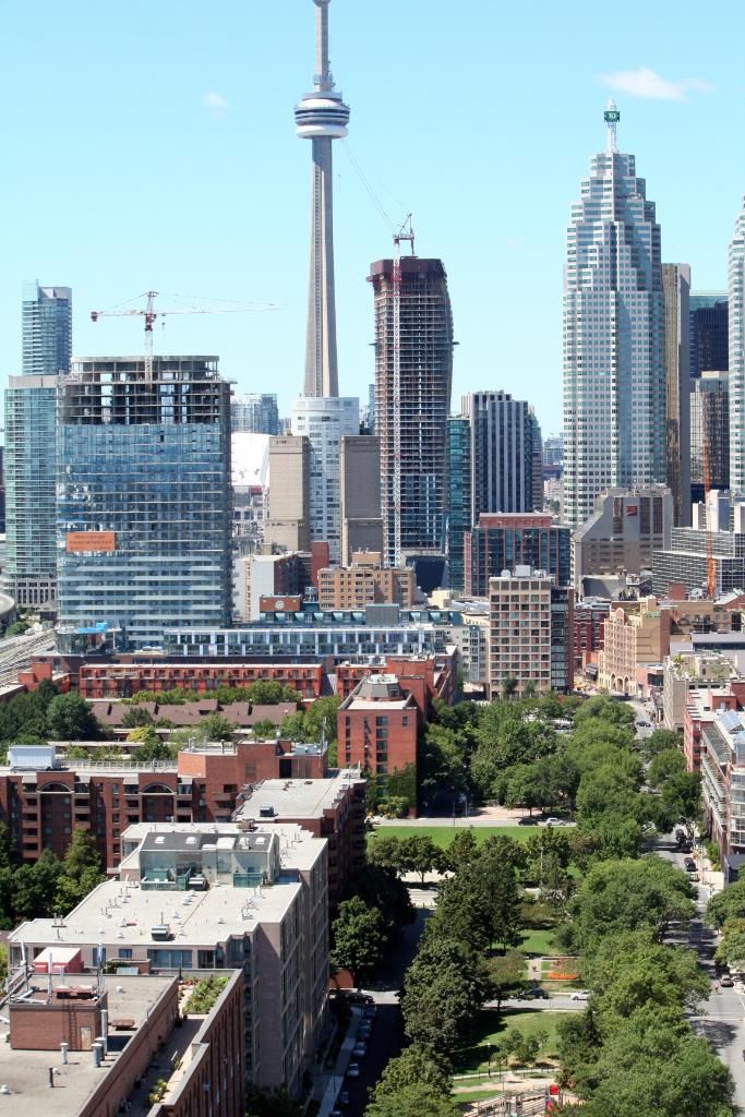
To be fair, that green glass is all South Core in the background, most of the newer development in the St. Lawrence Market neighbourhood uses a good mix of colour and materials.

... and there are tonal variations - and colour variations - in the buildings shown in the images that Razz has posted. Tonal variation is, by definition, not "monotony" .... even when the range is similar. And why shouldn't there be a unifying look, tying together buildings that serve essentially the same purpose?
 
More balcony glass up. Shot from today:

tVU8b.jpg
 
The basketweave effect, caused by the agency of the sun on those balconies, is charming. From all angles, and from near and far, Market Wharf delights. The Great Man never faileth.
 
This project is generally pretty good. The tower is great - the balcony wave effect looks fantastic. From a distance it really breaks up the monotony of the skyline.
 
The basketweave effect, caused by the agency of the sun on those balconies, is charming. From all angles, and from near and far, Market Wharf delights. The Great Man never faileth.

Sorry if I'm stating something obvious, but it really is more impressive from street level than in the perspectives people have been photographing here lately. From below, the wavy balconies appear to be curved in the vertical dimension, sort of like fun house ramps. It's a very intricate and interesting bit of trompe l'oeil. Arguably moreso than on Aqua - for all that building's sculptural beauty.

urbantoronto-5982-19072.jpg
 
Surely the undersides of the balconies will be painted, yes?
 
From below, the wavy balconies appear to be curved in the vertical dimension, sort of like fun house ramps. It's a very intricate and interesting bit of trompe l'oeil. Arguably moreso than on Aqua - for all that building's sculptural beauty.

Aqua also fails to equal Market Wharf from a practical point of view, since the balcony ends join the building at points that bear no relation to the rooms within.
 
I suspect this street closure is to remove MW crane.

LOWER JARVIS ST
from FRONT ST E to LAKE SHORE BLVD E. Lower Jarvis St will be closed due to hoisting from Front St E to Lake Shore Blvd
E
START: 2012-Aug-10 6:00:00 PM
END: 2012-Aug-12 11:00:00 PM
INFO UPDATED: 2012-Aug-07 10:57:50 AM
DISTRICT: Toronto East York
WARD: Toronto Centre-Rosedale (28)
ROAD TYPE: Major

Well, Lower Jarvis was blocked with a very large crane but the MW crane is still in place so I guess I was premature!
 
Last edited:
I see this building every single day. The wave effect is barely noticeable unless the conditions are right - like in the lighting of the above photos, or if standing underneath and looking straight up. Otherwise, 80% of the time it looks like a generic glass condo. Like a lot of aA's projects, it succeeds in the podium, but fails in the tower portion. Still, this tower is one of their better projects.

Also, you're kidding yourself if you think the waves are more intricate than Aqua's.
 
They're a lot less intricate, but the balconies don't loop into the box that forms the true core of the building at points that bear no relation to the apartments inside as they do at Aqua. There's less design grandstanding with Market Wharf, which is a good thing.
 
^ What an absolute ridiculous statement. You're seriously putting the design of Market Warf above that of Aqua?

Bear no relation to the apartments inside at Aqua? And they do in Market Wharf how exactly? They're completely disconnected from the core of this enormous slab, save for the shape of the penthouse suits. Even there the relationship between the two is tenuous.
 
Also, you're kidding yourself if you think the waves are more intricate than Aqua's.

No, that the overall visual effect is more interesting, because of how it relies on trompe l'oeil and changes as you get closer. But then I have not seen Aqua up close.
I would not say that it does more than Aqua, but maybe that it does more with less.
 

Back
Top