Toronto Market Wharf | 110.33m | 33s | Context Development | a—A

^ What an absolute ridiculous statement. You're seriously putting the design of Market Warf above that of Aqua?

"All day long they're singing
Ooh aah, ooh ahh.

That's the sound of men
Looking at a Jeanne Gang.
That's the sound of men
Looking at a Jeanne Gang."
 
It's a very intricate and interesting bit of trompe l'oeil. Arguably moreso than on Aqua - for all that building's sculptural beauty.

urbantoronto-5982-19072.jpg

Have you forgotten what Aqua looks like from that perspective??

aqua-tower-building-chicago-architecture-4.jpg

http://ebooksonl.blogspot.ca/2010/06/aqua-tower-inspired-by-rock-formations.html
2273.jpg

http://www.amazing-architecture.com/73/aqua/

Market Wharf does not compare favorably to Aqua.
Seriously, it's not even close.
 
Market Wharf's basket-weave/wave balconies work to achieve a very different effect than Aqua's balconies; they look entirely different and they aim to make a different type of statement than Aqua does. AKA, they don't really make a relevant comparison because the facades of each each have such different aims.
 
Have you forgotten what Aqua looks like from that perspective??

aqua-tower-building-chicago-architecture-4.jpg

http://ebooksonl.blogspot.ca/2010/06/aqua-tower-inspired-by-rock-formations.html
2273.jpg

http://www.amazing-architecture.com/73/aqua/

Market Wharf does not compare favorably to Aqua.
Seriously, it's not even close.

The only perspective where Aqua looks good. Otherwise, it looks like a bombed out slab apartment building. Overall I find Aqua a huge disappointment in its appearance stemming from something as simple as choice of railing.
 
Heck, who cares about the looks, and the trash-talk out there:confused:
......its won 2009 skyscraper of the year (Emporis) and was shortlisted in 2010 for the biannual International Highrise Award

The architects refined the terrace extensions to maximize solar shading, and other sustainable features include rainwater collection systems and energy-efficient lighting. Also the green roof on top of the tower base will be the largest in Chicago.
Aqua Chicago Is a Green Skyscraper with (LEED) certification

Crazy:eek:, comparing Market Wharf to Aqua is like comparing apples and oranges and total lunacy
 
Last edited:
I like Market Wharf, and I do think there is a bit of an apples and orangutans dimension to the comparison to Aqua; one being so simple and refined, and the other approaching a digital version of Gaudi-ike topographical biomorphism.

But however successful Market Wharf is on its own terms, I don’t think any great claims can be made for any particular originality of the wavy balcony basket-weave effect…

As with most things in Toronto, and certainly with a lot of the things that Clewes has been involved in, these kinds of gestures read like entry-level or junior versions of more daring experiments done in other places—places with bigger budgets, and developers that are more adventurous.

It’s not his fault, he is working with tight fisted individuals who, if they are not direct descendants of the Scots who used to dominate Muddy York, they are certainly as inspired in their penny pinching….

We can try to try to turn this into a virtue if want, and some on this forum do....

42b6f801.jpg

66a74f77.jpg

265bcd10.jpg

d5b56862.jpg

4e70d866.jpg

5730dbc7.jpg

e25c892b.jpg

7ffe3eb3.jpg
 
Market Wharf's basket-weave/wave balconies work to achieve a very different effect than Aqua's balconies; they look entirely different and they aim to make a different type of statement than Aqua does.

Honestly that's what I was trying to say - and that I find Market Wharf's statement more interesting.
 
thedeepend: Maybe those buildings you posted are "more daring", but more interesting/better than Market Wharf? There's some real tripe there - almost literally!

tripe_1202067i.jpg
 
thedeepend: Maybe those buildings you posted are "more daring", but more interesting/better than Market Wharf? There's some real tripe there - almost literally!

Really? I do love MW but it does not hold up on a international level. It fails from a distance where it appears to be another boring slab of concrete and glass. It only turns my head when I am in a 2 block radius. and looking up.

Thanks thedeepend for posting some great examples, truly stunning.
 
"Holding up on an international level" seems to be equivalent to "looking weird." Plenty of those architectural "stunners" shown above look hideous. Check out the gimcrack on the podium of the first one, for instance. And so much grey and white! You'd think they'd get shot down for being grey or white - but I guess that neutral colours are only despised when they are on Toronto buildings.

Market Wharf is an attractive building; it holds its own in its architectural context and offers something to its city. Is it a Calatrava or Foster? No, it isn't, and neither are those buildings above.

Ok well you're probably going to need a better argument than that...
Calling something you don't like 'weird' just makes you sound like an insecure teenager.
Anyway who's talking about Calatrava or Foster? We're comparing condo architecture, not big starchitect driven institutional projects...
 
Yeah. Who says weird? Just people like that other loser, Shakespeare!

Anyway, if you're done with the ad hominem bit why not tell us why those buildings have merit? I'd say the first is a complete train wreck. The second fine but not in Toronto please. The others unobjectionable but hardly better designed than MW.
 
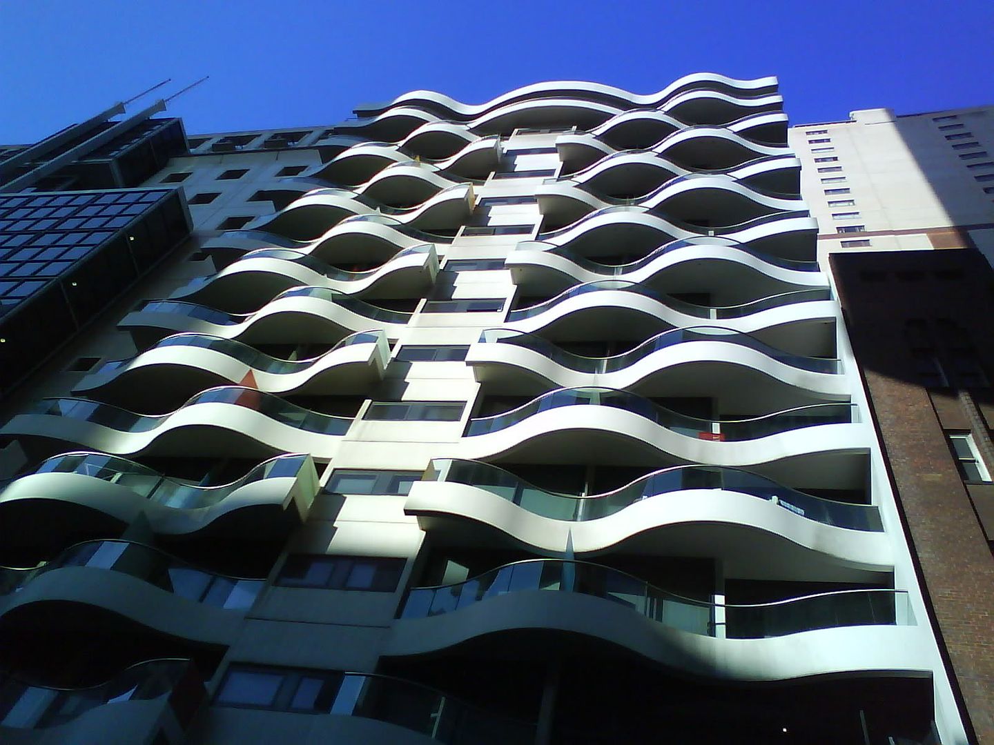
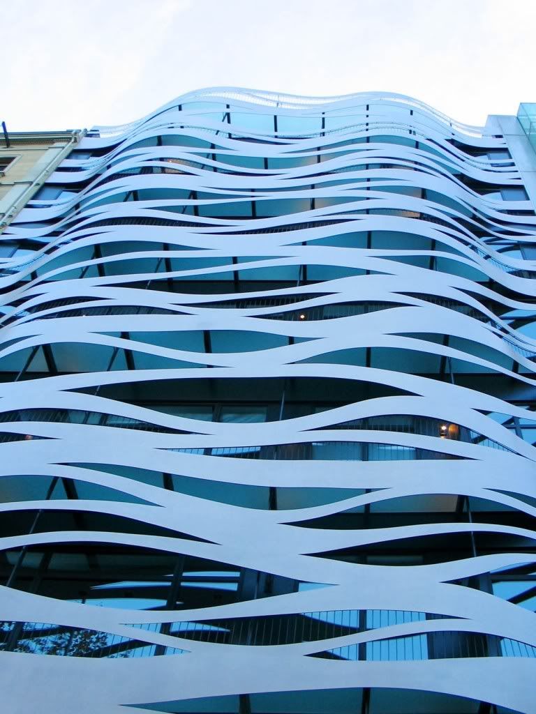
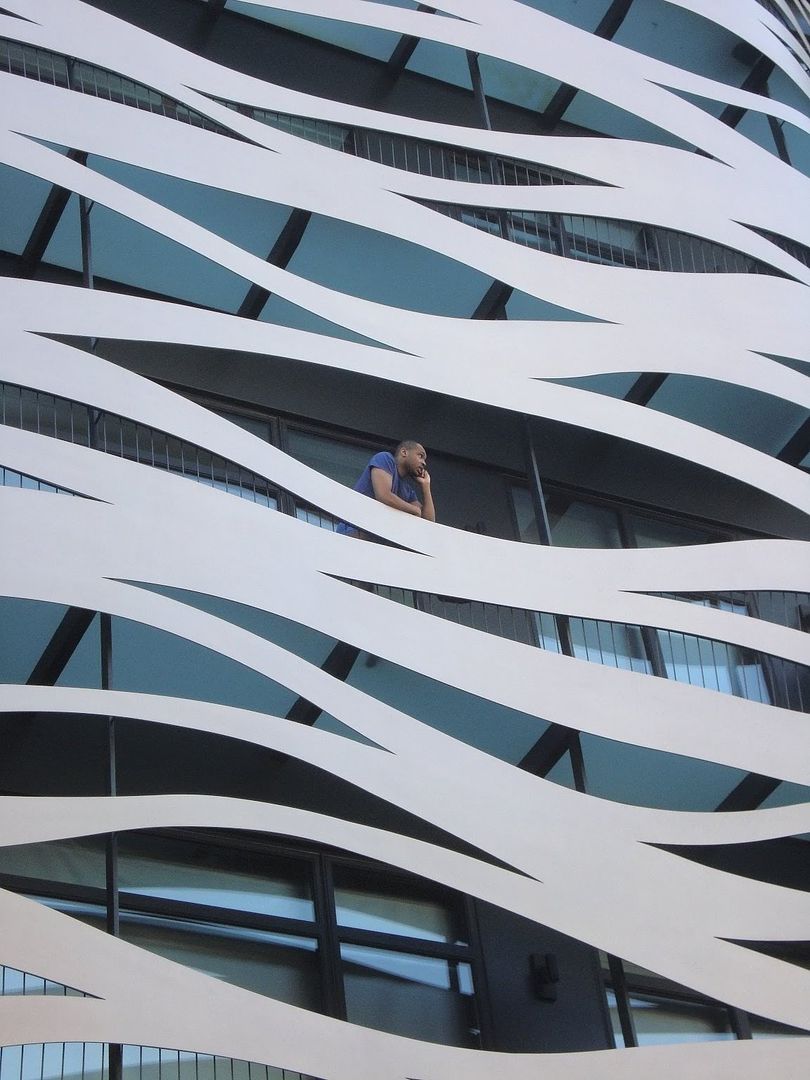
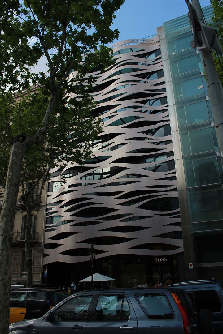
In many of the examples posted above, I find the wave-like effect to be so exaggerated as to almost feel almost gimmicky. Market Wharf, on other hand, reveals itself casually as you approach it from different angles. There's something about that quiet subtlety, and most of all, mystery that is intriguing. It doesn't wave its arms frantically and scream, "hey, look what I can do!" but rather, "come a little closer and see what other secrets I've got hidden up my sleeve". And upon closer inspection you indeed discover all the other nice little subtle details that are typical of aA designs: the richly-toned brick, the asymmetrical cut-out windows, the double layered podium that cantilevers over the street, etc. I think it's got a lot more meat on its bones and a lot more to offer to the inquiring eye.
 

Back
Top