Toronto Market Wharf | 110.33m | 33s | Context Development | a—A

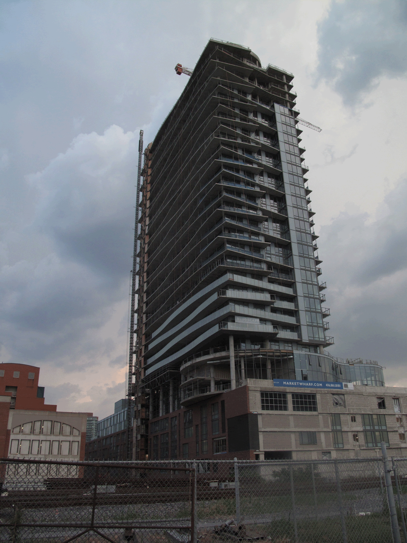
Taken July 21, 2012:
IMG_4474.jpg


Balcony glass rising on east elevation - July 20, 2012
IMG_4475.jpg
 
Wow, the balconies soften the building really nicely. I've found it a little busy, but with this addition it's nicely balanced.

*edit: and the subtle interplay between the vertical lines and the balconies is super tasteful. Enough to create visual interest, not so much that it looks like a massive tartan kilt.
 
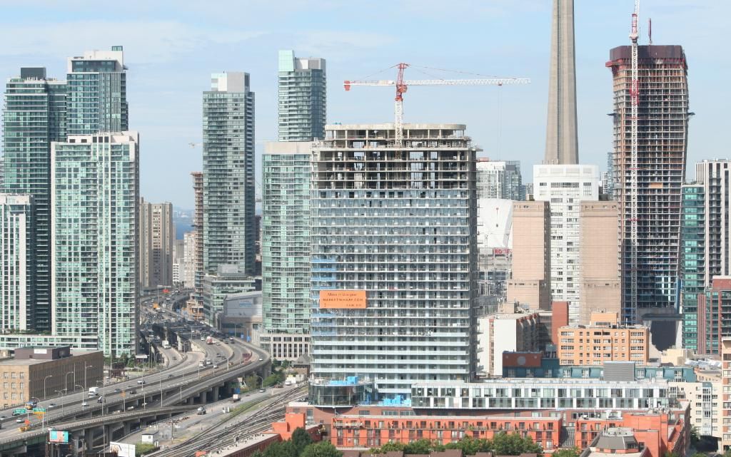
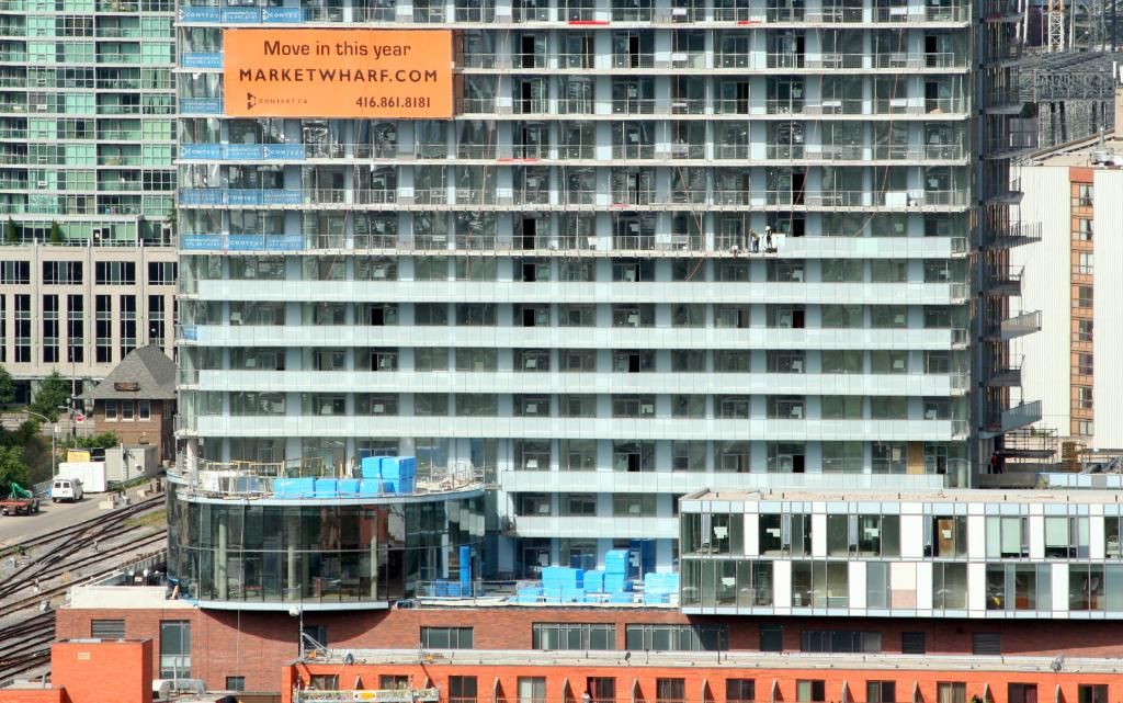
It's interesting that from a distance the balconies look totally flat. Market Wharf gives up its secrets when you get close to it.

I was concerned that it would look like a generic slab tower when looking at the east and west facades from a distance because the organic shapes of the balconies aren't visible, but the strong lines of the translucent balcony railings and the perpendicular vertical lines of different widths may save it from this perspective.
 
I am glad they used the frosted glass to differentiate the balconies from the main glass colour... however my fear is exactly what junctionist says - from a distance you cant see any of the articulation of the balconies and this thing just looks like a massive (view blocking) slab.
 
DTAH's The Modern, on Richmond, is another distinctive slab. Market Wharf's tower takes its cues from the large podium - also a slab - which in turn takes its cues from the surrounding St. Lawrence district red brick 1970s architecture. For all the nonsense we get about how aA's buildings supposedly all "look the same" the firm actually employs a wide range of forms, depending on the requirements of the site.
 
But the only place from which you can see it from a distance is from the Distillery District towers, and plainly, from the photos posted upthread, it's not blocking any views.
 
Okay, yeah, the end result is going to look fantastic. This should hopefully put an end to all those detractors of "trick balconies". What a fantastic building.
 

Back
Top