


nfitz
Superstar
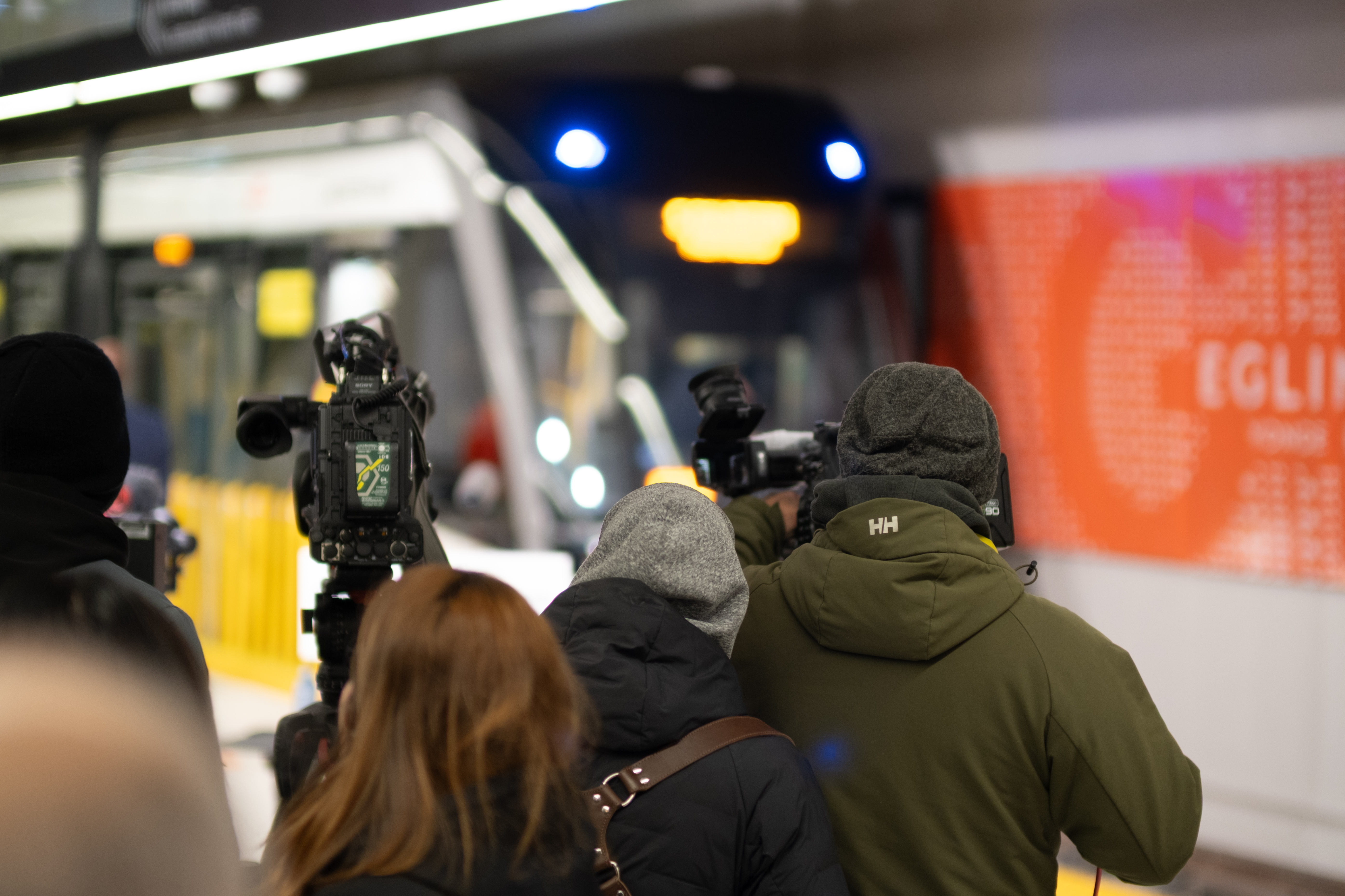
That's a station? Are they out of their minds?
Here's a 2019 image of the north service entrance to the Line 5 yard.
|
|
|
That's a station? Are they out of their minds?
Context?
Well its a false comparison. The GO logo specifically refers to the GO Trains and Busses. The idea of the T is to have a general symbol that represents all of transport in the GTHA including GO, TTC, YRT, MiWay, DRT, BT, etc.
The other problem is that Metrolinx is in it's own perverse bubble, and ignores that few other agencies are going to adopt this. Especially with that colour.The problem isn't that they want to have a global unifying logo, the problem is the logo they chose is awful.
I think the bigger problem is, Metrolinx had the awnser right in front of them if they wanted to use a symbol (one that people are already somewhat familiar with):Well its a false comparison. The GO logo specifically refers to the GO Trains and Busses. The idea of the T is to have a general symbol that represents all of transport in the GTHA including GO, TTC, YRT, MiWay, DRT, BT, etc.
The problem isn't that they want to have a global unifying logo, the problem is the logo they chose is awful.
I think the bigger problem is, Metrolinx had the awnser right in front of them if they wanted to use a symbol (one that people are already somewhat familiar with):
View attachment 355695
The idea is to have a single recognizable brand across the GTHA. For a lot of people - especially tourists and Torontonians who never leave Toronto, using a transit agency you aren't familiar with can be daunting. The idea is say you're someone who lives in Toronto, if you go to Durham and for whatever reason want to use the transit system there, you will encounter the exact same wayfinding, bus stop design, and what not so that it makes using transit more appealing. This is especially important if in the future we move towards more cross-regional service with fare integration where the existence of separate agencies and services becomes questionable.^I'm not sure why (other than empire building) a single generic logo is so necessary or why people feel we need to program everyone to look for a symbol that ML will only change in a few years. Is this a national thing? Or will I still have to look for something else in Montreal?
If more generic branding is needed, I would stick with the generic train-LRT-subway-bus drawn images as appropriate. With the logo of the specific operator underneath.
I would never, ever use a black and white graphic for wayfinding.... visibility at night has to be terrible.
Even London double deckers indicate which operator is running that route.
- Paul
The problem is it sounds good on paper however Metrolinx so far had failed to use it in their most recent projects. The new bay concourse doesn't use it, the new union station bus terminal doesn't use it nor does the new terminal at kippling. They plan to update the several years from now apprently where as the TTC when they changed theirs did it very quickly.The idea is to have a single recognizable brand across the GTHA. For a lot of people - especially tourists and Torontonians who never leave Toronto, using a transit agency you aren't familiar with can be daunting. The idea is say you're someone who lives in Toronto, if you go to Durham and for whatever reason want to use the transit system there, you will encounter the exact same wayfinding, bus stop design, and what not so that it makes using transit more appealing. This is especially important if in the future we move towards more cross-regional service with fare integration where the existence of separate agencies and services becomes questionable.
Again conceptually, this is actually a really good idea and something that we should be moving towards, but if we have to standardize the entire GTHA to one standard, we have to make sure its a good standard, and unfortunately this one ain't it.
Again conceptually, this is actually a really good idea and something that we should be moving towards, but if we have to standardize the entire GTHA to one standard, we have to make sure its a good standard, and unfortunately this one ain't it.

The station will be located 500m south of the current one when it is completed in 2022. It's weird that they didn't just wait for the new station to open before renaming it.The station is located 500m south of the former Lincolnville GO Station.