News   May 03, 2024
 570     0 
News   May 03, 2024
 363     0 
News   May 03, 2024
 203     0 

CampusCommon (50 Gerrard E, student rental @ Church St, 12s, Burgess)

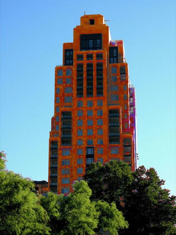
One of my favourite new buildings in Toronto! Love the colour! Just wish they'd kept the same vibrant red on the top portion (that bland beige/orange is timid.) There's a reason many people don't like it: it doesn't fit in with the beige aesthetic that is Toronto--it looks more like something from Tirana or Spain than conservative little Toronto.

Sure it's a ripoff to live there; but more bright colours is what I'm seeking to brighten up the streetscape!

Now here's where I compare two new buildings (based on exterior) and give you a demonstration of my value system: 50 Gerrard East=7/10 (would be higher if red was the sole colour) vs. Element (@Blue Jays Way and Front)=0/10.

I absolutely agree. It's a great punch of colour in an otherwise dreary streetscape. It's not great architecture- those windows look like jail cells- but the colour is such a breath of fresh air. People are afraid of colour in this city- it makes things stand out and you're not supposed to stand out.
 
I absolutely agree. It's a great punch of colour in an otherwise dreary streetscape. It's not great architecture- those windows look like jail cells- but the colour is such a breath of fresh air. People are afraid of colour in this city- it makes things stand out and you're not supposed to stand out.

This building is a good example of why we don't use colour much in this city: because when it has been used here normally, it is normally to cover up design deficiencies.

This building has been put up as cheaply as possible: if it came to light that no architects had been employed in its creation, I would not be surprised. The windows are cheap and nasty in terms of their construction and proportion, while the cladding was chosen for maximum coverage at minimum expense. The colour is meant to divert your attention from that fact. The bricks at ground level barely tie the building into the context of the historic structure this one surrounds, but thank goodness they are there as they are the only friendly gesture the building makes.

Alsop comes quickly to mind when colour as a design feature is mentioned - he is one of the only people working in this city at the moment who uses bold colour to its best effect: the mutli-coloured stilts holding up OCAD are an obvious example of that, as are the various elements for the funky Westside Lofts sales pavilion, and his Admin building at Filmport promises to use colour very strikingly too - and not as a way to cheap out.

In less laissez-faire times this building would have been declared a witch, and we'd be calling for her immolation.

42
 
The colour of the lipstick is fine. But it has been applied to the lips of a pig...and it remains a pig with lipstick (no matter the pretty colour).
 
I don't dislike this building. There's something Scandinavian about it, and not just the colour, but also the simple lines and the squareness of it.
 
I don't dislike this building. There's something Scandinavian about it, and not just the colour, but also the simple lines and the squareness of it.


I agree- it really is not as bad as it is being made out to be. I am so tired of the old argument that buildings have to blend with their surroundings. That's so typically Toronto. That way there's no experimentation, no novelty. There's this constant expectation that everything blend and conform which is part what made this place such a stifling city to live in until the 1970's. Jane Jacobs has been so eagerly adopted here in part because there's is such an conservative streak in this city. It may have saved neighbourhoods but it has also been used to justify maintaining the dreary state of many of our streets. Not everything is worth preserving and uniformity is not necessarily a positive thing.
 
Jane Jacobs did not call for uniformity. None of the complaints above are from anyone calling for uniformity.

42
 
I can't makes heads or tails of this place. It's a mish-mash arrangement of boxes with colour which distracts the lack of imaginative design and yet draws unnecessary attention to itself.
 
I am so tired of the old argument that buildings have to blend with their surroundings. That's so typically Toronto.

It is? Then why is Toronto such an ununiform mish-mash?
 
That's brilliant! Post of the month :)
 
SNF - wow - I briefly had the urge to kill. And then vomit. Now I feel like killing, and vomiting concurrently.

You have awoken the beast inside me. Watch out, next thread.

42
 
It's so European! Why do we have such a fear of colour in this city? The only reason you wouldn't like a tye-dyed scraper is because you want every building to look the same! Insert additional hyperbole here!!!
 

Back
Top