Hamilton King William Urban Rentals | 97.56m | 30s | LIUNA | Graziani + Corazza

Looks accurate to me!

29970-165362.jpg

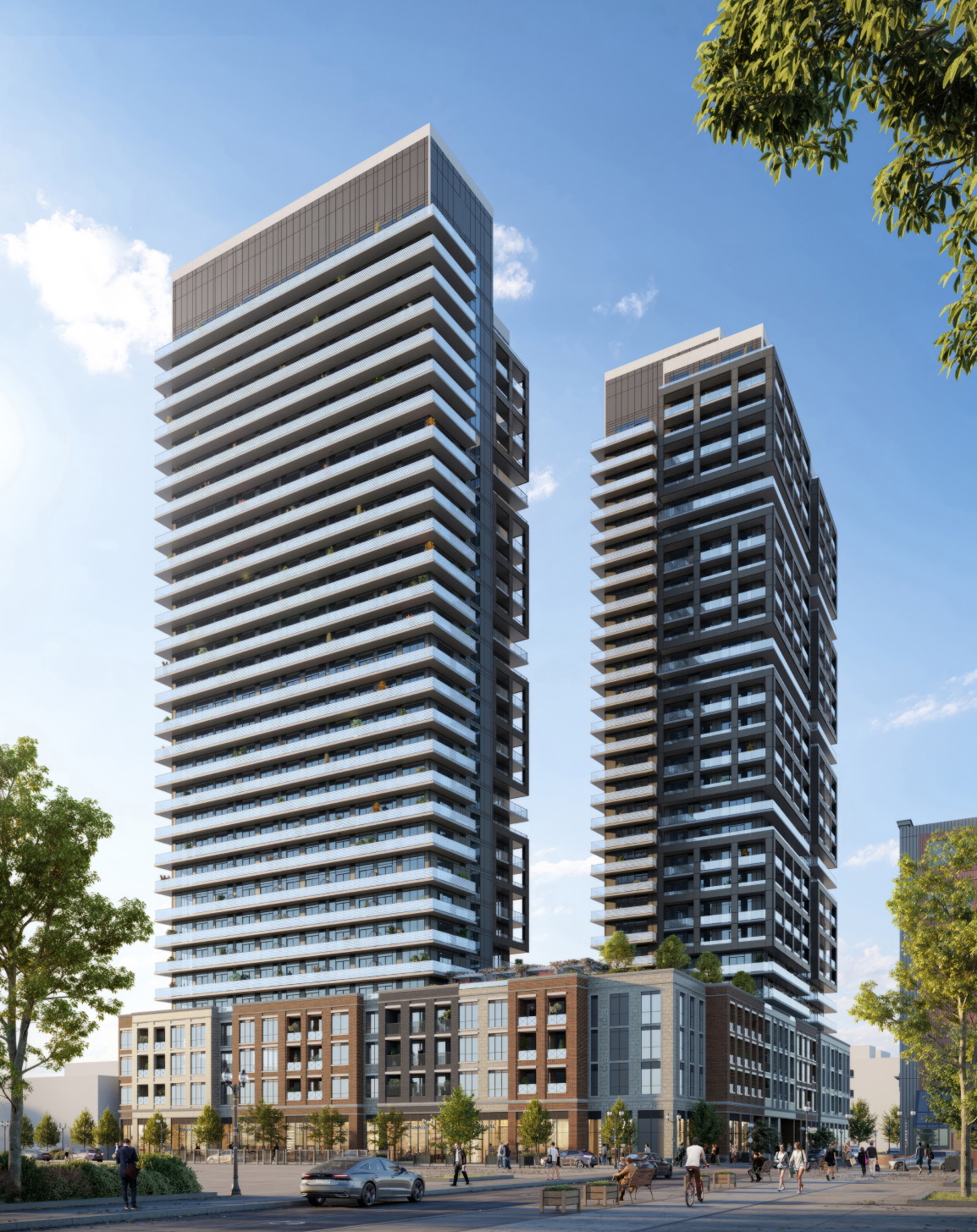
Thaaaat's not the render they had up on their site before, nor was it the one on the signage had up haha - the podium has gone through "several" different iterations.

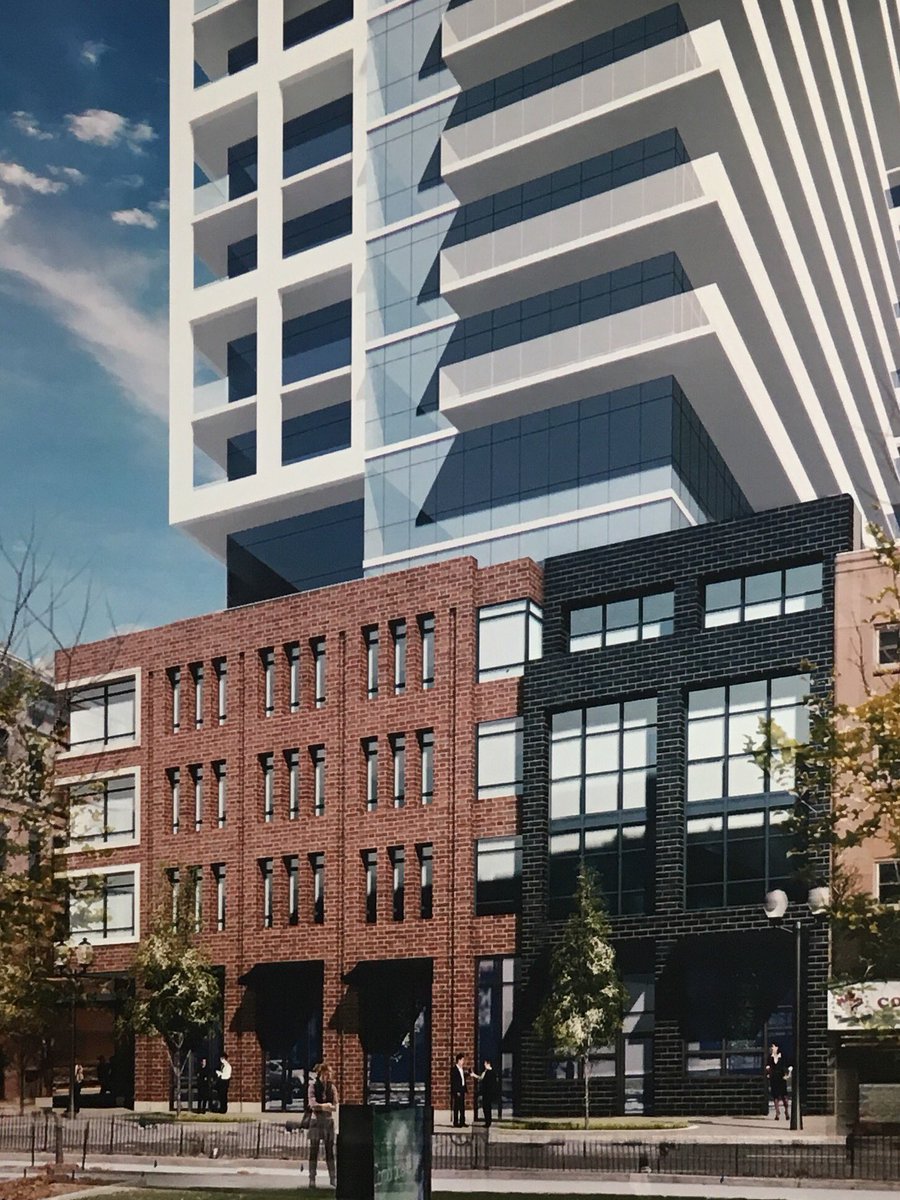
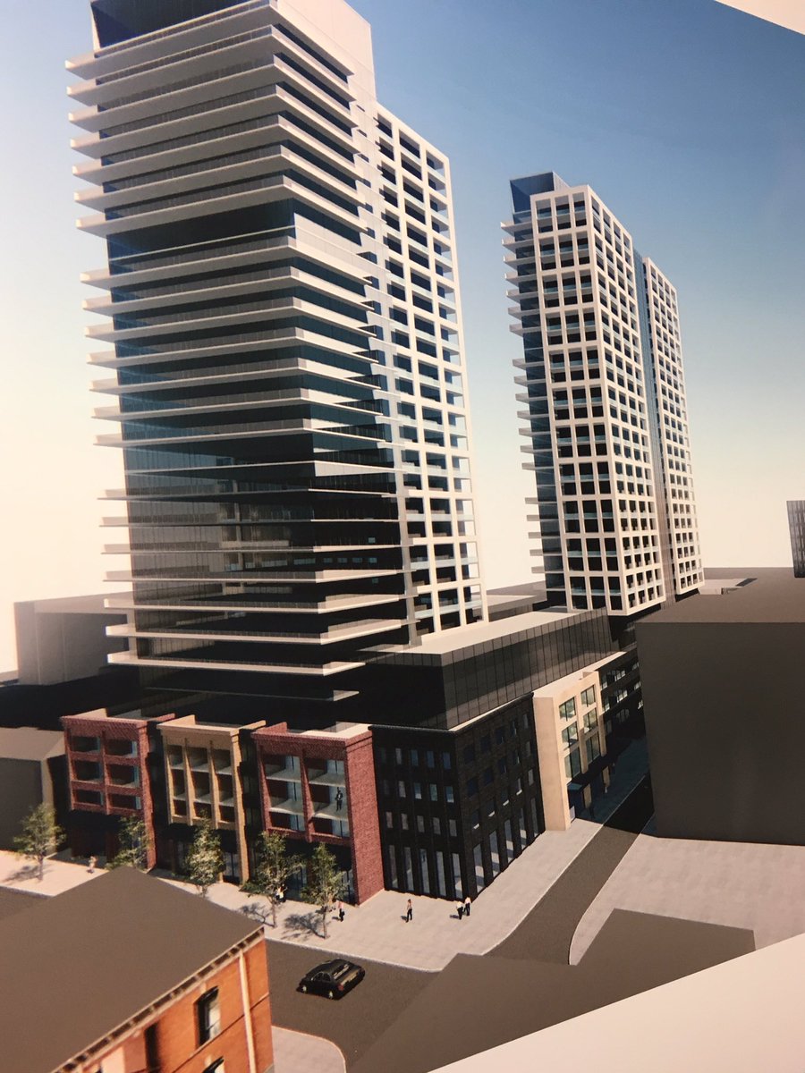
Leeet's visit some of the others:

ftMwGDh.jpg


m1W6jd0.png


DOR3cenUQAE6ehc.jpg


DOR3cenVQAEiLQF.jpg


CtSSJSU.jpg


a8d4e6cd-a4f5-4f84-ac1e-f5744d0a51a6-jpeg.439286


You can see even the podium on the signage did not match what was eventually created so nope - it doesn't window most accurate design to final result - the tower part? Maybe. The podium part? Mmmmnope. lol. That design you posted was posted long after the fact hehe.

This is only some of them too - I am missing a few between when they were still trying to incorporate the old kresgys design, and some of the later designs wen they were trying to make a better king facing front.. hehe..

Kinda wish they had been able to keep it with the art deco look in the first one - but there was only one stamp of that design left and it's somewhere in bc - all the niceties of it were stripped off long ago.. that and yellow brick ages HORRIBLY. I actually was mentioned by the spectator for finding the original mold for the art deco designs.
 
Last edited:
How so?
They might've changed the podium design a few times but the final rendering is pretty damn close to the final product
The towers yes, the podium was a mystery to us how the front would look right up until they added the finishing stone.

I personally hate the front - it doesn't feel cohesive to the extremely historical looking buildings on either side of it - doesn't even look like a "front" really. I find their attempts to "break it up" to look like different buildings very awkward. It's like being boxed in between loving and hating it - because you know it could be much worse, but you also know it could be much better. I feel like they experimented with something they don't normally do, and I applaud their effort, but it could have been better. Clearly they went after it several times from the drawing board.
 
Last edited:
After being accustomed to Vranich builds and other lower quality product of the past decade, I think this is a nice addition to downtown Hamilton.

This building has the best crown of anything built in Hamilton in the past decade.

Which isn’t saying much looking at Vrancor‘s incomplete top treatments, and Mac’s recent case of ‘The Cheapening’.
 
This building has the best crown of anything built in Hamilton in the past decade.

Which isn’t saying much looking at Vrancor‘s incomplete top treatments, and Mac’s recent case of ‘The Cheapening’.
I was about to say, that's not saying much - it's definitely not the best crown of anything built in say the past 100 years hehe..
 
I am curious as to where signage for those businesses is gonna go - there are no spots for lit signs.. I guess that narrow strip between the stone above the windows?
 

Back
Top