News   May 23, 2024
 307     0 
News   May 23, 2024
 424     0 
News   May 23, 2024
 686     0 

Ontario and Manitoba flags

Interesting how of all those proposals, only one includes the trillium--and the abstract "trilliummark" one (minus border) that's being phased out by the province, at that. Somewhere between cheeky and cheesy, I'd say (though it makes more sense on a flag than the three-men-in-a-tub)

If a trillium's called for, I'd rather it be a fresh design (and not necessarily as abstract as the trilliummark)
 
Personally I've always liked the flags that included the Union Jack in them, like Ontario, Manitoba and Hawaii.

I also like the flags of Quebec and Newfoundland in particular, as well as those of the Atlantic provinces' flags because they're so complicated/dramatic.

That said, I'd like to see some good ideas for a new Ontario flag. If something good was come up with, then I'd like to decide between it and what we have now. If it's not good enough, just keep what we have now. Let's not change just for the sake of change. I also think red, white and blue should definitely be used.
 
There is definitely a move by some in Canada to remove the Union Jack from everything. I think it's an integral part of Canadian history and identity.
 
It is part of our history, it can colour our relations with the UK - but it does not mean it has to be part of our identity. The change in citizenship rules by the UK (around 50 years ago?) was the beginning of the end for the Union Jack in all her old colonies :rolleyes:
 
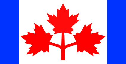
Hell, I would even love to see the early favourite for the national flag ("Pearson pennant") be resurrected as the new flag of Ontario. It's simply too beautiful a design to let go to waste. It already contains the triple maple leaf design that's on the Ontario coat of arms, and the blue strips could represent the Great Lakes. And the red, white and blue colours would be a tie to the British history of the province for anyone lamenting the loss of the Union Jack on the flag. I see no downside to using this design.

ca1964p.gif

Um, the blue stripes were the oceans at either side. You may notice that we only have the Great lakes - and they would be at the bottom :eek:
 
Um, the blue stripes were the oceans at either side. You may notice that we only have the Great lakes - and they would be at the bottom :eek:

I know that they were meant to represent the oceans as a national proposal, but Ontario obviously doesn't have that, so I substituted the Great Lakes - the location of the strips doesn't have to correlate with actual physical geography. It's about the idea of what they represent. Flags are symbolic, ya know :p

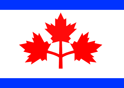
Maybe a version with the blue strips on the top and bottom could work. Personally I just love that design and hate the fact that it isn't used for anything. I maintain that it would work very well as a new flag for Ontario.
 
But Hudson Bay is at the top, so it could work.

Done. With this change it still retains the striking elegance of the Pearson proposal, and the argument that it's just an old design merely being yanked out from under the heatlamp of history's dustbin in the search for a new flag for Ontario is weakened.

ca1964abp.gif
 
^I was wondering that too.

Done. With this change it still retains the striking elegance of the Pearson proposal, and the argument that it's just an old design merely being yanked out from under the heatlamp of history's dustbin in the search for a new flag for Ontario is weakened.

ca1964abp.gif
I think it would be better with trilliums instead of maple leaves, so it's specific to Ontario.
 
^I was wondering that too.


I think it would be better with trilliums instead of maple leaves, so it's specific to Ontario.

But I believe the trillium was a more recent adoption, (60's?) whereas the triple maple leaf has been a symbol on Ontario's coat of arms for ages. Let me look into it.

EDIT:

TRILLIUM HISTORY:

Our provincial floral emblem since 1937, the distinctive three-leaved, three-petal trillium has become one of our provinces most well-known and beloved symbols.

The white blossom of the trillium is associated with peace and hope. Since 1964, the trillium has also served as the official logo for the government of Ontario. Over the ensuing four decades the trillium has become a universal symbol and seal for governments of all three major political parties.

While an indelible part of our natural heritage, the trillium's future remains a considerable source of concern. Trilliums take over 15 years to mature, and quickly die should their distinctive three leaves (their only food source) get picked. Many jurisdictions have passed laws preventing the picking of trilliums, and the preservation of this flower, and all it stands for, remains a laudable goal of conservation minded Ontarians province wide.


COAT OF ARMS HISTORY:

The Coat of Arms of Ontario was granted by Royal Warrant of Queen Victoria on 26 May 1868. The Shield of Arms consists of three golden maple leaves on a green background.

Above the leaves is the red and white Cross of St. George. It represents the English heritage of many Ontarians and also refers to King George III, who ruled England when Ontario became a colony. The golden maple leaves represent Ontario. Quebec uses green leaves, and Canada red ones.


So there you have it. The three maple leaves have been a symbol of this province for roughly 100 years longer than the trillium, though to be fair the trillium seems to be more recognized among the public because of its inclusion on all government letters. Maybe a new flag would need to include both.
 
Last edited:
There is definitely a move by some in Canada to remove the Union Jack from everything. I think it's an integral part of Canadian history and identity.

Actually, I see it more as part of British history rather than our own.
 
The British adopted the present design in 1801 - ten years after John Graves Simcoe became the first Lieutenant Governor of Upper Canada.
 
So there you have it. The three maple leaves have been a symbol of this province for roughly 100 years longer than the trillium, though to be fair the trillium seems to be more recognized among the public because of its inclusion on all government letters. Maybe a new flag would need to include both.
Only 69 years longer actually, as the trillium was adopted in 1937. But it doesn't really matter, the maple leaf is generally seen to represent Canada as a whole and not Ontario specifically. The trillium is Ontario's most recognizable symbol. Interestingly, the Ontario version of the maple leaf is gold, so the red maple leaf doesn't make sense regardless.
 

Back
Top