News   Nov 01, 2024
 2.1K     14 
News   Nov 01, 2024
 2.5K     3 
News   Nov 01, 2024
 744     0 

TTC: Redesigning TTC Signage

Why not eliminate references to the other side of the line entirely? North York Centre to King show "Northbound to Finch", St Andrew to Wilson show "Northbound to Downsview", both sides show "Southbound to Union", and the terminals + Union show their appropriate signage there.

Though the "Downsview via Downtown" and "Finch via Downtown" would be acceptable too, and a nice TTC throwback.

How do other cities with circle rapid transit lines handle it?
 
In London the sign only tells you where you can actually get to from that platform. This removes any potential for confusion.

It's the same complaint about the LED maps on the trains - no one cares where the train has come from! They only want to know where it is going!

goukaseishi_jubileeline_sign_london.jpg
 
How do other cities with circle rapid transit lines handle it?

I think most to use a logical station to indicate "via". So yes, "Finch via Union" and "Downsview via Union" would make the most sense in this case.

One of the first things they could do is remove ANY reference to "Northbound" at Union station. It goes without saying! (And someone who knows that they need to catch a train northbound from Union could easily end up on the wrong train because they saw "Northbound" and an arrow pointing at a train.) Emphasize "To Downsview via University/Spadina" and "To Finch via Yonge".

For their circle line, Berlin actually uses circular arrows , which is kind of interesting. They'll use the same arrows on the digital departure signs and the front of the trains.
 
How about this:
Line 1 to Downsview
Line 1 to Finch

And that's it. Eliminate directions, via X, etc. Just refer to directions by their end points. That's what Montreal does and it works beautifully. By far the easiest RT system in Canada to navigate as an unfamiliar tourist/new arrival.
 
How about this:
Line 1 to Downsview
Line 1 to Finch

And that's it. Eliminate directions, via X, etc. Just refer to directions by their end points. That's what Montreal does and it works beautifully. By far the easiest RT system in Canada to navigate as an unfamiliar tourist/new arrival.

Paris does this as well. I found it a bit confusing at the time, but it makes sense when you have branching routes.
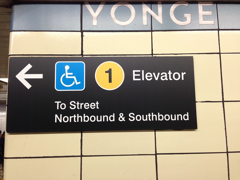
 
How about this:
Line 1 to Downsview
Line 1 to Finch

And that's it. Eliminate directions, via X, etc. Just refer to directions by their end points. That's what Montreal does and it works beautifully. By far the easiest RT system in Canada to navigate as an unfamiliar tourist/new arrival.

In addition, they should have signs on the side of each car facing out with the destination of the train and the line number. They would show, for example: 1 FINCH. The number would be in a coloured circle. Having just the destination is insufficient, it needs the line number as well. If they can't get the colours using LED pixels, then a decal on the train itself, like they have in New York City.

Number-12-Subway-Sign-NYC-MTA-Train.jpg


nyc-subway.jpg
 
Last edited:

Back
Top