TheTigerMaster
Superstar
Montreal are trying something new now

I like it. Its a very simple design. The one problem is that the sign is white so that it will get dirtier a little faster.
Montreal are trying something new now

This needs to die! Its a horrible font to be used on signs. But it should still be used for the station name on platform walls.
The TTC needs to throw out the old design(s) and come up with something brand new. And yes, that does mean that our beloved TTC font should be replaced with something more modern and accessible.

This needs to die! Its a horrible font to be used on signs. But it should still be used for the station name on platform walls.
How fatally horrible is it?? I reckon that Joe Clark would have more issues with its potential self-conscious "it's TTC heritage, maaan" misuse these days than with its original application (and yes, that includes more than just platform walls).
At that point, you might as well be proposing the ultimate sacrilege: ditching the TTC logo...


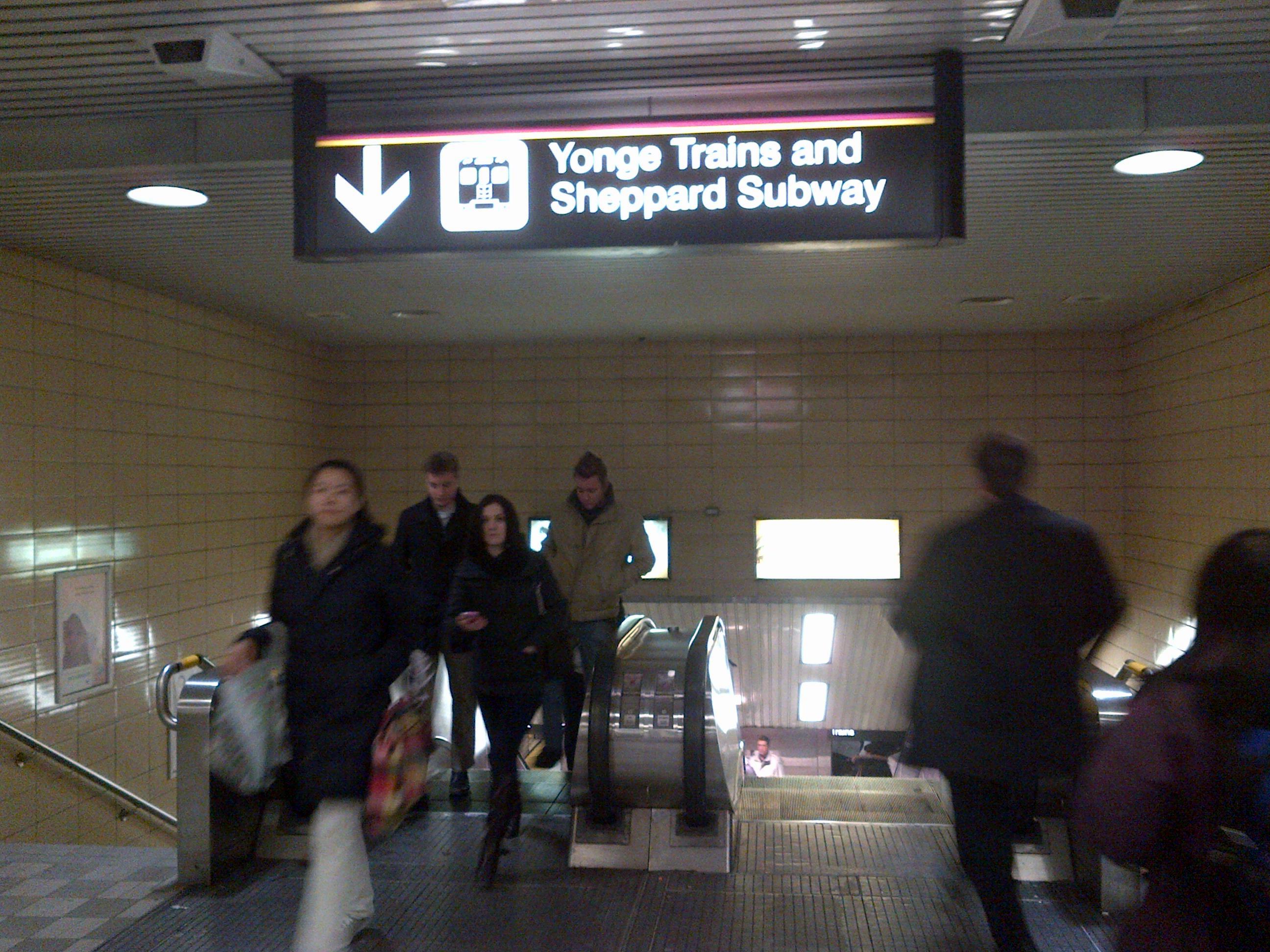
The TTC has a laundry list of customer service issues. But one of the biggest one of them is the horrible lack of uniformity and the extremely confusing nature of the TTCs signs. I often find myself confused about where to go; and I consider myself to be somewhat of a Toronto transit expert.
I personally think that it is about time that the TTC replace every single one of their signs with ones that are more modern and less confusing.
...
I could keep posting more, but I think that I've made my point clear. The TTC needs to replace EVERY sign on the system with new ones with brand new design. I personally think that the TTC should adopt the design that the Eaton Centre uses to direct its customers to Dundas and Queen stations (I don't have any photos of this. I'll take a photo and post it next time I vist the Eaton Centre).
Here are some examples I made of what I think the new TTC sinage design should be. These signs would be used on the exterior of every subway/LRT station to identify it. I personally think that this is much better then the TTC's current "system". This is just the first version so there are still a few issues:
-The purple for the Sheppard line is a little too dark. It makes seeing the "C" at distances a little difficult
-I haven't added the TTC logo
-I haven't added subway/LRT pictograms
Feel free to point out any other issues.
I've renamed the Subway/LRT names to the following:
YUS: Route A
Bloor-Danforth: Rote B
Sheppard: Route C
Eglinton-Scarborough Crosstown LRT: Route 1
Finch LRT: Route 2


Why would the TTC want signs that say the Yonge subway is route A with a smaller font saying TheTigerMSTR?
Its a watermark. It obviously wouldn't be there if the design were implemented by the TTC
Why add the watermark? I detracts from the look of the signs.
I know that. The design looks much better without the watermark. But I didn't want somebody to copy/paste it and pass it off for their own work. What do you think of the design? Just ignore the watermark.
On your first post in this thread you posted a whole bunch of pictures that you borrowed from someone else but you are concerned that this effort of typing words and numbers on different colours of background could be plagiarized? Where do you stand on creative commons? Should you even be showing us this work of yours? Someone might take the TTC font and type on a background as well and your plan to make untold millions on TTC signage will be ruined.
Does anyone have any thoughts on the design and how it compares to the one currently being used?


