News   Nov 25, 2024
 102     0 
News   Nov 25, 2024
 231     0 
News   Nov 22, 2024
 853     1 

TTC: Redesigning TTC Signage

Instead of the stacked "TTC" - perhaps we can simplify it into just a Serif "T" in the centre? It is identifiable, provides historical continuity and carries qualities of other modern, stylized transit system logos.

Not a big fan of the stylized bgfrancey version - it looks "flippant".

AoD

PS: I see car4041 already suggested that idea. Like!

I've tried placing a single T in the center of the logo and at least to me, it looks better without. I found that the T detracted from the simplicity of the ribbon and shield. I also find that the shape of the shield already implies the letter T.

Besides, why do we need to be like so many other agencies and slap a T in our logo?

Of course, I'd welcome someone to post a version of the logo with an inset T. Personally, I just can't get anything I make not have the T look like an afterthought.
 
Last edited:
While I liked the direction that bgfrancey was heading in as far as visual identity for the TTC, I think he took too much detail away from the original TTC logo. I've created my own version of what I think the evolution of the TTC logo should look like.


[IMAGES REMOVED OCT 2013 BY MOD]

I know that the changes that were made are subtle, but they were done for good reasons. The most obvious change is the removal of the cluttered TTC text to improve iconography in maps, to enhance its display in digital formats and small print, and to improve readability at a distance.

The shield and ribbon are instantly recognizable throughout much of Ontario/Canada without the need for text, and in case there was any doubt about what the symbol meant, it would almost always be accompanied be text on signage and in print.

I have also reduced the size of the ribbon, shifted it up, and removed the white border to both emphasize the nested shield and to move the balance of the logo closer to the centre of the shield.

Like bgfrancey's proposal, removing the text from the center of the shield still allows you to do fun things such as inserting a ! for a service advisory, i for info and ? for inquiries.

that's the right idea, although without the text there is nothing to identify it. I gave it a whirl.

5exKN.jpg
 
Last edited by a moderator:
Single T version - not quite what I have envisioned, since I haven't resized the T and need vector graphics to do that job properly.

TTC-T-LOGO.png


AoD

PS: Looking at it, I would move the wings up to the horizontal centre-line of the T as well.
 
Last edited:
Personally I think the logo is fine as is, but check the version of the logo on the vehicles - it has thicker wings which appear higher and has a white outline around the whole logo. The version on the vehicles has always been slightly different from the version used on printed materials and was drawn up in 1953 so it is original. The overlapped TTC letters were a continuity from the late 1930s and were consistent with other transit systems that used that concept. The HSR still uses their overlapped letters as well.
 
My suggestion is: rather than tampering with the logo through blanks and single T's and disposing of the existing stacked "TTC" letters altogether--keep it. But augment it, perhaps through some of the suggestions at hand. That is, the TTC shouldn't be dumbly, unimaginatively harnessed to using just the standard logo, letters and all, at all scales and in all contexts (as is mostly the case now)--it can use blank versions, station-name versions, all kinds of versions, all with the fundamental ribbon-and-shield (or even just plain shield a la Paul Arthur) motif. That way, the existing logo, rather than being deemed a dated, dispensible artifact, can instead serve as the "Mother Logo"--contemporary-design-nightmare stacked letters and all. Then we can have our cake and eat it too. Right?
 
its cool how in a lot of the threads here you weirdos complain about people in toronto being content with ugly hydro poles, poorly maintained parks and badly designed buildings. yet are blindly opposed to a refresh of a logo.
 
its cool how in a lot of the threads here you weirdos complain about people in toronto being content with ugly hydro poles, poorly maintained parks and badly designed buildings. yet are blindly opposed to a refresh of a logo.

Perhaps if you substitute "misguidedly altered buildings" or "needlessly demolished buildings" for "badly designed buildings", you'd get an idea of what the opposition to said "refresh" is all about...

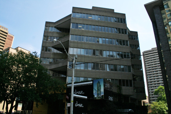
20100821%20-%20Chaz%20Full%20View%20of%20Dubois.jpg


Here's a case where what's "badly designed" to some is "needlessly demolished" to others
 
Single T version - not quite what I have envisioned, since I haven't resized the T and need vector graphics to do that job properly.

TTC-T-LOGO.png


AoD

PS: Looking at it, I would move the wings up to the horizontal centre-line of the T as well.

Can you try that but with the "TTC" written instead? I know that'd be very similar to the current logo, just not jumbled up, but I think unjumbling the letters alone might be sufficient....
 
CC:

I could - but the badge area won't be wide enough to handle "TTC" at a scale that wouldn't leave way too much blank space at the top/bottom

AoD
 
TTC Logo.jpg


Could the TTC logo be used as the basic shape for TTC signs. If each line is colour coded, put that colour on the TTC logo at each station. The shape tell you its TTC, the colour tells you what line you are on, and as you get closer, the station name, which could be lengthy) would be shown.

I don't like my TTC logo, and the interchanges look awfully colourful, but I will post anyways.
 

Attachments

  • TTC Logo.jpg
    TTC Logo.jpg
    84.1 KB · Views: 1,009
What do you guys think of the Paul Author design that is used at St. George? I personally think that the TTC should just adopt it. All the studies and designs are complete and all the TTC needs to do is install it.
 
What do you guys think of the Paul Author design that is used at St. George? I personally think that the TTC should just adopt it. All the studies and designs are complete and all the TTC needs to do is install it.

Joe Clark has a good photoset of the Paul Arthur signs (most of which have been taken down).

Some aspects of Arthur's system are great, such as the explicit use of "Green Line" and "Yellow Line". (And simply the fact that it's actually a system, unlike the status quo!)

I can never decide what I think about using a unique pictogram for each station. I don't know of any other transit system that's found it necessary to do this, and I'm skeptical whether it would really help anyone, especially now that the stops are always audibly announced. But at the same time, maybe the pictograms would eventually become an iconic part of their respective neighbourhoods.

The green and yellow straplines are useful at St. George, where they help distinguish between the two levels, but they would clash with the colour schemes of other stations in extremely ugly ways (imagine yellow straplines at Queen or green straplines at Ossington).

I definitely wouldn't adopt his weird distinction between "rapid transit" (subway) and "transit" (buses/streetcars). Very unclear, since logically, "rapid transit" is a subset of "transit", not a distinct category.

And I don't think I'd adopt the Gill Sans font either (which, like Joe speculates, probably just reflects Paul Arthur's Britishness). I'd use the subway font for the station name and some highly legible signage font for everything else.
 

Back
Top