News   Apr 18, 2024
 423     0 
News   Apr 18, 2024
 3.1K     1 
News   Apr 18, 2024
 2.1K     4 

TTC: Pape Station Renovation

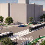
Is this just a purely cosmetic change to the platform level? If it's more than that, part of me thinks they should wait until the plans for the DRL interchange there are at least semi-finalized, because otherwise they're just going to have to rip it up again in ~10 years in order to build the new platform and the transfers between the existing station and the new platform.

Then we'd end up with a Spadina Station type of look, where the streetcar platform area (and the stairs leading up to it) are a different look than the rest of the station.
 
The TTC hires the world's leading architects for new stations on the edge of the city, but the ones serving iconic neighbourhoods like Greektown strangely get such banal design. Victoria Park was a good renovation that enhanced the original architecture, but this renovation and the Dufferin project look cheap. It was partly for this reason that people spoke out in favour of preserving the original tiles. They're hardly spectacular, but the historical look is better than a mess of uninspired renovations put together by hacks without a sense of style like the Yonge line downtown.
 
Ho Hum so far for this station so far.

The artwork is the only thing saving the platform so far. A small blue trip has been added to the top in a few places.
[video=youtube;yj1QbKIV_Ho]http://www.youtube.com/watch?v=yj1QbKIV_Ho[/video]
 
Do not like the artwork at all. If they were straight photos it would be one thing, but many of them seem to have some cheesy post-processing done on them, making them look like the output from an untalented teenager discovering the 'solarize' filter in their freshly downloaded copy of Photoshop.
 
I just went past this station today. What the heck happened with that artwork?! Why is there mid-90s horrible photoshop effects on the photos? This is just terrible and it makes me wonder how they decided on the artist to use for this station. There is no way they held a competition or anything because that is the most amateur stuff I've ever seen in my life.
I am seriously wondering if they just gave the job to a friend of whoever gave out the contract or something.
Truly embarrassing.

edit: I just noticed someone beat me to the punch with this complaint in a post above.
I want to know how this happened though. Is there any way to find out who did the art and how they were chosen?
 
Last edited:
Thank you for the information.

It makes me sad that Pape Station is going to look like that for a long time. It makes no sense that this happened. I just can't picture such awful looking art on subway walls anywhere else in the world. I am usually not one to complain about Toronto in this way but this is frustrating to me.
 
That holographic artwork or whatever it is looks terrible. Hopefully the exterior station reno is done well.
 

Back
Top