Toronto XO Condos | 53.64m | 14s | Lifetime | Core Architects

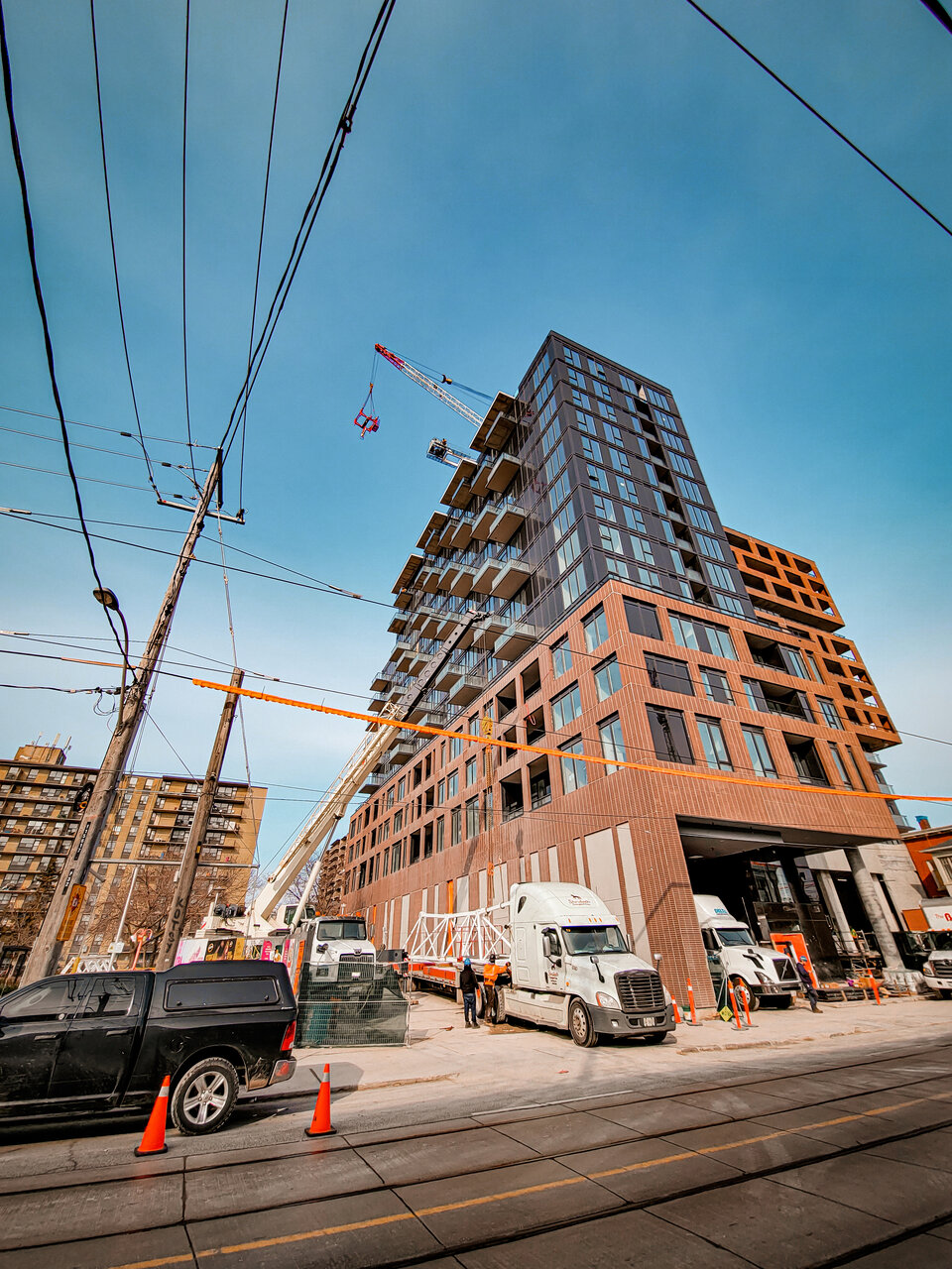
Crane coming down today.

20230329_094336.jpg
 
I want to react specifically to two pics from @AlbertC 's series above:

20230406_164502-jpg.467827


That streetwall on King West looks awful to me, it's outright too large (we're not talking overall building height here, just that sheer vertical on the south side of King)

To me, that would be bad on a brand new suburban build, completely lacking in human scale and proportion; but that it sticks out like such a sore thumb in not fitting into its context makes it that much worse.

Now, up close.....

20230406_164428-jpg.467826


That retail is both bad in an absolute sense, and bad in that it completely diminishes the best retail vibes one gets from Liberty Village, or the old main street retail here.

****

There are different options about how to achieve a nice vibe at-grade, but the thing is, this little strip gives you perfect templates:

Option 1: Go 2-3 storey with the streetwall, in the style of an older factory, then stick the tower above it, set back 4-6M

1682531866269.png


Option 2: Similar, but higher street wall by using the old Carpet Factory as your model:

1682532017838.png


Generally, I would oppose a streetwall this tall, but if you make it this contextual and elegant, you get a free pass.

***

Option 3: Just go with typical retail form on the north side of King here:

1682532171868.png


Obviously there's room to improve the rather grubby above; but the idea is right, make it 3s, wtih a bit more height on the ground level, refreshed and new with a good signage band, tuck the tower behind the roof line 6M back, done.
 
20230421_100519.jpg


20230421_100427.jpg


20230421_100401.jpg


What gets me the most is the mess of the sidewalk on King. Their concrete walkways in front of the storefronts are several inches higher than the sidewalk. So they poured this ramp in between them, which looks awful. I hope they plan on rebuilding the sidewalk because that's not the only reason the sidewalk looks so bad.

20230426_143214.jpg


There are also several damaged sections of the brick cladding. Not sure how this would be fixed other than replacing the entire pre-cast section. Here's one just to the west of the heritage building at the corner.

20230426_143244.jpg


While on the topic of the pre-cast brick, the mortar used in-between the sections is really thick and unsightly, making it really obvious that it's just sections of pre-cast installed.

20230426_143340.jpg


What a mess. Luckily we're getting another one of these across the street! 🤢
 
I'm thrilled to see so much warm brick on this - I keep hoping that more and more colour and warmth finds its way back into Toronto's colour palette - but, by gum, I have to say it is the worst-handled brick treatment I've seen in recent memory. Those plus-sized sutures between the panels are really awful. The scale of the project and its respect for the corner building gets good marks in my books, though.
 
I had some positive words for this development earlier - and I'm still broadly positive - but those Frankenstein stitches between the panels ... woof.

And pre-cast panels *always* get damaged in installation somehow - it's what really makes pre-cast panels look so cheap. And then it's just on your building for the next few decades!
 

Back
Top