HHC
Active Member
Wow.. unreal shots. What a view.
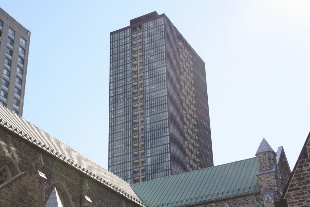
Did you ask what happened to the design at the top?


Re: Cobweb Lobby Chandeliers and Awful Art
The original illustration included in the X condo brochure shows light, airy and simple chandeliers thoughtfully considered in sense of scale to compliment the lobby and building design.
Installed this week are a disastrous redesign-- heavy, chunky and imposing, these chandeliers look like space-junk covered in cobwebs.


I'm with you. They look great and add warmth + sophistication to the lobby. To each his / her own. At first, I thought the Chandeliers were damaged, but that's just the way they are. They are particularly impressive when driving / walking by the lobby in the evening.
