casaguy
Senior Member
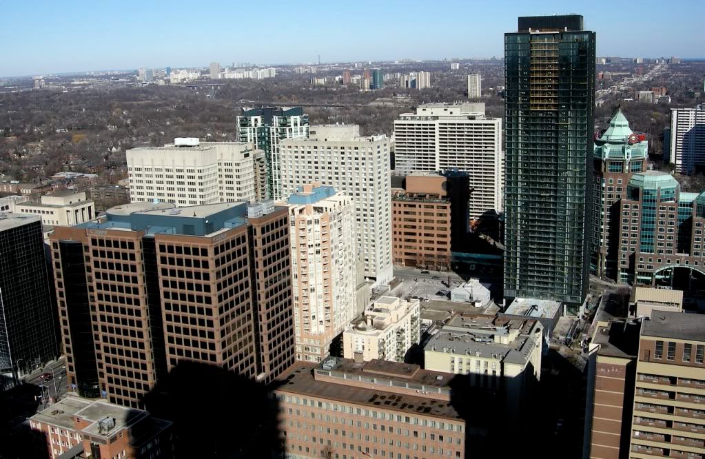
From Casa today:
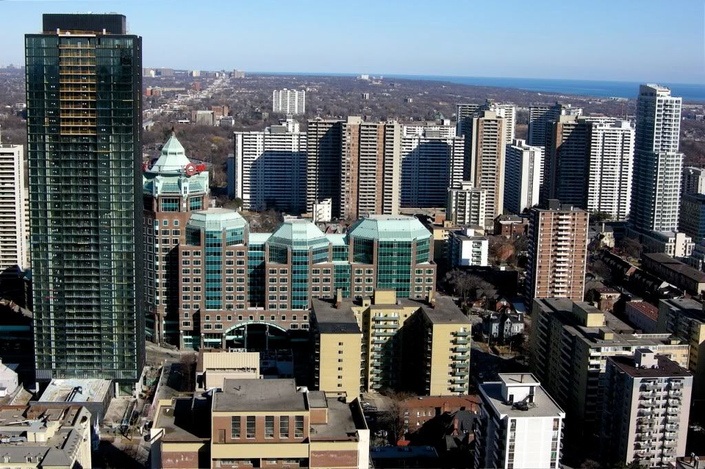


^It's the best-looking post-war building east of Yonge Street! Even better looking than Casa.
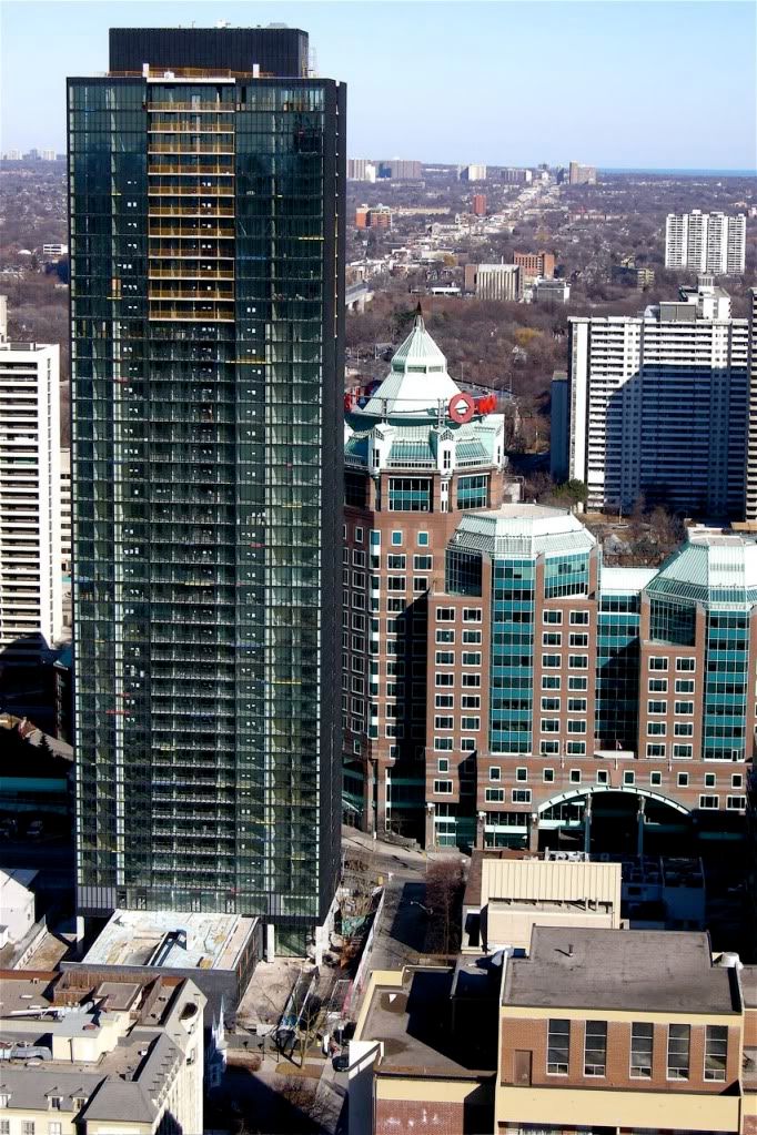
Evaluating the look of a residential building that's an homage to Mies in terms of 'Miesian sleekness' ought to take into account the fact that his residential towers had similar mechanical features on their roofs, surely?
Evaluating the look of a residential building that's an homage to Mies in terms of 'Miesian sleekness' ought to take into account the fact that his residential towers had similar mechanical features on their roofs, surely?
From Casa today:
X is like a beacon of hope for architecture amongst the clutter of commie blocks and overdone po-mo. I hope the east-side units got a discount for having to stare at Rogers Castle all the time.