Toronto West Harbour City | ?m | 36s | Plaza | BDP Quadrangle

WHC 3 is going to the Design Review Panel on Tuesday, June 15. Minor Variance and Site Plan Approval applications have been submitted. I'm not sure of the address, but if WHC 3 is 38 Grand Magazine Blvd, then the following is listed on the City's planning applicaiton status webpage:
Site plan approval for a 17 storey and 15 storey tower above a 9 storey podeum including - a 2 storey structure adjaced to Fort York BLVD containing Live Work Units - 424 units of which 22 are Live Work and 5 are townhouse type units - 457 parking spaces - above and below grade. 403 resident - 54 Visitor. - Also - 2 autoshare spaces - and 13 Tandem Spaces not included in above calculation.
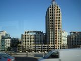
 
Can anyone down in that area get us pics of how the townhomes are shaping up, just north of the towers? Or is that whole area closed off to pedestrians still? (I imagine that may be the case because the townhomes are on new streets which most likely still haven't opened to the public yet?)
 
SP!RE ... here's my shot of WHC2 from May 25th; at that time, concrete has been poured for the WHC2 townhouses, but exterior wall construction has not commenced; the exteiors of WHC1 townhouses (to the right outside of this photo) were completed

Click to Enlarge
 
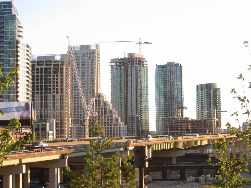
Ok, so it's not my ideal condo, but I gotta say **** **** it looks good from the Gardiner.

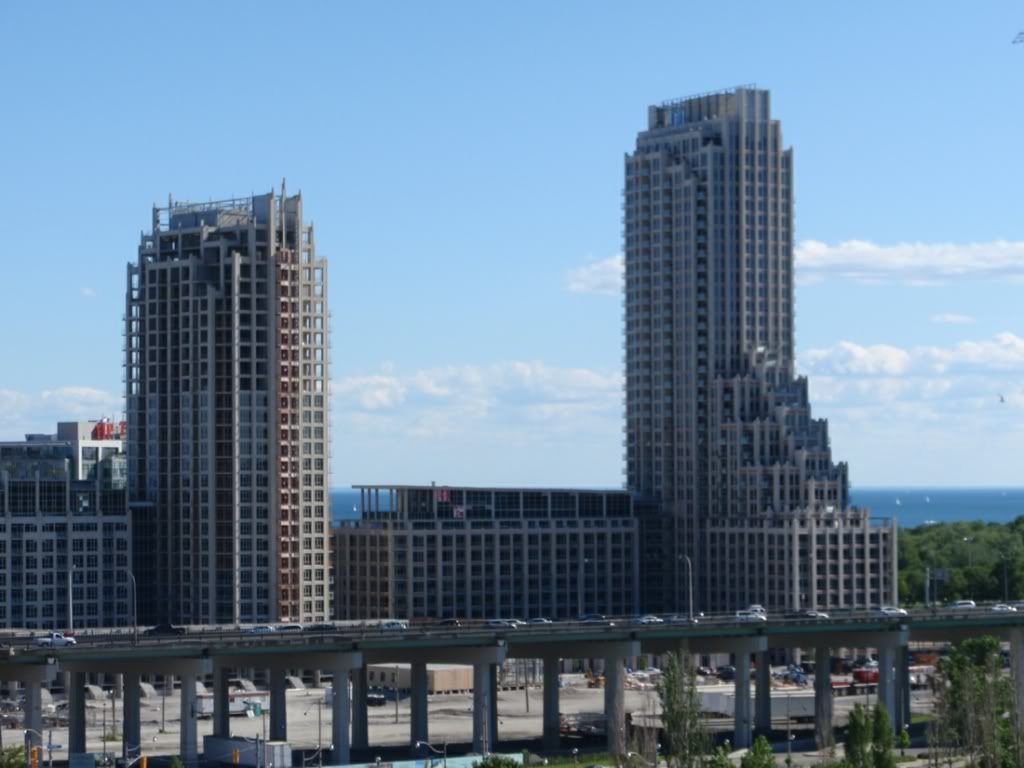
12 June 2010:

dsc09092qy.jpg
 
Last edited:
June 19 2010 update

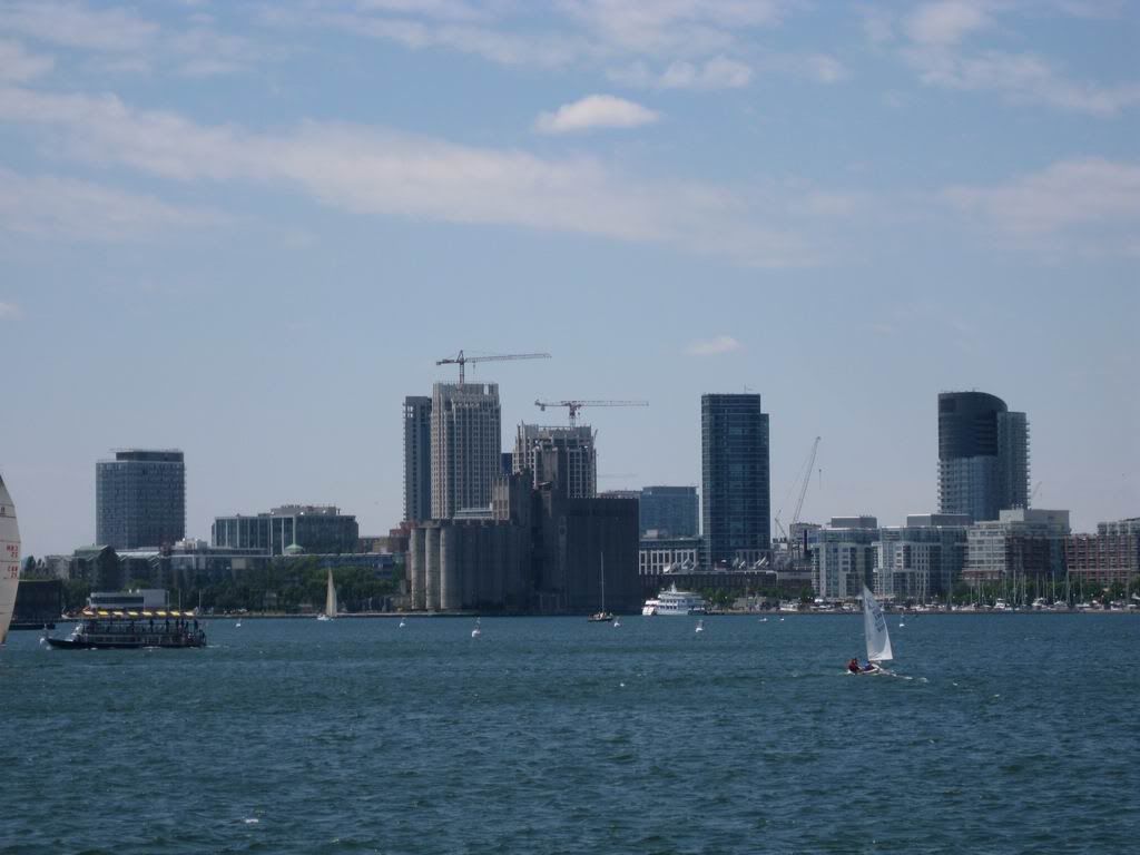
West Harbour City 1+2 seen from the Island Ferry
IMG_4768.jpg
 
From Panorama:


PanoramaViewWestHarbourCity.jpg


42
 
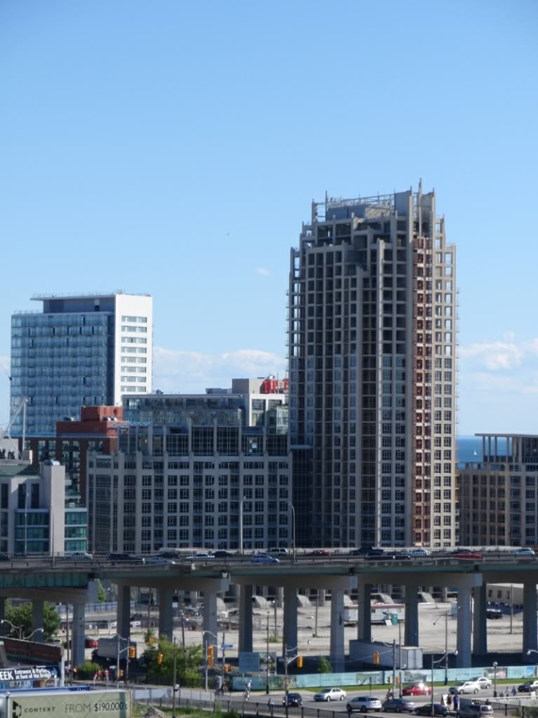
July 1 2010 update

Crane is down for West Harbour City 2 ~
IMG_4788.jpg
 
I visited a friend last week who moved in a few weeks ago. All I can say is that this building is horribly average. The lobby looks like a throwback to the 80s , with its granite medallion and cheap veneered columns. The corridors and common areas are poorly finished - cheap dark brown carpeting, wall paper that looks faded and washed out, and cheap suspended acoustic tiles (yes! you read that correctly..) in the corridors. Very disappointing. The only redeeming thing was the view from her corner suite, and the acceptable space plan. But this building is a snooze...Makes you realize how important it is to have a good interior designer on the team..
 
I visited a friend last week who moved in a few weeks ago. All I can say is that this building is horribly average. The lobby looks like a throwback to the 80s , with its granite medallion and cheap veneered columns. The corridors and common areas are poorly finished - cheap dark brown carpeting, wall paper that looks faded and washed out, and cheap suspended acoustic tiles (yes! you read that correctly..) in the corridors. Very disappointing. The only redeeming thing was the view from her corner suite, and the acceptable space plan. But this building is a snooze...Makes you realize how important it is to have a good interior designer on the team..

This is often overlooked.
 
Yes, the location and interior space are important, but the overall condo experience (and its ensuing financial returns) are also tied to grand total of the impression created by the location, architecture, space plan of the suite AND the tone and feel of the COMMON AREAS (lobby, elevators, corridors, amenities) I think that this building does not present well. Also, another judge of a buidlings quality is he finish of the PARKING GARAGE. Parking garages are full of one-time finishes - often construction grade elements with no embellishments. As such, its a good indicator of the level of craftsmanship/ care/ quality that went into the making of the overall building. At West harbor, the parking garage looks twenty yrs old, with sloppy RC work. So perhaps they did not hire a top notch contractor.
 
I visited a friend last week who moved in a few weeks ago. All I can say is that this building is horribly average. The lobby looks like a throwback to the 80s , with its granite medallion and cheap veneered columns. The corridors and common areas are poorly finished - cheap dark brown carpeting, wall paper that looks faded and washed out, and cheap suspended acoustic tiles (yes! you read that correctly..) in the corridors. Very disappointing. The only redeeming thing was the view from her corner suite, and the acceptable space plan. But this building is a snooze...Makes you realize how important it is to have a good interior designer on the team..

Perhaps, but is that the be all and end all of a good liveable space? A lot of the more high-design condo spaces seem completely unliveable to me, uncomfortable and impractical. I wouldn't want to live in a fish bowl or in the pages of a Design Within Reach catalogue, necessarily.... and no matter how 'high' design it may be considered the ubiquitousness of Cecconi Simone-esque modernism in Toronto is starting to feel a little lazy and a little tired, which is sort of the trap of high design: once everybody wants it it is no longer cool. Leave the design trends and fads to hotels/bars/restaurants. When it comes to a choice of residence there are other more important things to judge the worth of a condo on.
 
Perhaps, but is that the be all and end all of a good liveable space? A lot of the more high-design condo spaces seem completely unliveable to me, uncomfortable and impractical. I wouldn't want to live in a fish bowl or in the pages of a Design Within Reach catalogue, necessarily.... and no matter how 'high' design it may be considered the ubiquitousness of Cecconi Simone-esque modernism in Toronto is starting to feel a little lazy and a little tired, which is sort of the trap of high design: once everybody wants it it is no longer cool. Leave the design trends and fads to hotels/bars/restaurants. When it comes to a choice of residence there are other more important things to judge the worth of a condo on.


i concur ... Cecconi Simone are being used EVERYWHERE, and IMO they aren't that good .... it's the same pallette for EVERY project they are involved in.

i like the majority of this building's unit layouts ... that's pretty much fixed and can't be altered (structural columns).
the design/style of common areas is always changeable.
 
Is the roof / mechanical's finished at WHC I? Certainly doesn't appear so.

I was thinking the same thing. It seems to be only half done. It looks quite akward like that and the HVAC units aren't covered up. I'm sure they are going to add in the missing panels at some point.
 

Back
Top