Where did I tell anyone how to act? One's post count/date of joining the site is irrelevant. Whatever point you are trying to make, it is illogical and comes across as being snobbish. Ad hominems are not counter-arguments. If you want to have an actual discussion, then please respond with some courtesy.
One's comments aren't exempt from a retort, simply because they are a veteran of this site. Everyone has the same right to express their views. ProjectEnd told me to leave the City and I responded -- I think -- in appropriate fashion, by telling him that his comment was ridiculous, and I listed several reasons why. He even acknowledged my reply in a positive manner.
Yes, I think the state of Toronto’s public realm is objectively messy and neglected,
largely. Perhaps I should have been more clear:
squalid means extremely dirty ('dirty' doesn't necessarily imply litter, exclusively, but an unkempt appearance) and unpleasant, as a result of neglect. Whether one finds that unpleasant, is subjective, but what isn't is the fact that Toronto is mostly shabby. Much of the City has a ramshackle aesthetic. This isn’t really a contestable observation.
What is at issue is that some people find that endearing and others don’t. Basically no one would deny the reality of this observation, though. This issue has been raised time and again, which is evidence that such a state exists.
To provide some perspective, here are some examples of what I think are acceptable and unacceptable standards for Toronto's high streets, for example; feel free to disagree:
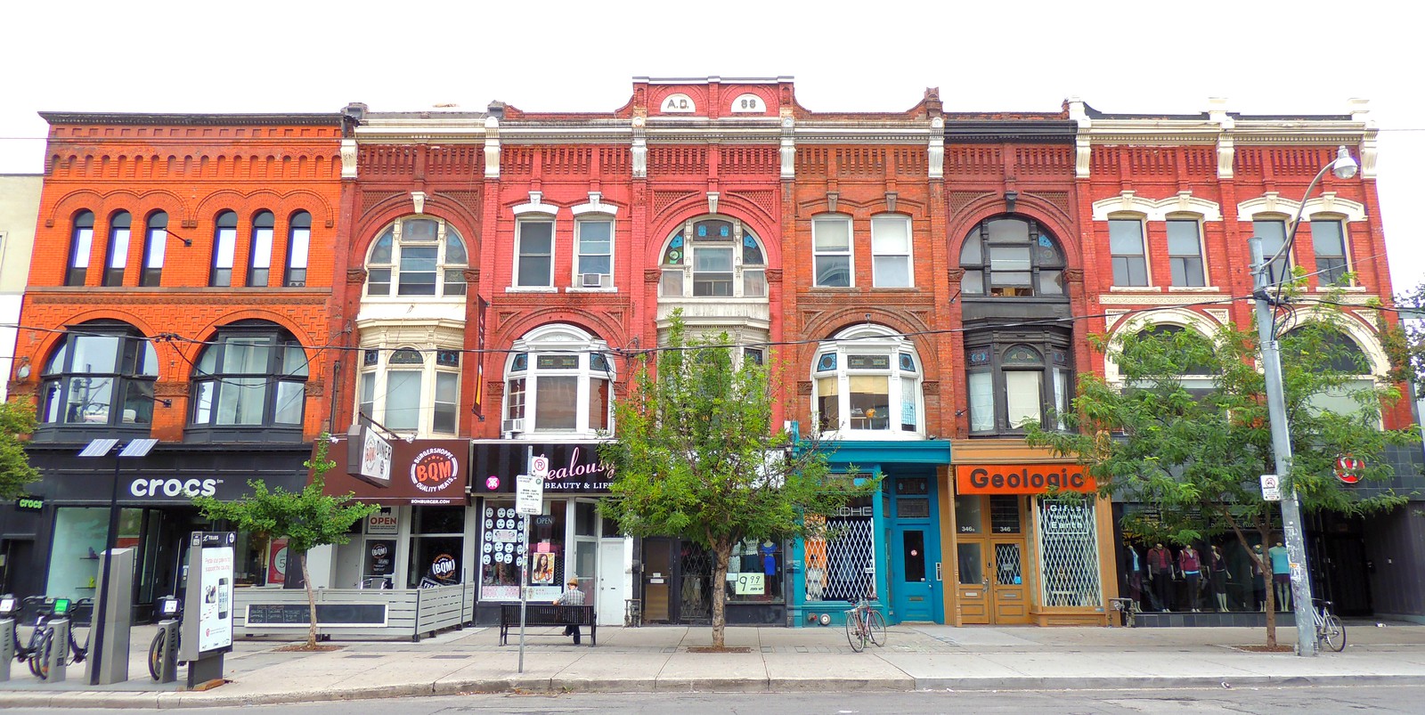
Noble Block
Very good, by Toronto standards, but still not great (similar to the Carlyle Block on Queen East; see link below for clarification). The building on the far left is excellent. Some minor touch ups could be used around the cornice and a restoration of the original ground floor design would be nice (this is an issue with most, older buildings in Toronto). Still a reasonably attractive ground floor, from what I can tell, here. The building in the center, with the five, individual sections, would look better, I believe, by stripping the painted brick and revealing its original colour/rawness, as seen on the portion that is to the right of center. The original upper windows in the sections adjacent to the center have been replaced, at some point, and would look better if replaced with replicas that are indicative of the time when said building was designed and constructed. The cornices also need some painting. The section on the right (Geologic) disrupts the continuity of the white painted framework on the four sections to the west, thus, making it look like a standalone building, with a cursory glance, as opposed to anchoring the eastern end of a much larger structure. The eastern end of the block is mostly, pretty good, minus the upper windows. The lunettes might have originally had some stained glass motifs that no longer seem to be present (if it ever was). The ground floor -- from what little can be seen - looks to be obliterated and has a generic renovation. The windows might look better without the painted accents. That isn't a really a bother to me, though.

Source
More photos of the Noble Block:
https://tayloronhistory.com/category/noble-block-queen-st-west-toronto/
Carlyle Block:
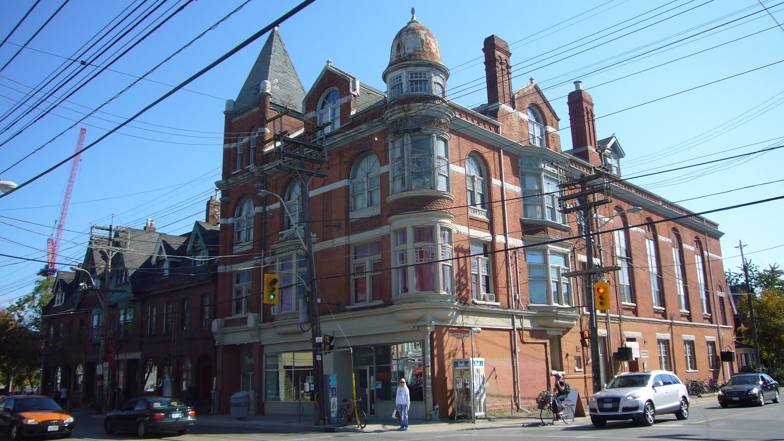
The Great Hall
Pre-renovation (unacceptable): The shingles on the roof were falling apart. The turret was rusted out like like an old truck. The cornice below the turret's windows, stretching eastward, seems to have accumulated the rust from above. That whole frame is either rotting or is covered in lots of grime. I wouldn't run my nose along it, again. The second and third floors are mostly decent. Unfortunately, the ground floor as been altered from its original design. It looks a little better, post-renovation.
Besides the building, this photo exemplifies Toronto's shoddy public realm. There are more overhead wires than Methuselah lived in years. The utility poles might even look out of place in Whitehorse. The one in front of the building is leaning and has generic looking streetlight and traffic light brackets attached to it, not to mention, an unsightly transformer. I could nitpick a little more, but that will suffice.
Source
Post-renovation: The painted turret, finials and frames look excellent. The restored, shingled-roof looks great. Why the framework below the crown wasn't addressed, I don't know. It seems like the one feature that wasn't considered. That detracts from an otherwise solid renovation. The building; namely, the ground floor, looks much better now, than what is depicted in this image (see street view link). The streetscape still looks horrible and utterly embarrassing for what is arguably the most prominent high street in Toronto; but that is a City issue.
https://www.google.com/maps/place/T...c345dac1cd2ccc7b!8m2!3d43.6432865!4d-79.42208
Source
When I used the word, squalid -- with respect to buildings (in this case) -- I meant things of this nature: Big Bop (pre-renovation)
https://www.google.com/maps/place/T...c345dac1cd2ccc7b!8m2!3d43.6432865!4d-79.42208
This building now looks incredible, with its restoration; though, the omission of the mansard roof, from said restoration (which I believe was due to a farcical zoning issue; correct me if I am wrong), is unfortunate.
On the north side of Queen, directly across from The Great Hall, are some examples of pretty common building conditions, even on our major streets; and this isn't even nearly representative of how bad things can be in such major areas. The two, three story buildings, on the left, look forlorn. The building in the middle appears to be abandoned (at least at the time of this street view update), but its poor condition was certainly extant, prior to any change in ownership/tenants. The tall building on the left, especially, looks as though it was engulfed in a fire that was put out swiftly before any compromising, structural damage could occur. I know a lot of these building issues are due to slumlords, but the point is, these problems exist and I don't see how they contribute anything positive to one's experience of the City. Turn the camera to the left and also notice the severely rusted utility pole; another common feature of Toronto's high streets and lesser ones.
https://www.google.com/maps/@43.643...4!1saR3wYTCJTKvMoLJBVuZtQw!2e0!7i16384!8i8192
Moving directly east of these properties, there is this beauty that resembles carrion:
https://www.google.com/maps/@43.643...4!1sJpv3rYu005ah6KO19G6Aow!2e0!7i16384!8i8192
I have barely even scratched the surface re the public realm, but this is a starting point that gives one a vague idea of what I am talking about. So many buildings and public areas in the City have seen so little -- if any (in the case of the former) -- maintenance in decades that one would think that they would be overcome by lichens.


/arc-anglerfish-tgam-prod-tgam.s3.amazonaws.com/public/VWHLNFWWAVGTZCWBARYS3AXEJQ)


