cynicalguy
New Member
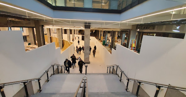
More photos via @chrisjamesdrew
 t.co
t.co
Bay Concourse Passageway Opening - Union Station - December 23, 2019 · Monday, Dec 23, 2019 📸
Shared album · Tap to view!
