vic
Senior Member
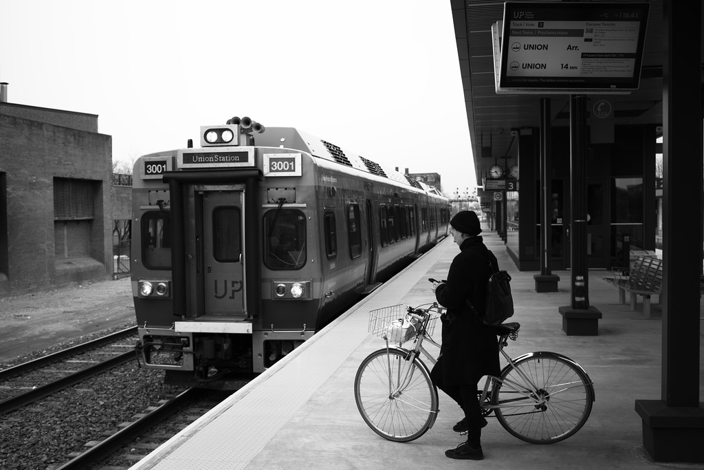
 Bike and Train by Vic Gedris, on Flickr
 Bike and Train by Vic Gedris, on Flickr
Took the UPX home from Jays Home Opener Friday. It was packed, standing room only, wouldn't be surprised if not everyone got on. ...
Bike and Train by Vic Gedris, on Flickr
If ridership keeps going up, they should go the skytrain way. Bring in the fare gates!
Since ML is going the route of introducing RER and attract more typical off peak riders, fare evasion would go up.
You also need to remove the LCD screens and no smoking signs.Erase the UPX logos, and I'd completely believe this photo came out of the 40s or 50s.
Good one on no smoking signage!You also need to remove the LCD screens and no smoking signs.
Good one on no smoking signage!
But the LCD sign looks passable as a 50s style paper billboard -- the big font of that sign is right up the alley from that era.
Though the suggestively dynamic info "14mins" is just a tad weird for a static paper sign.
Oh yes! Good catch....and nobody's even mentioned the smartphone yet.
Yeah, those are the main things that look out of place. The TV really does just look like any old information sign. Maybe service at this station is every 14 minutes? And no smoking? What is this, an operating room?The mysterious alien "No Smoking" sign, and "14mins" on a paper billboard, appears to be much weirder looking for 1950s than holding some small indistinct object.
I was thinking the exact same thingErase the UPX logos, and I'd completely believe this photo came out of the 40s or 50s.

Is that an analog clock? Most places use digital clocks these days. Still, an new fanged analog clock is better than a sundial.