You are using an out of date browser. It may not display this or other websites correctly.
You should upgrade or use an alternative browser.
You should upgrade or use an alternative browser.
Toronto U of T: Robarts Library Renovations & Robarts Common | ?m | ?s | U of T | Diamond Schmitt
- Thread starter AlvinofDiaspar
- Start date
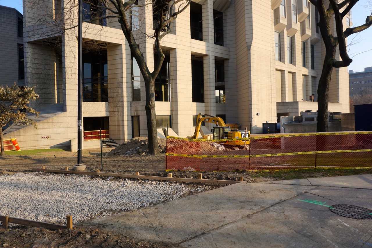
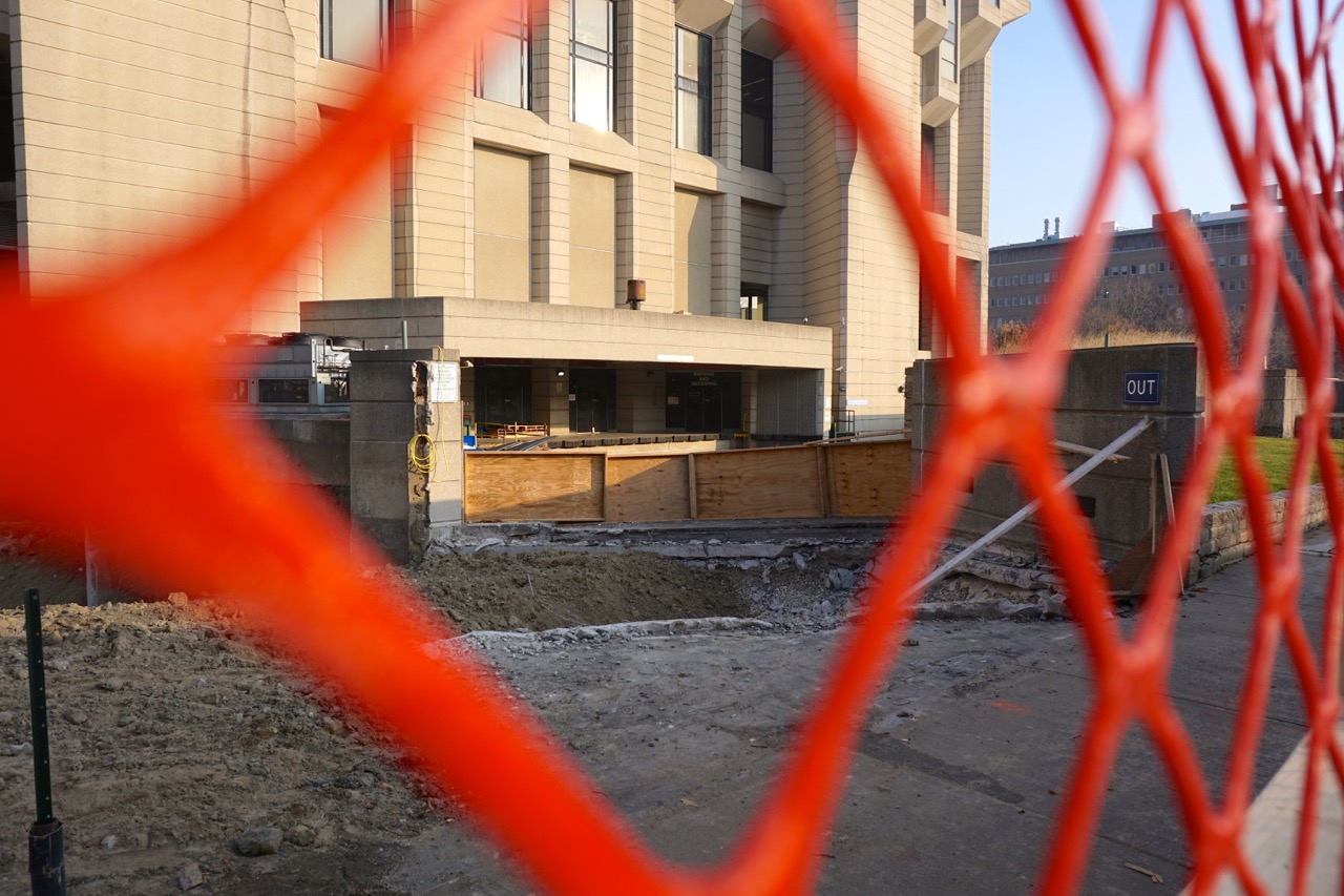
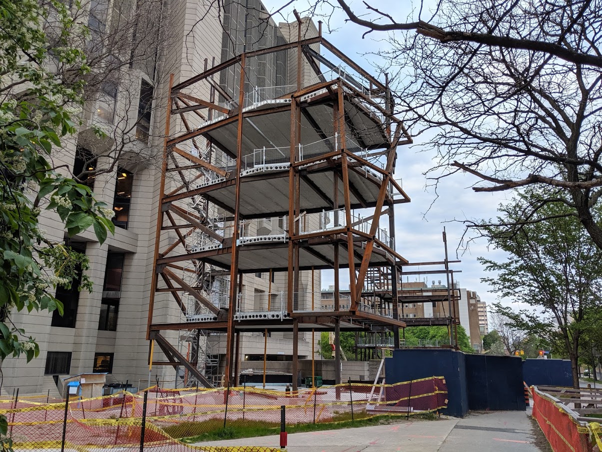
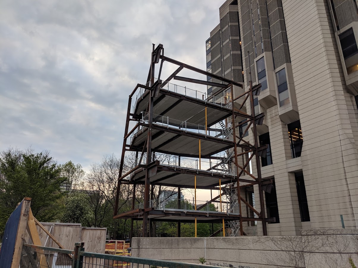
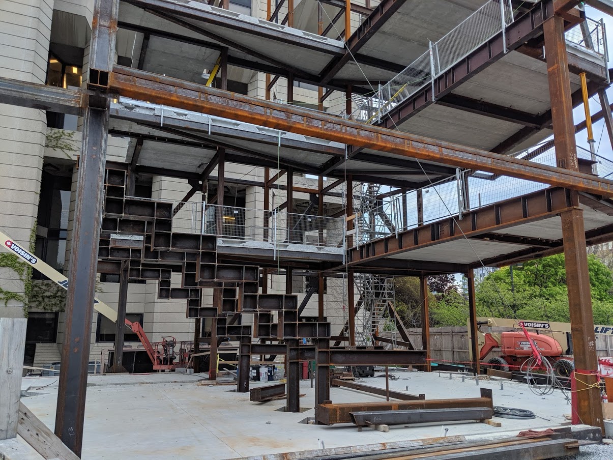
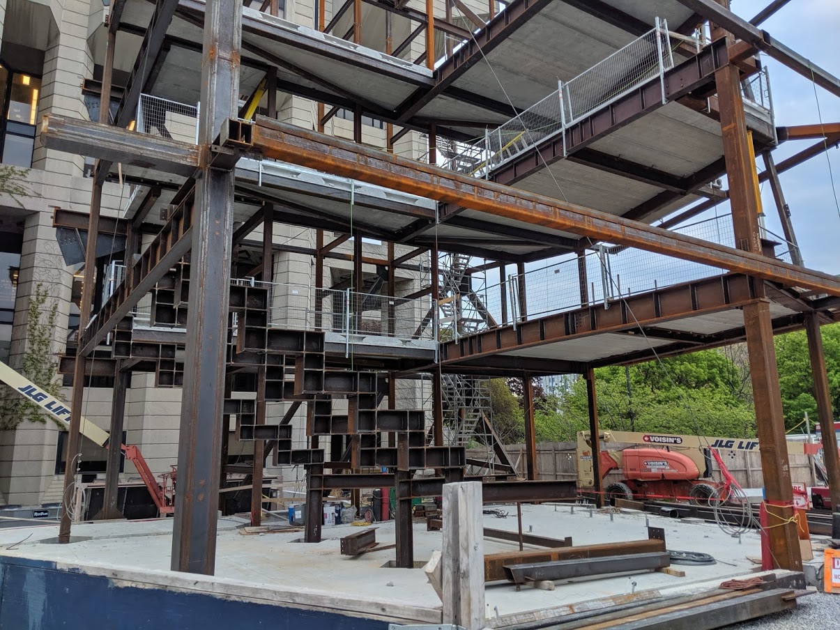
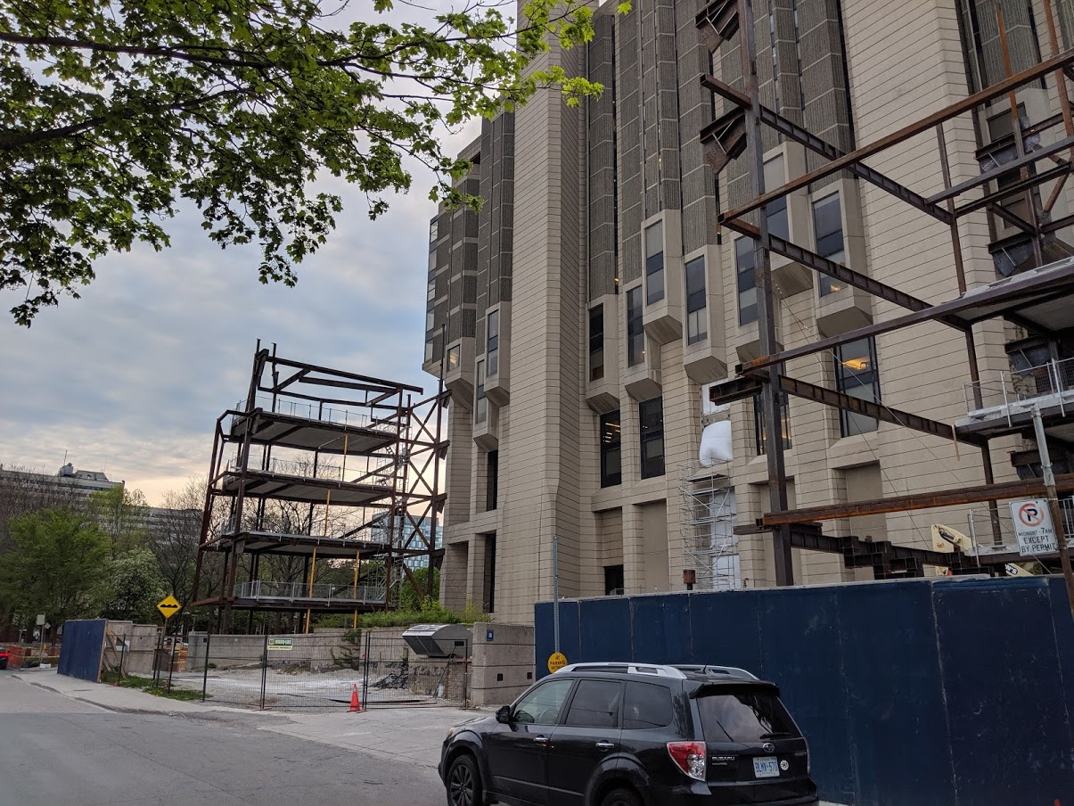
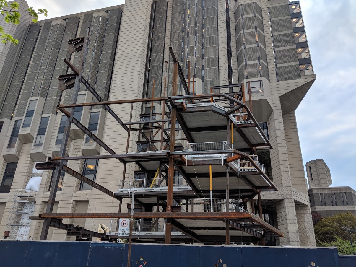
Over two and a half months later, a bit further along:




42
42
Attachments
ProjectEnd
Superstar
ProjectEnd
Superstar
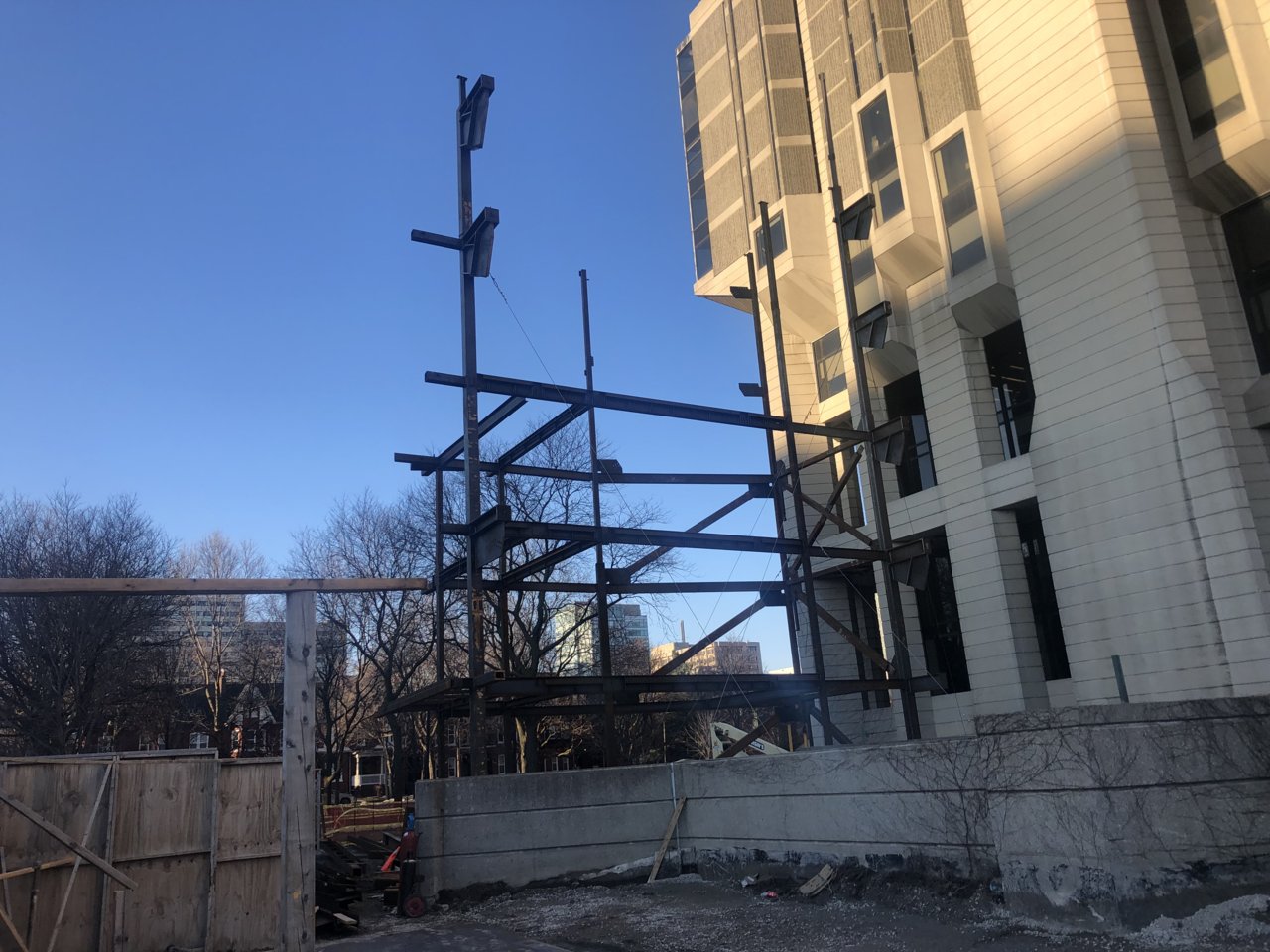
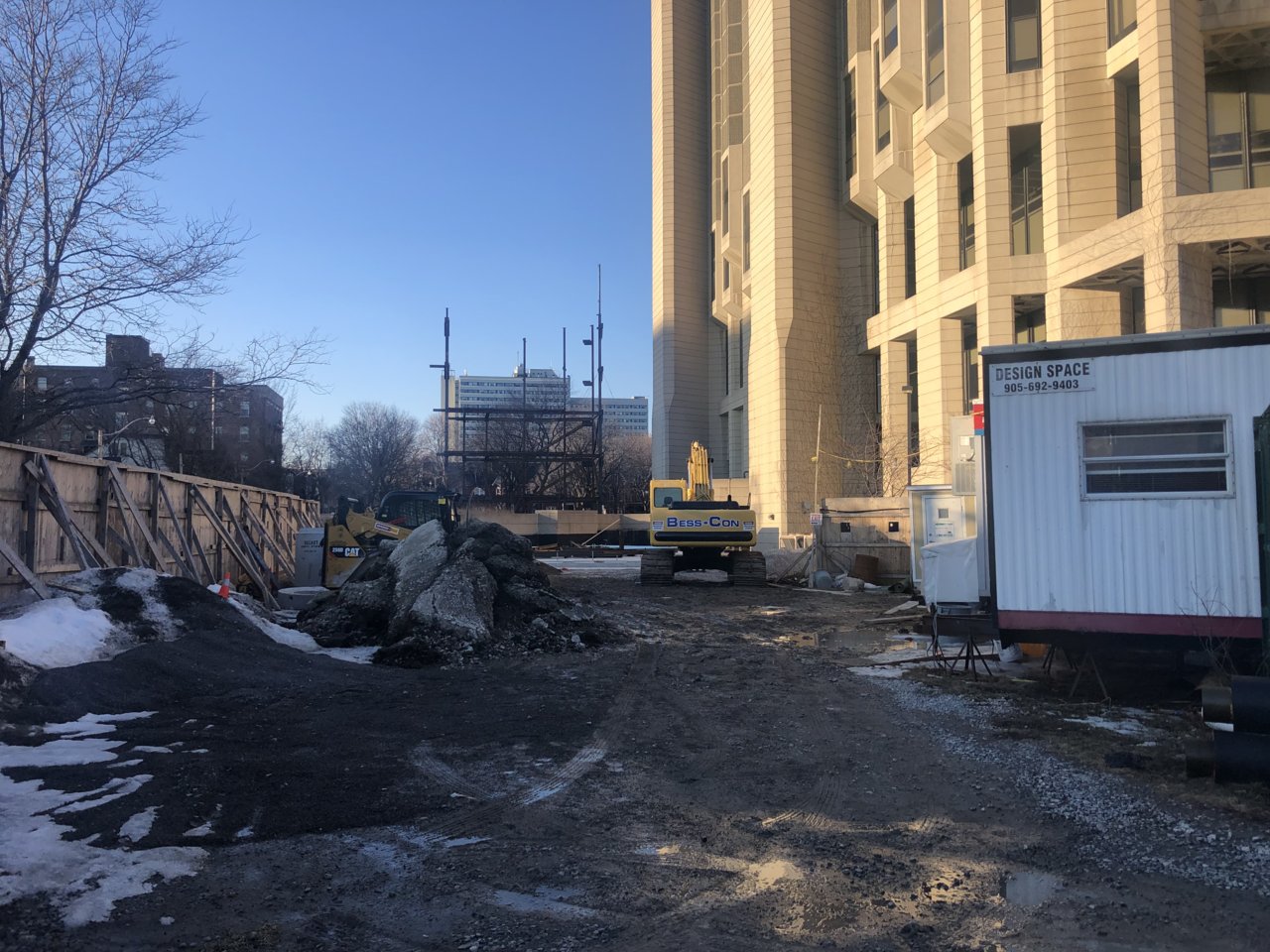
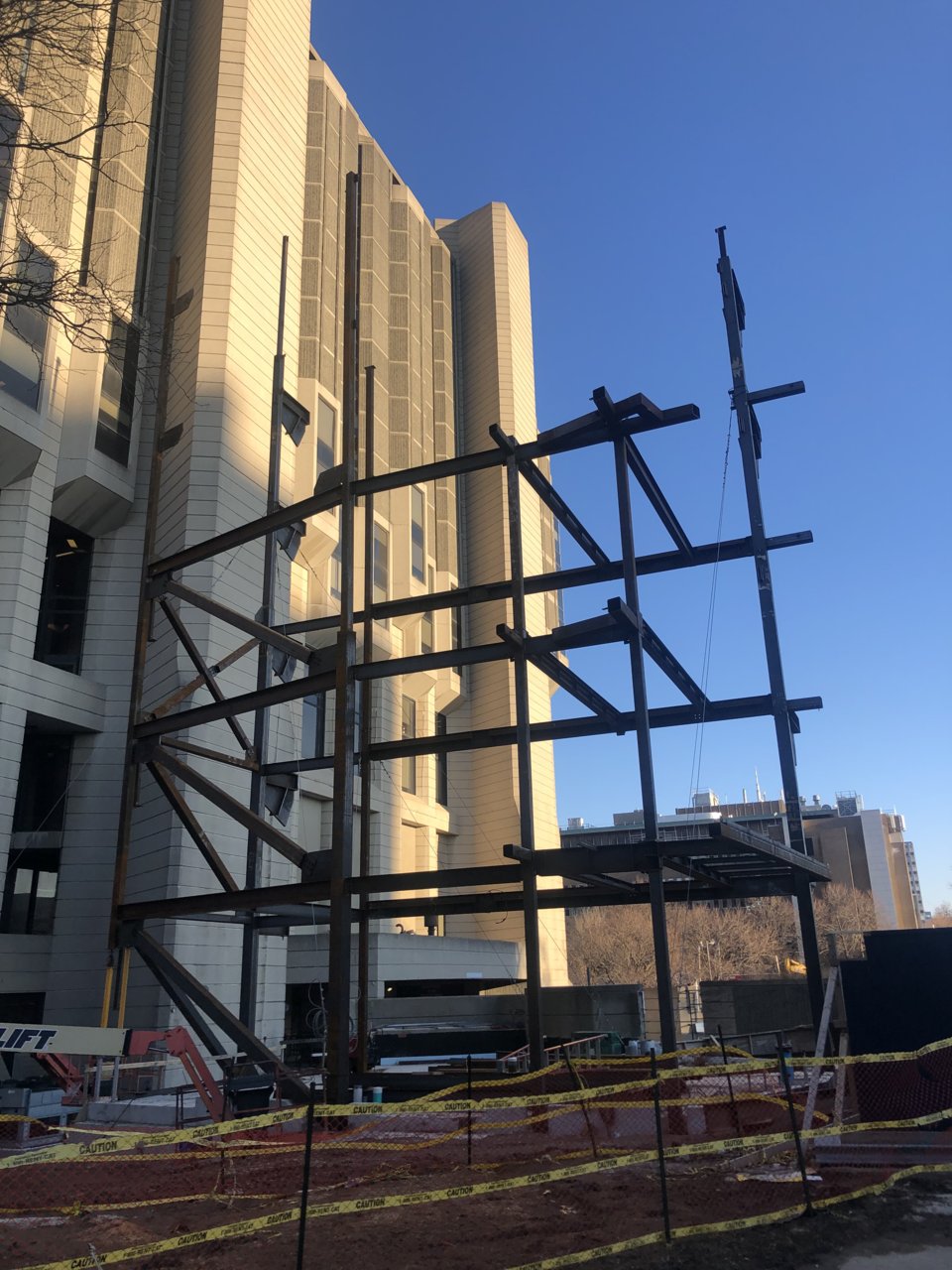
Steel!
AlvinofDiaspar
Moderator
A little surprised to see them use steel for this <insert conspiracy theory about the library sinking here>.
AoD
AoD
ProjectEnd
Superstar
ProjectEnd
Superstar
Patch
Active Member
May 24, 2019
Kenojuak
Active Member
I have to say this project really saddens me. I understand the practical necessity, and at least it's a decent design (although could be more responsive to the building in both material and form) but this really ruins the triangular plan and this beautiful west edge of the library. 
Marcanadian
Moderator
Sunday:
 Robarts Library by Marcanadian, on Flickr
 Robarts Library by Marcanadian, on Flickr
 Robarts Library by Marcanadian, on Flickr
 Robarts Library by Marcanadian, on Flickr
 Robarts Library by Marcanadian, on Flickr
 Robarts Library by Marcanadian, on Flickr
 Robarts Library by Marcanadian, on Flickr
 Robarts Library by Marcanadian, on Flickr
 Robarts Library by Marcanadian, on Flickr
 Robarts Library by Marcanadian, on Flickr
 Robarts Library by Marcanadian, on Flickr
 Robarts Library by Marcanadian, on Flickr
 Robarts Library by Marcanadian, on Flickr
 Robarts Library by Marcanadian, on Flickr
 Robarts Library by Marcanadian, on Flickr
 Robarts Library by Marcanadian, on Flickr
 Robarts Library by Marcanadian, on Flickr
 Robarts Library by Marcanadian, on Flickr
 Robarts Library by Marcanadian, on Flickr
 Robarts Library by Marcanadian, on Flickr
 Robarts Library by Marcanadian, on Flickr
 Robarts Library by Marcanadian, on Flickr
 Robarts Library by Marcanadian, on Flickr
 Robarts Library by Marcanadian, on Flickr
Kenojuak
Active Member
Truly a masterpiece.
Edit: These photos are fantastic. They really capture the angularity and the terrific textures.
Edit: These photos are fantastic. They really capture the angularity and the terrific textures.
Last edited:
AlbertC
Superstar
AlbertC
Superstar
MetroMan
Senior Member
I have to say this project really saddens me. I understand the practical necessity, and at least it's a decent design (although could be more responsive to the building in both material and form) but this really ruins the triangular plan and this beautiful west edge of the library.
I was also saddened when hearing about this but then I had gone last week and didn't even notice it. I didn't even think it had started construction yet. I went by again today to have a look. It's actually not as bad as the render makes it appear. The addition is on the back of the building on a narrow side street, covered in trees and without enough room to back up for the view as seen in the render. The view of the building at the main corner at Harbord & St. George is preserved. You won't even see the addition from there.
jje1000
Senior Member
Personally wish the addition drew more from the vertical language of Robarts rather than being some generic glass polygon.
Also wondering- I wonder if Robarts could work much better with a more pedestrian-oriented landscaping around it-more paved areas, the space being more park or square-like, with Robarts sitting as an object within the space, rather than the landscaping being the left-over space not occupied by the structure.
As of now, it still suffers from the problem most modernist-brutalist structures, face, which is that they're often surrounded by an apron of under (and often un-) defined space that often gives them an unwelcoming feeling.


![IMG_9081[1].JPG](http://cdn.skyrisecities.com/forum/data/attachments/133/133987-fa62fcde954f2490585ada09d2c023f2.jpg)