Toronto U of T: Robarts Library Renovations & Robarts Common | ?m | ?s | U of T | Diamond Schmitt

In most views from the west now, this does not look like it's Robarts at all, just a new building adjacent to it.

Maybe it's best looked at that way, because adding anything to Robarts is a no-win situation. If the design of the new section were one that was more reminiscent of the existing Robarts building, we'd get other members screaming "no more brutalist buildings" or "trying to pretend it was built years ago" or something like that. Although it's possible that another design could have more people rally behind it, there's ample precedent on UT to show that there's simply no design that would bring everyone, maybe even a majority of members on board.

At least this is up against the quieter and less idiosyncratic west side where it does not impinge on any of the classic views of Robarts from St George and Hoskin.

42
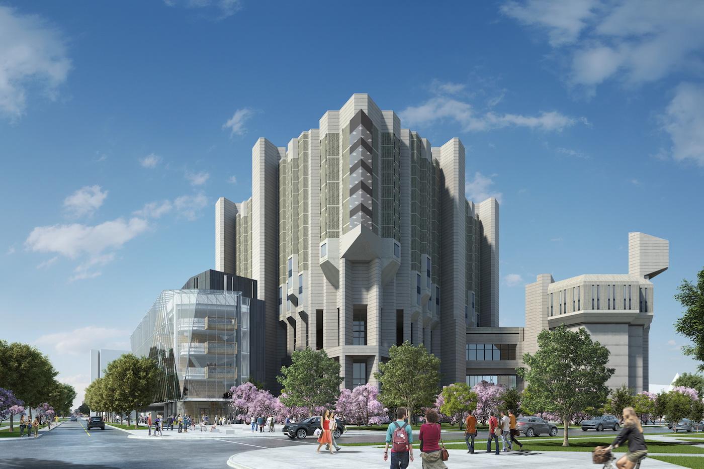

I thought some of the milder, gentler cousin to Brutalism would work well - e.g. something with design vocab like Ron Thom's Massey College. TWTBA also came to mind. Even DSAI themselves had other builds (not suggesting the use of stone but Morrison Pavillion at Gerstein for one) with a language that would have been a better bridge than a wide expanse of anonymous glazing with some odd, why bother facetization.

AoD
 
Last edited:
I see this is a separate building and the last thing the site needed was more stone/brick or concrete. I'll confess to some visional tension though... a bit like driving around a mountain and wondering what rock-fall future awaits the charming windowed-cafe nested below its alpine neighbour.

I do think a glass eye should be added to the "horse" head as a nod to Diamond's addition.

931-45284.jpeg

UT
 
I'm just very glad they didn't 401 Bay'd this building in pursuing this addition.
 
I'm just very glad they didn't 401 Bay'd this building in pursuing this addition.

Recladding all of Fort Book? Wow, what a thought.

If they went all glazing, they'd sure as hell have to renovate the interior.

I'm assuming the stacks still have all the charm of of a basement in an abandoned British housing estate.
 
Hey, that's a Peacock!

My mistake. Here's an idea: Throw a glass box over the peacock, and we'll nickname it "Pheasant Under Glass".


Politically-incorrect affordable housing internet humour.
incorrect.png
 
The extension looks like a patch up job against the old part of the building. It doesn't blend in and sticks out like a shore thumb . They should have used some of the old precast concrete to blend in between windows and the extended part.
 
Recladding all of Fort Book? Wow, what a thought.

If they went all glazing, they'd sure as hell have to renovate the interior.

I'm assuming the stacks still have all the charm of of a basement in an abandoned British housing estate.
Since the city's position on Brutalism seems to be "There's no sacred cows!"...this has come to mind that every building of that era might be subject to dreadful re-cladding or worse. :(

Turkey, if you're feeling less charitable.
It has been suggested (or heard) somewhere that there is a novelty component to this, and it's indeed a turkey. Thus, I've been presuming quietly to myself that the new addition is it's egg it just laid or protecting. And for what that's worth...
 
Last edited:
I was ready to hate this, but I think they have actually threaded the needle decently well. it is clearly a distinct building from Robarts, though with some echoes of the geometry and massive scale of Robarts. But then some deliberate differences like liberal use of glass, and a non-symmetrical elevation. It is physically separated from the existing building in a way that shows separation and confuses neither structure. I am eager to see what materials go over the rear sides of the new volume where you see blue skin and some horizontal carpentry, as this is an important transition face.
 

Back
Top