Toronto U of T: Goldring Student Centre at Victoria University | ?m | 3s | U of T | Moriyama & Teshima

Well, he can't help his name. Just like the guy who the Outerbridge Crossing was named for
 
Blake, however, is the one with the cash and as we all know, money speaks in this town. It is a tacky name though...

No more so than anyone else's name, which can be found on numerous university buildings, hospital wings, opera halls, so-called crystals, etc., around town. It's pretty well accepted by now that if you make a substantial donation, you get recognized. It goes back at least as far as Massey Hall ...
 
No more so than anyone else's name, which can be found on numerous university buildings, hospital wings, opera halls, so-called crystals, etc., around town. It's pretty well accepted by now that if you make a substantial donation, you get recognized. It goes back at least as far as Massey Hall ...

I hope you didn't take my post in an insulting manner since I did not mean for it to be taken as such. I am merely insinuating that Mr. Goldring's generous contributions will help Vic in the next ten, if not twenty or thirty years.
 
Here we go people...

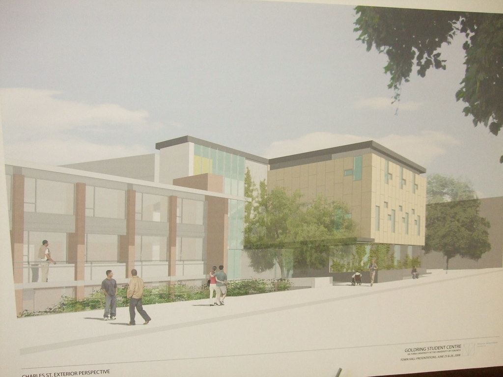
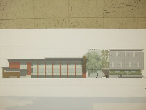
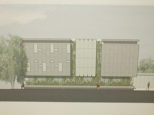
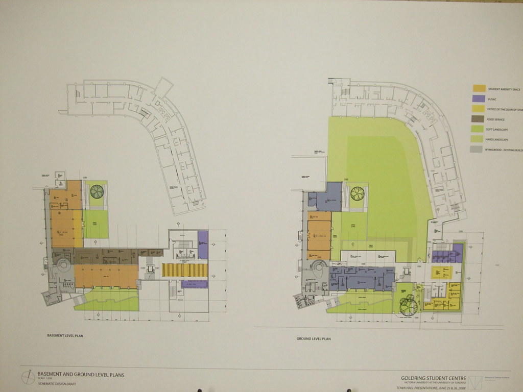
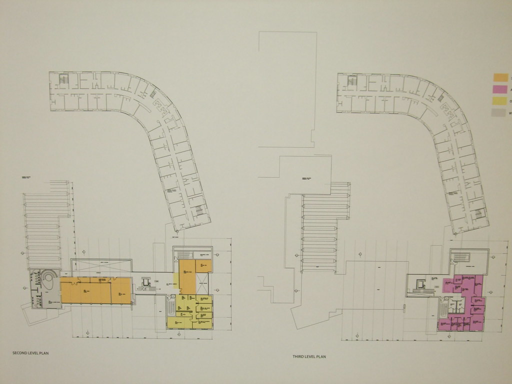
Some preliminary renders from the meeting yesterday.

2614237770_84a3a2a72b_b.jpg


2613405931_d5be284f91_b.jpg


2614239452_f243481efa_b.jpg


2614240230_7d659115e7_b.jpg


South
2614240964_2f59d3632b.jpg


East
2613408911_7d874f34a6.jpg


Personally I think it's a bit boring. I think they can open it up more with a few windows etc. I understand that M+T want to create connections between the Goldring addition and existing Vic buildings with similar profiles (NF Hall and Pratt Library (where I also work - come on by!:))), but I still think they can do more to articulate the structure. Eric Arthur's original structure has a certain 'lightness' to it and I feel that M+T should pay a little more respect.

Just for the record, you are reading these renders correctly - the Marg Ad. driveway is being filled in to create another quad between MA and Wymilwood. Access comes from the north side through the Colonnade's rear access route.
I'm not sure how that's going to work but apparently they have done traffic studies and the like.


More importantly however,

What do you think?
 

Heh... that's a good point you made, ProjectEnd. They really have created a similar profile to the Bader theatre, and ESPECIALLY the Pratt Library. The roof design is a strong example of this. I love the Pratt library, but this design doesn't quite work for me yet.

It could be made better.
 
Is this from Diamond Schmitt?

These are on the very bland/conservative side of the architecture road. Lets keep clear of such roadblocks.

p5
 
The shot of that lounge area reminds me of the 70's interiors at York University.
 
BLECH...Horrible...:(

Though at least it's deferential--to a fault, perhaps; but deferential all the same. (Now, imagine if this was a *replacement* structure.)

Re M+T, kinda resembles a straightened-out Bata Shoe Museum...
 
I thought of the Beta Shoe Museum too when I saw it for the first time. It's not that bland in that I can't see it built in a suburban office park. It is refined and offers some sophisitication. Cheapening is unlikely. Something even more distinctive would be preferable, though.
 

Back
Top