Toronto U Condominiums | 183.79m | 56s | Pemberton | a—A

Imho these two are damn boring and I fear the balconies glass ain't gonna makes things better. Another repetitive project brought to you by yaAwn.

They're the Honda of their field. They spit out predicable safe design. I never hate anything they do, but they've never come out with a design that's put a smile on my face either. For someone that gets a huge amount of personal joy from design, I usually lose interest as soon as I find out aA are involved.

I know it's going to be functional and uncluttered. That said, it's mind numbing sterility that kills the soul if you look at it too long.
 
Last edited:
They're the Honda of their field. They spit out predicable safe design. I never hate anything they do, but they've never come out with a design that's put a smile on my face either. For someone that gets a huge amount of personal joy from design, I usually lose interest as soon as I find out aA are involved.

I know it's going to be functional and uncluttered. That said, it's mind numbing sterility that kills the soul if you look at it too long.

aA had a short run. HP came in and snatched the crown with authority. There are some other firms coming up who are producing better work.

aA doesn't seem to diversify. It's the same stuff time and time again.
 
I was about to say the same thing especially since seeing a rendering of 501 Yonge. I think aA is running out of creative juices.
 
aA are responsible for "good" design, using quality material on easy to produce floor plates. While their stuff isn't amazing, it's far better then the crap pumped out for say, City Place or Liberty Village.
 
attachment.php
 

Attachments

  • IMG_1865.JPG
    IMG_1865.JPG
    605.8 KB · Views: 1,772
aA are responsible for "good" design, using quality material on easy to produce floor plates. While their stuff isn't amazing, it's far better then the crap pumped out for say, City Place or Liberty Village.

Seriously? Cityplace is several notches above Liberty Village and it's because firms like aA have designed towers there. Concord's execution is questionable like many other developers.

I do agree with you. Some may find aA's form and flare "mind numbing" but, considering the market and developer's need to spare every penny, I'll take it over something that tries too hard to stand out and ultimately fails. Too many firms either don't bother, lack the ability or, a little of both to design an exterior around an interior. I'll take a quality apartment tower everytime over flamboyance held up by spandrel glass.
 
Last edited:
I'm looking forward to seeing the sales centre gone and the landscaping complete. I think there's a park element on Bay at the south end of the block
 
spotted that a few posted pics back.. was gonna give it time to see if they fix that, but its probably not going to till they get further installations completed.
 
October 6th:


attachment.php


attachment.php


attachment.php


attachment.php


attachment.php


attachment.php


attachment.php
 

Attachments

  • IMG_8639.JPG
    IMG_8639.JPG
    385.8 KB · Views: 1,109
  • IMG_8640.JPG
    IMG_8640.JPG
    175 KB · Views: 1,117
  • IMG_8641.JPG
    IMG_8641.JPG
    325.2 KB · Views: 1,064
  • IMG_8643.JPG
    IMG_8643.JPG
    177.2 KB · Views: 1,123
  • IMG_8645.JPG
    IMG_8645.JPG
    126.2 KB · Views: 1,087
  • IMG_8647.JPG
    IMG_8647.JPG
    280.1 KB · Views: 1,082
  • IMG_8666.JPG
    IMG_8666.JPG
    152.7 KB · Views: 1,061
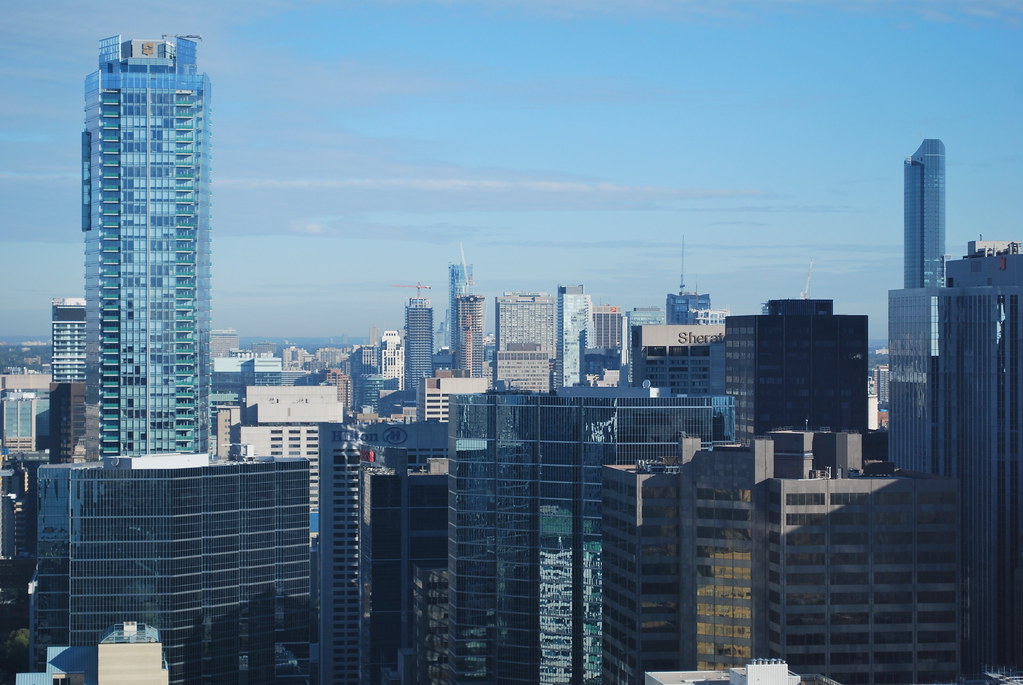
The slanted application of the balcony mass is starting to look pretty good as more glazing is being applied.

42
 
They're the Honda of their field. They spit out predicable safe design. I never hate anything they do, but they've never come out with a design that's put a smile on my face either. For someone that gets a huge amount of personal joy from design, I usually lose interest as soon as I find out aA are involved.

I know it's going to be functional and uncluttered. That said, it's mind numbing sterility that kills the soul if you look at it too long.

These towers are growing on me with every passing day. Like many aA designs, they don't scream for attention, but once you get up close to them, there's a lot to keep your interest. The movement of the balconies across the building as well as the criss-crossing lines in the frit glass really make this building look dynamic to me without being tacky. It's the same thing with Market Wharf and Harbour Plaza Residences - aA's designs often look like they should be in motion. My only real criticism is the lack of retail in the podium, but that's something that the developer is responsible for. I'm wait-and-see on the roof.

Let's also keep in mind that it's taken a very long time for these towers to get built, and so this is quite an old aA design. It would be somewhat disingenuous to hold it up as an example of where they are as a firm today.
 

Back
Top