Toronto TYSSE: York University Station | ?m | 1s | TTC | Foster + Partners

I don't find platform depth to be a significant factor in terms of practicality provided there are elevators and working escalators. At peak hours I find the smaller tube-like stations to be claustrophobic and for heavily used systems like Toronto and Montreal (which is even busier), I much prefer spaciousness. Some of NYC's stations are just awful, especially in the summer.
 
To be honest I actually like the so called "bathroom tile" stations. Not necessary for the aesthetics but because they are so much more compact and closer to street compared to modern subway stations. I just find them much easier to use.
I agree! At the least, they are relate-able.

I'm almost answered Northern's post before:
I think Toronto really hit the high-water mark with the original Spadina Line
The example for me is like bathroom tiles in terms of material (they are tiny tiles), but done wonderfully and *still* gives me joy after all these decades:
Dupont Station. It needs some TLC esp at street level, but the basic design endures, and so does the welcoming ambience and function.

I see pictures of the new monstrosities up in the nether regions, and remember why some people don't live in the burbs. Soviet tractor factories are not my idea of art, and believe me, I'm not just into the classics.

Many of those new stations are a reminder to me of how the ROM Crystalline Entity Period isn't yet fully past.
 
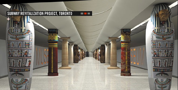
I don't know about that. I think Museum looks terrific.

Museum specifically, wasn't finished. They ran out of money and had to paint the ceilings and exposed cabling instead of installing the false ceilings that had been designed for the renovation.

Planned:
MuseumRenaissance_2.jpg


Built:
museum-01.jpg
 
Metro is on point.

I would add to that, not only did they not finish the original design; but the original design only did the platform level, which results in a jarring juxtaposition of the old yellow bathroom tile as you arrive at the escalator to exit the station as well as through the mezzanine.

Also, they painted over the tile at the 'jail cell' end of the station, and it doesn't look great, it should have been replaced wmore appropriate material.

***

Victoria Park got a spectacular bus terminal, and much needed windows at the platform level. But they did only bits and bobs of the wall tile, and only partially redid the ceilings and lighting in the mezzanine.

Dufferin saw incomplete and sloppy tile replacement.

Even Bloor-Yonge, got some new ceilings on one of the two mezzanines, but they didn't do the bit right over the escalator/stairs. I get that that's more challenging. But can say nothing more thoughtful than 'It looks really stupid'?
 
Last edited:
I wonder if the designers for the York U subway station got their inspiration from this subway station in Tbilisi...
MetroTbilisi-211.jpg
 
That sunken garden really is something special. Reminds me of some of the metro stations in Sao Paolo.
Origaonly they were going to make it an entrance but decided that the slope was too steep so they planted the garden there instead. The stairs are for access to it. At least that's what I think I heard someone say at doors open.
 
Origaonly they were going to make it an entrance but decided that the slope was too steep so they planted the garden there instead. The stairs are for access to it. At least that's what I think I heard someone say at doors open.
If there was a plan to put doors there then that was before the first renderings were released to the public. I never recall any mention of an entrance there. However, I do recall that, although never explicitly stated, the idea was to make it into an outdoor amphitheatre. It was supposed to have a lightly-sloped hairpin concrete ramp down to the bottom level, with grass, not shrubbery, between the levels.
 
I think there was a plan for a door at the bottom of the amphitheatre, but it was never intended to be the main door… and when the amphitheatre was cut, the door was cut.

42
 
Since it is going to be a light well/green wall, it would have been even nicer if they didn't put paving at the floor and have a small gravel Zen garden with bamboo planting. Put some chairs by the glass wall, and you'd have a decent indoor public space.

AoD
 
If there was a plan to put doors there then that was before the first renderings were released to the public. I never recall any mention of an entrance there. However, I do recall that, although never explicitly stated, the idea was to make it into an outdoor amphitheatre. It was supposed to have a lightly-sloped hairpin concrete ramp down to the bottom level, with grass, not shrubbery, between the levels.
That's what it was I couldn't remember exactly what it was all I remember that it was going to be assessable to the public originally.
 

Back
Top