Toronto Totem Condos | 64m | 18s | Worsley Urban | RAW Design

Someone renovated a home across the street from here that I stare at in amazement each time I pass, one must wonder where people get their taste from.

I'm more interested/amused by the home across the street from 17 Dundonald and the reno. that they did on it this spring and summer. The massacre continues as they renovate the back of the home now. I'll get a better shot that will show more horrific details with better lighting instead of an iPhone photo and replace it in the next day or two. It's worth a smile.
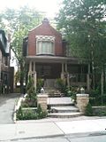
 
I never really liked the Arts and Craft style of architecture. The massive porches and dark colours always look so gloomy to me. I guess the owners felt the same way and that's why they lightened it up and added the glass railing. Though the covering of the brickwork in that marble has a very 80's feel to it.

However I don't mind the sculptural front garden and stonework. It's better than the sad front yard and pavers they had before.

 
I'm more interested/amused by the home across the street from 17 Dundonald and the reno. that they did on it this spring and summer. The massacre continues as they renovate the back of the home now. I'll get a better shot that will show more horrific details with better lighting instead of an iPhone photo and replace it in the next day or two. It's worth a smile.


Man, my wife and I cringe every time we walk by this place. It's really funny that so many others feel the same!
 
In the future, there will be a battle over tearing down say, the 4 seasons opera house, to make room for a super-tall skyscraper.

Some will be advocate for its preservation as a valuable piece of the city's architectural record. Others will call it a boring, ugly black box.

The former group will call the latter group ignorant, middle-class, suburban-minded philistines. The latter group will call the former group over-educated, spoiled, asshole elitists.

Everyone will probably be close to right on all accounts.
 
I never really liked the Arts and Craft style of architecture. The massive porches and dark colours always look so gloomy to me. I guess the owners felt the same way and that's why they lightened it up and added the glass railing. Though the covering of the brickwork in that marble has a very 80's feel to it.

However I don't mind the sculptural front garden and stonework. It's better than the sad front yard and pavers they had before.

Traynor you continue to amaze me, you have a before shot! I do agree, the front looks better with the stone pavers, gardens, lighter paint and a water feature (not seen in my photo) but some of the tiles, stonework and lighting features that they used just do not work. I give them credit for putting some love and passion into the home, but it still makes me smile when I walk by as they kind of missed the mark with some of the materials and fixtures that they used.
 
Jesus. Can we PLEASE do something about Church Street itself before veering off onto the side streets where (USUALLY), this type of development isn't necessary (just yet)?

Cough, The Beer Store, cough.

Or, perhaps even the empty lot next to 22 Wellesley?
 
Jesus. Can we PLEASE do something about Church Street itself before veering off onto the side streets where (USUALLY), this type of development isn't necessary (just yet)?

Cough, The Beer Store, cough.

What's wrong with Church Street?

Or, perhaps even the empty lot next to 22 Wellesley?

Yes! BTW, it's two lots, two different owners fighting over property lines or damn thing.
 
Amen

Jesus. Can we PLEASE do something about Church Street itself before veering off onto the side streets where (USUALLY), this type of development isn't necessary (just yet)?

Cough, The Beer Store, cough.

Or, perhaps even the empty lot next to 22 Wellesley?

Yes, my son...if you have faith...we can achieve greatness...(relates to your 'Jesus' reference in case you're thinking WTF!) ;)

But seriously, yeah, I agree...unfortunately the nature of the system means that the same guy that owns one lot may not be the same that owns another and so those that we'd love to be way down on the development 'target' list often get targeted for development way before those that SHOULD be developed sooner...

...too bad there wasn't some kind of a system that the city could impose whereby properties that are more desirable for development could be 'encouraged' to be developed sooner and those that are not so desirable (at this time) could be 'DIScouraged'...

Wouldn't make some property owners happy though and sure would affect the value of property...
 
Jesus. Can we PLEASE do something about Church Street itself before veering off onto the side streets where (USUALLY), this type of development isn't necessary (just yet)?

To be fair, even if it's a side street, it is close enough to Yonge as well as Wellesley Subway, and talk of a new Dundonald subway entrance makes it even more tempting an "intensification site".

That said, I'll say a few things:

(1) if you knew today's heritage parameters (as opposed to those of, say, the 70s), you'd know why claiming it isn't heritage in any way shape or form is hooey,

(2) despite fears of facadism, I feel its modernism might actually make it *more* fitting as a podium element to a tower than silly tacked-on Victorians would,

(3) IIRC the building has already undergone at least one major post-Commercial Travellers reno--a sympathetic one; but it also explains something of an 80s/90s gloss (the present colour scheme? window tinting?) to the place.
 
Funny, I worked in this building, and I allways just assumed that it was an old school that was turned into an office building.
I loved working in that area, for one you get some exercise walking to bloor for the subway line, instead of trying to get on
at Wellesley North bound. The area especially on Yonge for lunch and after work get together was awesome with all the small
restaurants/bars in the area.
 
Jesus. Can we PLEASE do something about Church Street itself before veering off onto the side streets where (USUALLY), this type of development isn't necessary (just yet)?

Cough, The Beer Store, cough.

Or, perhaps even the empty lot next to 22 Wellesley?

I agree... all four corners at Church and Wellesley are screaming for an upgrade, it's such a shame. AND this area gets so many visitors especially during the warmer months... you'd think the BIA would want to be proud of their neighborhood.
 
One of the four corners is heritage designated, buildings on two other others are in the works. The north-east corner (designated) definitely needs some major work and restoration, but not redevelopment. The BIA and the Church-Wellesley Neighbourhood Association do incredible work for the neighbourhood behind the scenes that most people wouldn't even realize, I've been to many meetings. By the way, the BIA just completed the semi-annual complete sidewalk power-cleaning including the removal of gum. One of those little things they do twice during the warmer months.
 

Back
Top