You are using an out of date browser. It may not display this or other websites correctly.
You should upgrade or use an alternative browser.
You should upgrade or use an alternative browser.
Toronto The Selby | 165.5m | 50s | Tricon | bKL Architecture
- Thread starter khris
- Start date
skycandy
Senior Member
steveve
Senior Member
Today:


TheKingEast
Senior Member
walked by today, they're getting ready to plant some shrubbery and plants. Got a peak at the lobby, very different than I had expected. Looks pretty upscale inside. Looking like quite the project.
Tuscani01
Senior Member
It's going to be home to a new O&B restaurant, and a cafe upstairs
TheKingEast
Senior Member
It's going to be home to a new O&B restaurant, and a cafe upstairs
O&B on Sherbourne? Never thought I'd see the day. Good to know.
edit...did some research. It's called "Maison Selby". They're hiring.
https://jobs.smartrecruiters.com/OliverBonacini/743999676883864-barista-new-restaurant-opening
Last edited:
Avenue
Active Member
I wish James Cooper Mansion became a restaurant too. Sherbourne can use all the help it can get.
TheKingEast
Senior Member
I wish James Cooper Mansion became a restaurant too. Sherbourne can use all the help it can get.
Yea, missed opportunity there. I've been in the mansion portion. The gym is on the top floor and is meh. Would have been much better served if it was a restaurant, cafe or store of some sort.
Rascacielo
Senior Member
TheSix
Active Member
Personally, from a distance, I think this building has more class and presence that 1 Bloor E any day of the week. Especially driving South on the DVP, where the overhang appears bold and dramatic. Whereas 1 Bloor E looks like a bulky forgettable box.
My only criticism is the shared point from other UT members that they should have went with the bold red brick exterior from the initial renders. But overall, an excellent addition to the TO skyline.
My only criticism is the shared point from other UT members that they should have went with the bold red brick exterior from the initial renders. But overall, an excellent addition to the TO skyline.
Tuscani01
Senior Member
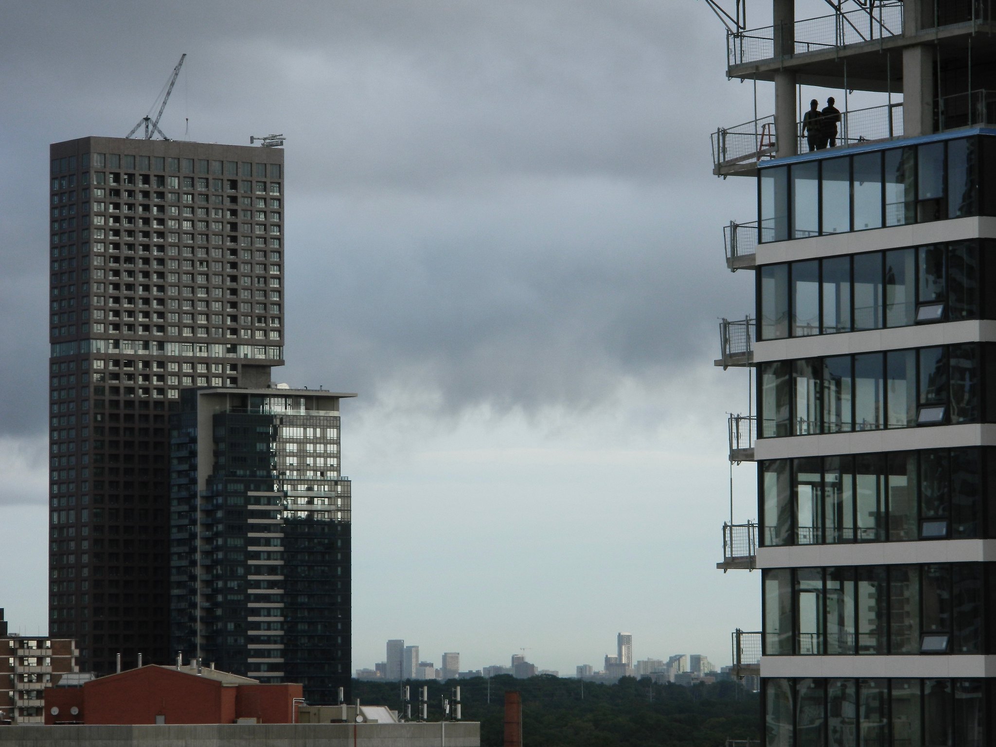
From just now. The clouds made it look as if there was a mountain range in the background.
At nearly the exact same time you took that picture, I was on the ground taking this picture:
Attachments
Yegger
Active Member
I love this building. Its nice clean lines, symmetric grid, varying profiles, warm colour palette and good choice of materials contribute a subdued class. It has gravitas that few other new buildings are able to emulate.
Benito
Senior Member
Rascacielo
Senior Member
TheKingEast
Senior Member
Not sure if these images from www.triconhouse.com have been posted yet:


I've never seen them before.
Looks like a pretty luxurious rental.
I've never seen them before.
Looks like a pretty luxurious rental.
Last edited by a moderator:


