Marcanadian
Moderator
I hope the black one isn't a possibility for the tower. I prefer the one on the right if that's the case, though I'd still take something more striking.
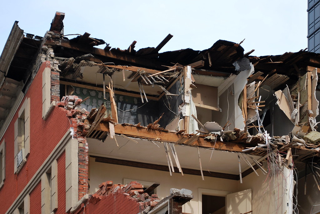
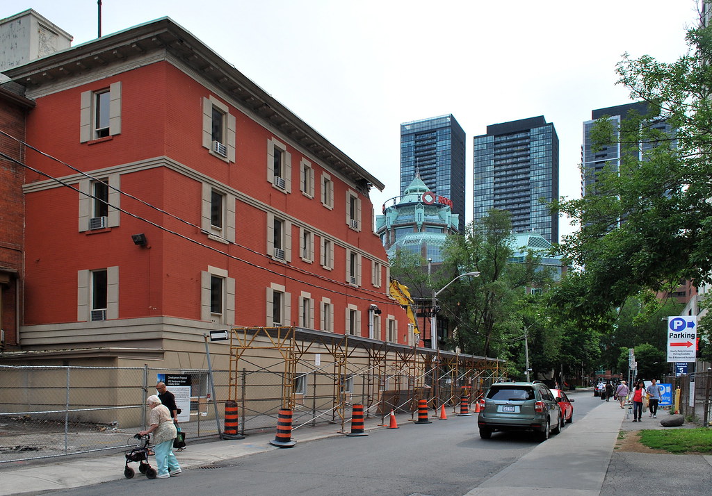
 The Selby by Marcus Mitanis, on Flickr
 The Selby by Marcus Mitanis, on Flickr
 The Selby by Marcus Mitanis, on Flickr
 The Selby by Marcus Mitanis, on Flickr
 The Selby by Marcus Mitanis, on Flickr
 The Selby by Marcus Mitanis, on Flickr
 The Selby by Marcus Mitanis, on Flickr
 The Selby by Marcus Mitanis, on Flickr
 The Selby by Marcus Mitanis, on Flickr
Now that is a sin. There was nothing wrong with that building, and it had more chutzpa than anything that will be erected there. Let the dung fly. Higher isn't always better.