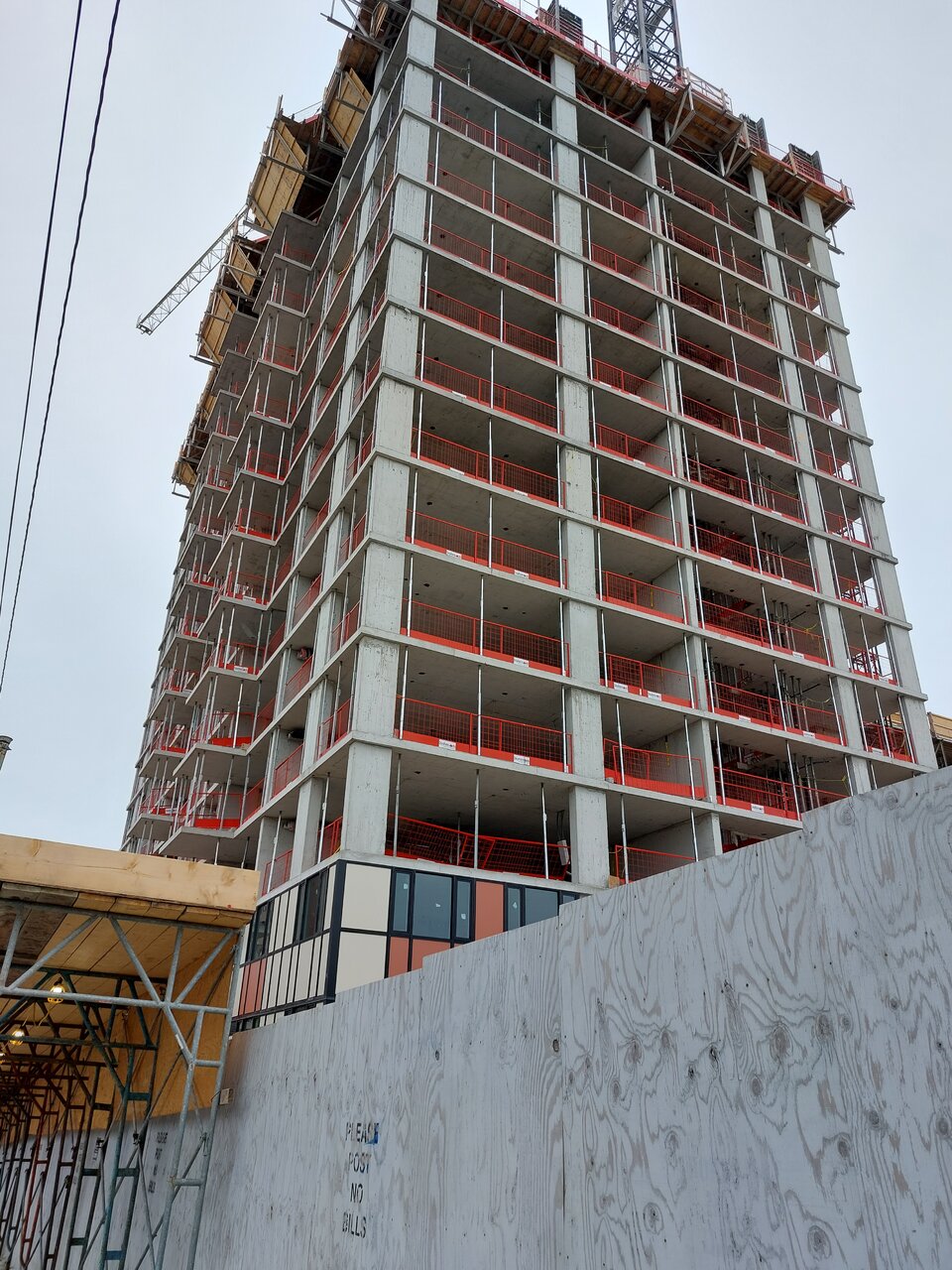
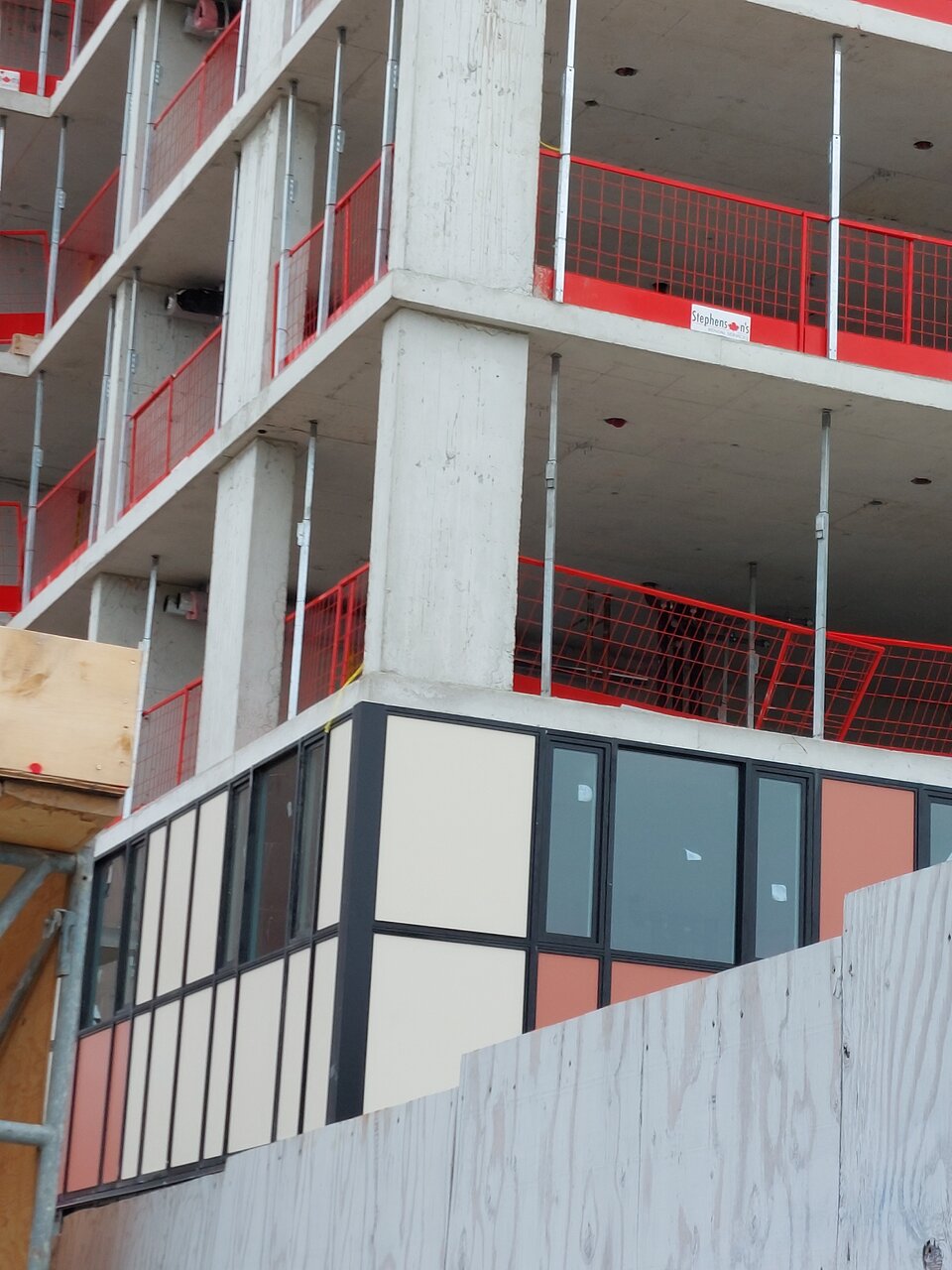
The cladding is striking for being just typical window wall, if all for the sake of cheapness... It did give me some thoughts though.
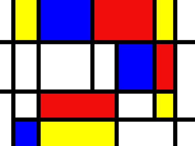
The salmon and cream colors are actually quite pleasant, this is just an incompetent way to use them; stuck in a weaving mess of mullions that contrast very harshly...
I always hoped more developers would just embrace bright coloured spandrel (like Library District condos) since they were going to be cheap anyways; at least the city wouldn't be a blanket of grey, but this is taking that idea a bit too far...
Like in some regards, the materials being pretty uniform all the way up may actually make the design feel decently cohesive. I'd really need to see much more on the tower though to definitively say if I think it's truly bad or not. That's not to defend how cheap they are being here, it's quite laughably incompetent in many ways, but honestly I think this could be far worse minus the warmth (cue the Toronto grey.)


