You are using an out of date browser. It may not display this or other websites correctly.
You should upgrade or use an alternative browser.
You should upgrade or use an alternative browser.
Toronto The Britt Condos | 142.03m | 41s | Lanterra | Arcadis
- Thread starter AlbertC
- Start date
cd concept
Senior Member
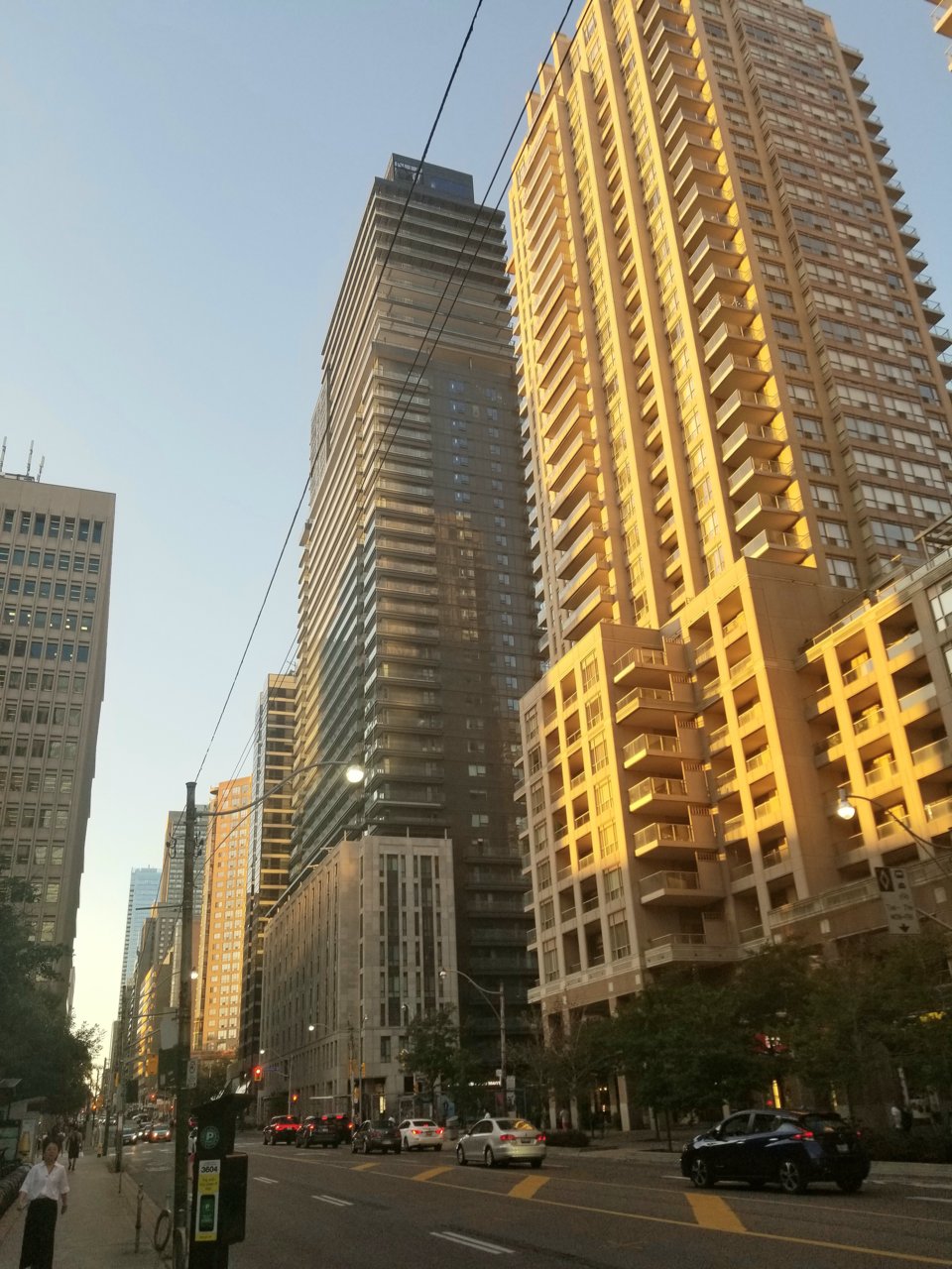
We need more podiums like photo up above ! Too much glass nowadays in the city !
TheSix
Active Member
We need LESS podiums like photo up above! Too many buildings not designed with an engaging and inviting street presence nowadays in the city!
kweku
Active Member
Imagine the Developer had the GUTS to build the entire tower like the Podium
That will be perfect tower to make a difference in the South Core.
That will be perfect tower to make a difference in the South Core.
thefreak
Active Member
The execution of this podium is really bad in person. I have commented on it before, but it really is horrendous in person. It feels cheap, completely uninviting, busy and rickety. There is too much BAD texture in the stone. Should have gone more flat design like the "Kings Club" building on King west. It would have matched the disgusting tower better as well.Imagine the Developer had the GUTS to build the entire tower like the Podium
That will be perfect tower to make a difference in the South Core.
kweku
Active Member
The execution of this podium is really bad in person. I have commented on it before, but it really is horrendous in person. It feels cheap, completely uninviting, busy and rickety. There is too much BAD texture in the stone. Should have gone more flat design like the "Kings Club" building on King west. It would have matched the disgusting tower better as well.
I understand but you are missing my point.
The non-glass cladding is what's appealing here, it might have been executed poorly but the podium looks a million times better than the tower portion.
Only if some developer could build entire tower with such cladding on well executed delivery in the South core to break the GLASS curse
AlvinofDiaspar
Moderator
The non-glass cladding is what's appealing here, it might have been executed poorly but the podium looks a million times better than the tower portion.
Only if some developer could build entire tower with such cladding on well executed delivery in the South core to break the GLASS curse
You are comparing it against a very, very low bar - and no one can afford to clad a condo tower in stone - the best one can do is probably something like 1 St. Thomas by Stern - and they used high quality precast. Or like what other places have done - using terracotta or metal.
AoD
thefreak
Active Member
No I think i got your point. But a flaming bag of you know what would look better than the tower portion. The stone is still very ugly. A tower clad like that would not look good. Would a stone tower look nice? Well maybe. But it has just as good of a chance as looking bad There is a lot of ugly looking non glass cladding out there. Developers should not be appreciated or complimented for "not using glass" if the end result is still both ugly and bad architecture.I understand but you are missing my point.
The non-glass cladding is what's appealing here, it might have been executed poorly but the podium looks a million times better than the tower portion.
Only if some developer could build entire tower with such cladding on well executed delivery in the South core to break the GLASS curse
Dustin William
Active Member
The tower is ok - not too interesting. The podium is not bad - I appreciate the use of stone (or at least something that looks like stone) but the big disappointment here is the mech crown. It's indented too far, and it's a box, with a mix of windows, cladding and vent grates. Lanterra did an incredible job with ICE - one of the most incredible mech levels - all hidden behind a design that carried straight up from the building. I find a lot devs don't pay as much attention to the design of their mech levels.
Towered
Superstar
What's with the strange obsession with arcades on Bay? This is the latest in a long line of buildings to have one, and it's very badly done. It's squat, narrow, and dark, making the retail look as uninviting as possible. Look just across the street at 1001 Bay to see an example of how it should be done.
argus
Active Member
A significant portion of the podium stone cladding has been damaged. The tower is simply dreary.
G.L.17
Senior Member
Monday evening:

steveve
Senior Member
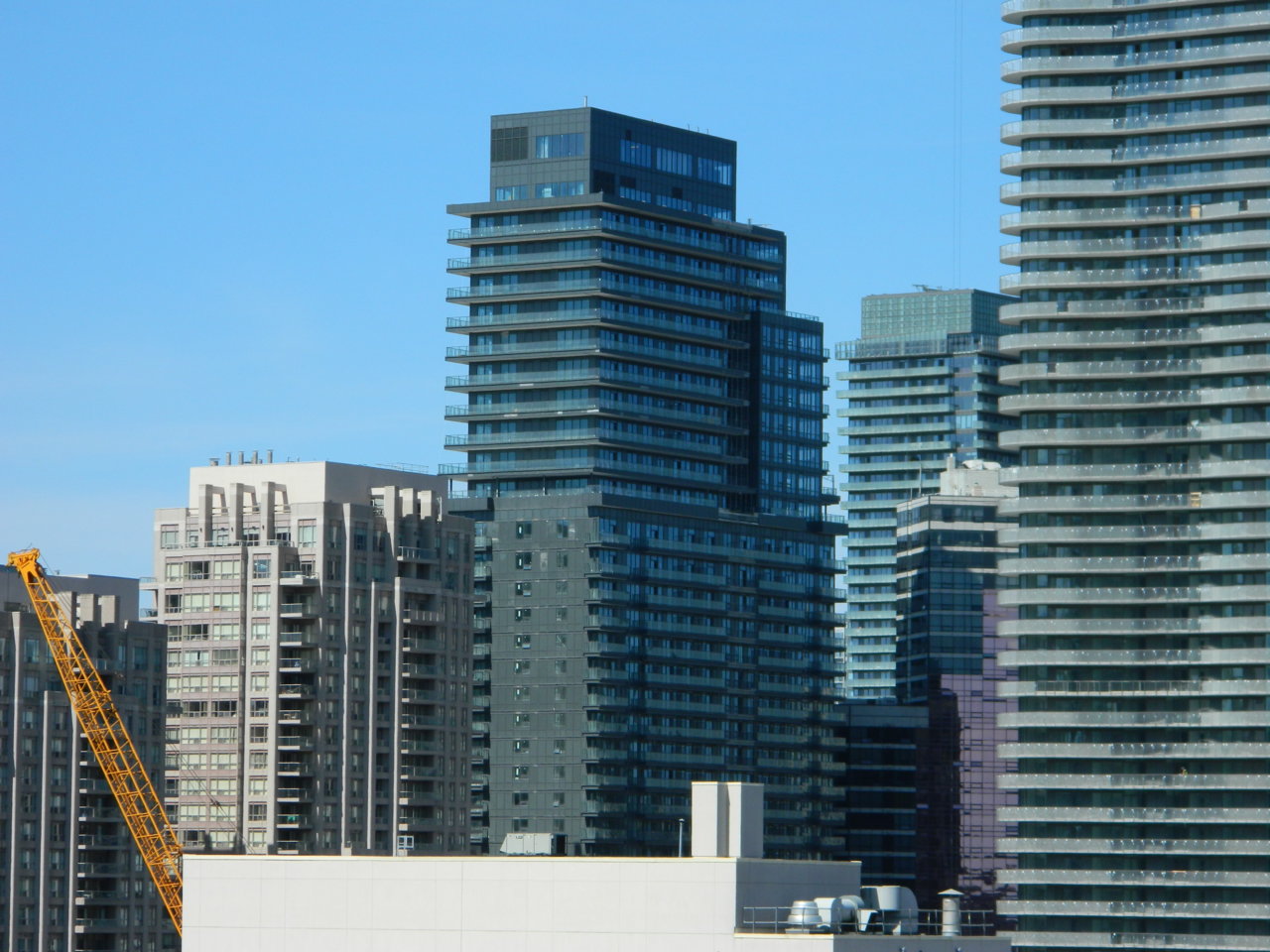
Today:

someMidTowner
¯\_(ツ)_/¯
That might be hands down the least flattering angle of The Britt I've ever seen. Which I guess isn't saying much
karledice
Senior Member
Agreed and well it's Lanterra so you can't expect muchThe execution of this podium is really bad in person. I have commented on it before, but it really is horrendous in person. It feels cheap, completely uninviting, busy and rickety. There is too much BAD texture in the stone. Should have gone more flat design like the "Kings Club" building on King west. It would have matched the disgusting tower better as well.