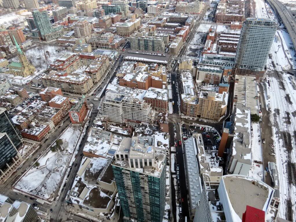
Toronto The Berczy | 41.76m | 13s | Concert | Arcadis

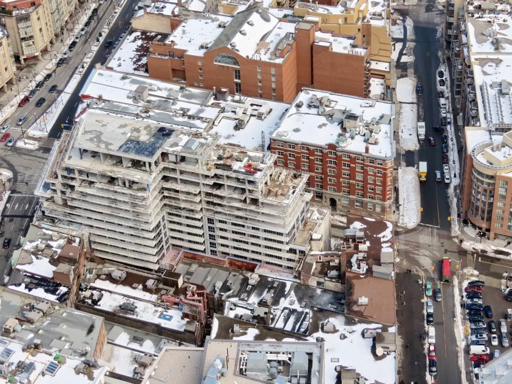
I think this building fits in really well, and the set backs work also very well, however not feeling the window treatment so far. The black windows look ok, but the rest above that is not working for me.
 
Brickwork update.
photo.jpg
 

Attachments

  • photo.jpg
    photo.jpg
    95.9 KB · Views: 574
Yes - the crane is gone. I'll grab one after work if I can
 
I love the black mullions as opposed to the same old grey or silver caps. It looks great in that shot!

I agree. Matching the mullion colour to the glass and spandrel can go a long way. Since the rise of Aura has made this detail more apparent, it's been a pet peeve of mine on other projects.
 
The MET is another example of dark mullions matched well to dark glass.

I really wish Aura's mullions were like those of The MET; that's indeed a project that would look 10x better with even just that one minor change.
 
it does not look that terrible in my opinion. it depends on what type of glass they will use for the balconies
 
it does not look that terrible in my opinion. it depends on what type of glass they will use for the balconies

I'm on the fence. I agree, it's not horrible, but it's not great either. I'll reserve my final judgement once we see some of the balcony glass and the cladding on a few floors.

Hands down the lower section is one of the best I've seen in the city and I'm excited to see the final touches. The only judgement I have is the exterior lighting they installed on the brick columns (new section on Church) seems out of place. I was hoping for something a bit more stylish but maybe it has to do with the LEED gold requirements.
 

Back
Top