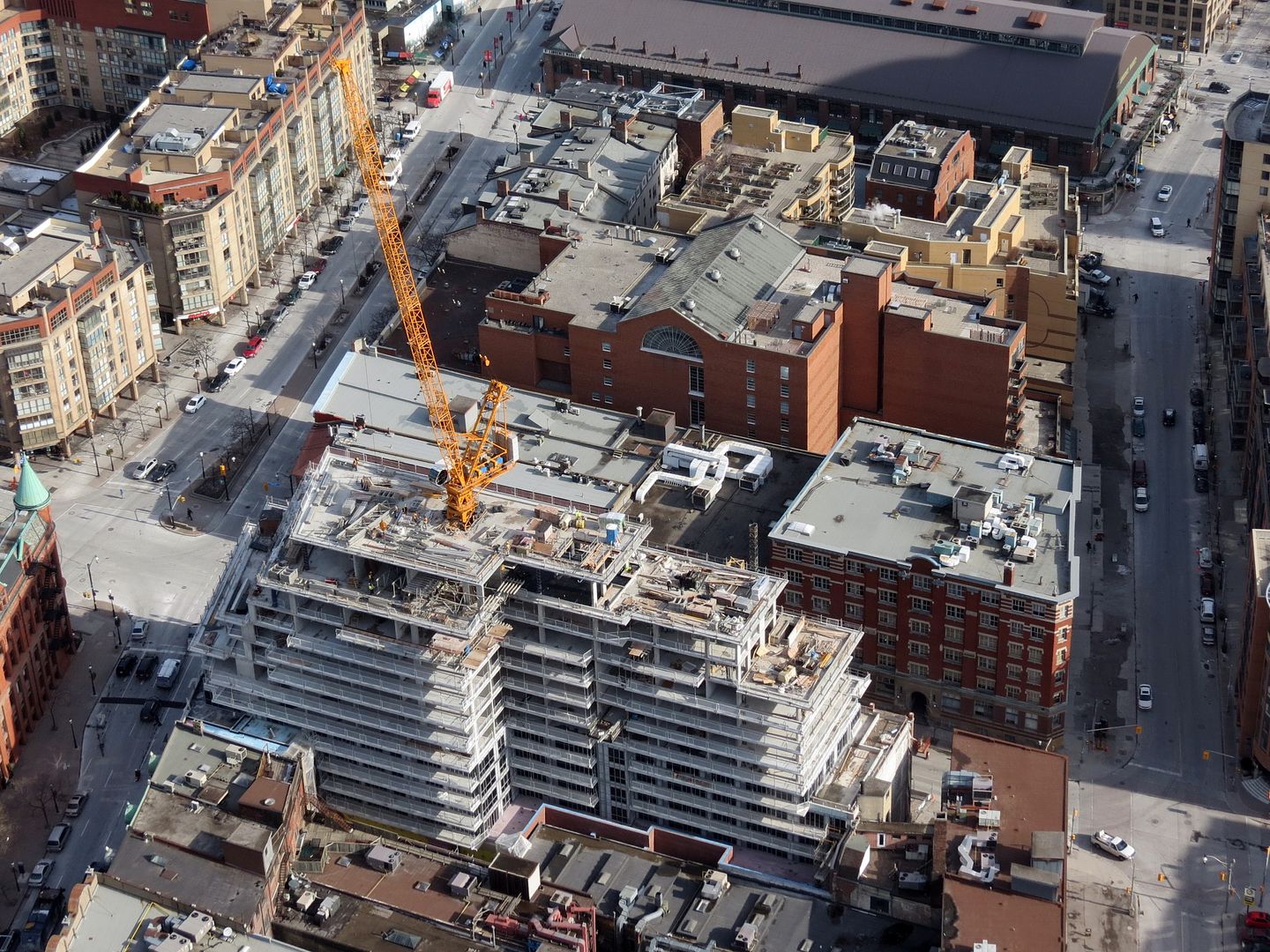
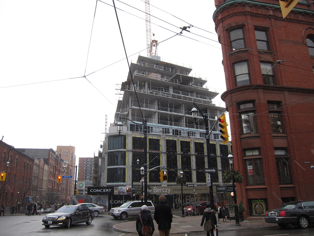
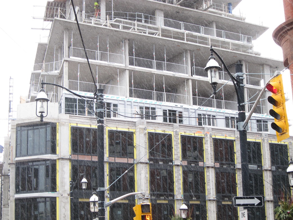
Uh oh. The silver part going up on the first setback looks like "spandrel done wrong" to me. AKA it looks like they designed the building to be a sleek, expanse of glass, but then filled in lots of the mullions along certain sections with spandrel as an afterthought.
The result looks unintentionally heavy, like a spandrel wall punctuated by vision glass/ windows, as opposed to a design that considered what the contrast between spandrel and glazing would look like before it was constructed.
I am not complaining about heavy spandrel use because it's actually a very positive feature from an eco-friendliness standpoint. But I prefer an integrated design process where the spandrel is considered as part of the design.
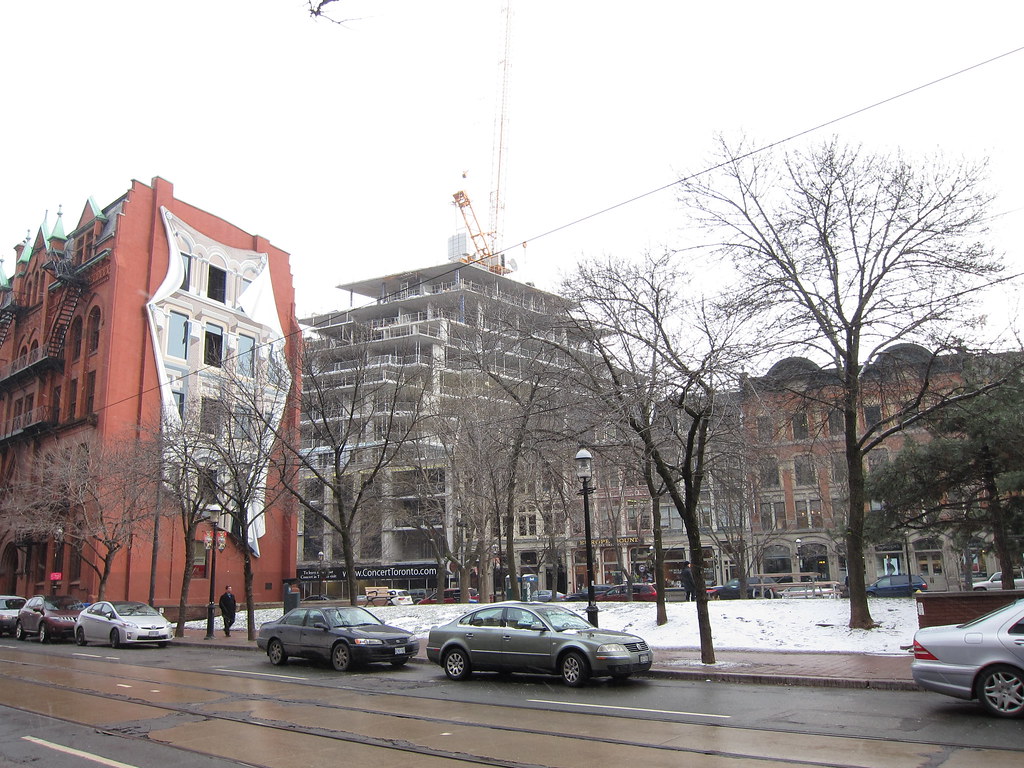
Anyways, I'll wait to see more of this stuff go up to bitch any more about it. In general, I've been a big fan of this project and how it treats its surroundings.


