Toronto Ten York Street Condos | 224.02m | 65s | Tridel | Wallman Architects

I saw the model of this recently and I think it's going to have a terrible effect on the skyline from the waterfront. There is no decoration or design details on the south side of this building. All you will see is one tall, white spandrel slab. There are no contrasting materials or colours or anything at all to make it visually interesting. So if it turns out like the model, it will be one big wall of blandness that unfortunately, blocks out some nice looking towers like ICE 1 AND 2. I hope I am wrong and the final design is different from the model.
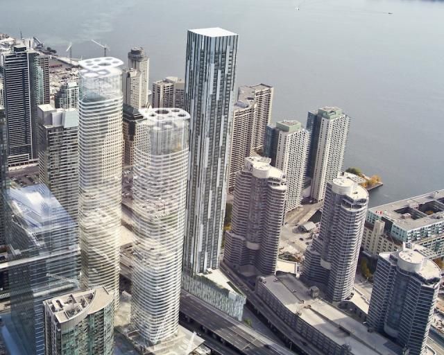
 
I saw the model of this recently and I think it's going to have a terrible effect on the skyline from the waterfront. There is no decoration or design details on the south side of this building. All you will see is one tall, white spandrel slab. There are no contrasting materials or colours or anything at all to make it visually interesting. So if it turns out like the model, it will be one big wall of blandness that unfortunately, blocks out some nice looking towers like ICE 1 AND 2. I hope I am wrong and the final design is different from the model.

Well there you go:confused:
Most people on this forum and everywhere didn't like this

 
I don't like that bland box either but from the point of view from the Islands, this probably would have looked better than the tall, flat, white wall we are going to get with the newer design. Could they not have at least used some contrasting textures and colours, to provide some visual interest? (or put in some cool design features) The skyline view from the water should be an important consideration. It's the view that usually defines cities and that especially applies to Toronto. Every tourist takes a picture of the skyline from the waterfront. If we protect view corridors throughout the city, why not consider the most important view, from the waterfront/Centre Island? Sadly, this building is going to block out, what would have been a great addition to that view. The city should have forced Tridel to address that issue.

This building looks much better in the renderings, then it does on the actual model. The renderings emphasize the flat ironish feature and don't show how mundane and oppressive, that flat south side will appear. Go check out the model in Tridel's office at Front & John Street. Then look at it, straight on, looking north and see how animated that looks.
 
Last edited:
I don't like that bland box either but from the point of view from the Islands, this probably would have looked better than the tall, flat, white wall we are going to get with the newer design. Could they not have at
This building looks much better in the renderings, then it does on the actual model. The renderings emphasize the flat ironish feature and don't show how mundane and oppressive, that flat south side will appear. Go check out the model in Tridel's office at Front & John Street. Then look at it, straight on, looking north and see how animated that looks.

http://www.google.ca/imgres?hl=en&b...IQcMBw&iact=rc&dur=445&page=1&start=0&ndsp=33
http://www.google.ca/imgres?start=7...=0CAUQhBwwADhk&iact=rc&dur=496&page=3&ndsp=42
sir r you talking about this?
 
Last edited:
Yes, the current design is superior to the decorated box that was the previous design. I do wish the central pre-cast clad portions of the north and south elevations were sleeker, though.
 

The view driving eastbound on the Gardiner, is going to look nice but I'm talking about the view from the south and even the north. This building will only look good on its west side but the others will not be interesting at all. I just think there should have been some attempt to make the all important, south side, more animated and interesting, so the skyline wouldn't look so bland. This building is going to be so prominent in skyline pics/views.
 
I'm not sure what everyone is so excited about here... : / Having a flatiron floorplate does not a great project make.

There are all sorts of exciting massing typologies that could have been used here, but instead we're getting another point-tower / pancake building. And it's not going to be a pretty point tower, either. The design is incoherent and awkward to my eyes, and the precast and spandrel glass are already worrying me.

For any of the naive folks who expect this, by some miracle, to not relate closely to the cladding on 300 Front, go to the Tridel store and take a look at the model.

Yawn.

TL;DR Extruding the same floorplate over and over again is nothing to get excited about. This location deserves something special.
 
Last edited:
Re- design please. Cut and paste same statement if you agree that its current renders and models are just not doing it. and will only wreck the skyline if this gets built. Theyre on the right track with its western side but needs more attention for the other three sides.
 
Re- design please. Cut and paste same statement if you agree that its current renders and models are just not doing it. and will only wreck the skyline if this gets built. Theyre on the right track with its western side but needs more attention for the other three sides.

I may also be underwhelmed by this design, but it's a done deal. No amount of cutting and pasting is going to alter anything other than the post count in this thread.
 

Back
Top