Toronto Ten York Street Condos | 224.02m | 65s | Tridel | Wallman Architects

The menkes property across the street will have a PATH connection and WaterParkPlace III, kitty corner to 10 york will have a PATH bridge to Maple Leaf Square.
 
I will be curious as to how they handle cars and where the "driveway" will be. The building is surrounded by 2 one-way ramps and there is certainly no room for another light on York for an entrance or exit on York. An underground ramp that opens up on Lower Simcoe would solve all issues, but would probably be very very very expensive to build.
 
That ramp might come out of the City's share of the $40 million dollar profit they intend to make.

Small sacrifice for having proper ingress/egress.
 

Why does architect Rudy Wallman mention that it will be between two highways. Isn't the offramp that currently goes by the south side of this site not going to be there once they change the ramp to end West of Ten York at Lower Simcoe??? As such, you will just have the Gardiner to the north of the building and the at grade Harbour Street on the south side.
 
When names change, they change in our threads too. I'm just talking about ease of finding buildings that are marketed by their addresses. After a quick look through to see if we have been following our policy in all cases, it turns out that some of them have slipped through the cracks. We'll have to consider whether or not it would be a good idea to actually follow our policy 100 per cent (one hundred %) of the time or not!

forty-two

I see what you did there
 
Am I the only one who isn't a fan of this design?.. i don't get why there is so much hate over a project like 88 Scott, yet no hate ate all for this one.... I love the project/height ambition, but i feel a tower of this height/prominence on the skyline deserves more,
 
Am I the only one who isn't a fan of this design?.. i don't get why there is so much hate over a project like 88 Scott, yet no hate ate all for this one.... I love the project/height ambition, but i feel a tower of this height/prominence on the skyline deserves more,

I committed earlier (that I rather like it) but somehow I get the feeling that the design will change. Maybe completely. It's a gut feeling, it's not based on anything I've heard. I adore the fins as viewed from grade although they won't show from a distance.
 
Will those boxes actually be lit up, that could be pretty interesting.
 
Will those boxes actually be lit up, that could be pretty interesting.

It's mentioned in this article - http://urbantoronto.ca/news/2011/11/build-toronto-and-tridel-officially-announce-ten-york

"Vertical bands of windows will extend from the building's four sides. Those strips will extend at different angles and will be clad in differing tones, catching the light at different intensities throughout the day. At night those strips will be lit for dramatic effect, with the vertical architectural gestures culminating in fins reaching skyward to the top of the building's mechanical penthouse. That crown will be sheathed so that it begins to blend the building into the sky."
 
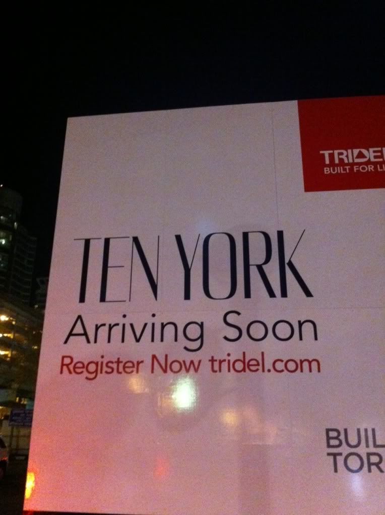
On my way back from the ACC I grabbed this shot

Looks like a development is planned for across the Street from
90 Harbour, which has been renamed 1 York.

photo-1513.jpg


Anyone know what this development is all about?
 
Am I the only one who isn't a fan of this design?.. i don't get why there is so much hate over a project like 88 Scott, yet no hate ate all for this one.... I love the project/height ambition, but i feel a tower of this height/prominence on the skyline deserves more,

This building, while restrained, shows a lot more sophistication and grace than the ham-fisted 88 Scott. Lots of points regarding 88 Scott's issues have been made, including its haphazard asymmetry, and general lack of cohesion. Ten York doesn't suffer from those issues, and on the whole, is a more well designed building.
 
This building, while restrained, shows a lot more sophistication and grace than the ham-fisted 88 Scott. Lots of points regarding 88 Scott's issues have been made, including its haphazard asymmetry, and general lack of cohesion. Ten York doesn't suffer from those issues, and on the whole, is a more well designed building.

Ten York certainly conservative in form, if not in ornamentation. Why can't we have something a little wilder... like a slanted roof?
 

Back
Top