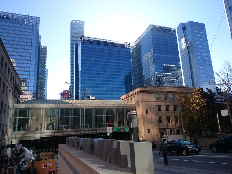
Toronto Ten York Street Condos | 224.02m | 65s | Tridel | Wallman Architects

Honestly (IMO), I'm highly impressed so far with this project. Minimal balconies, sleek and amazing podium design, great tower design, and a dramatic location between an off ramp and the DVP make this a highly attractive condo for anyone to live in, regardless of architectural knowledge/appreciation. I don't really notice any spandrel, and it'll be a nice way to fill in the skyline a bit, even though it does block some of the C.B.D. in certain/classic views of the city. This is an early sort of critique, but this is showing good signs of a great project.
 
Nov 18
30977079052_d60d0f70a5_h.jpg

31006003671_64a2aa55b5_h.jpg

30313217013_3fcbb3dda2_h.jpg

30313256433_37fb392bd7_h.jpg

31006009491_d19ab562a1_h.jpg
 
As illustrated here:

31101828791_fedd7cab87_c.jpg

Personally, I like this.

Toronto is going through a renaissance. The extensive building that is occurring now in Toronto is unique in that few cities have had so many towers built in such a short period and in a condensed area. The most common built form of this time is glass towers as you've captured. This will change in the future as new materials, technology, design, preferences and geographies will change expectations. In 50 years or 100 years Toronto will be an icon of this built form. Provided the buildings are done well, like the Delta hotel, and the streets remain vibrant I believe this architecture will stand the test of time and will come to look elegant and "classic" in the future.
 
Hi everyone,it's my first post on this forum.
You 're right steveve. The downtown core need more variety of color.
2 days ago,when i was driving,i took some photos of that amazing building.Personally,it's one of my favorite building in the city.
I am a 10 York fan from Hamilton.
Enjoy the photos everyone!

10 york.jpg


10 york2.jpg
 

Attachments

  • 10 york.jpg
    10 york.jpg
    118.5 KB · Views: 1,869
  • 10 york2.jpg
    10 york2.jpg
    120.3 KB · Views: 1,856
I love ten York, I love glass towers and I think south core is shaping up quite nicely. I would like to see different colours of glass though. One can appreciate the era of glass towers and still desire more variation.

Couldn't have said it any better myself. All I want is some colour! Give me a tower that's predominately red for a start.
 
I consider that more of a brown colour but it's definitely the direction I'm thinking of. I don't understand why so many developments are scared to spice things up colour wise. It doesn't cost more or take any extra effort to just pick something that isn't blue or green. Even more black and/or white buildings would be welcome compared to the blue or green glass that makes up of what feels like 90% of new developments.
 
I consider that more of a brown colour but it's definitely the direction I'm thinking of. I don't understand why so many developments are scared to spice things up colour wise. It doesn't cost more or take any extra effort to just pick something that isn't blue or green. Even more black and/or white buildings would be welcome compared to the blue or green glass that makes up of what feels like 90% of new developments.

It has everything to do with cost. They don't think about the mark they are leaving on our city.
 
I consider that more of a brown colour but it's definitely the direction I'm thinking of. I don't understand why so many developments are scared to spice things up colour wise. It doesn't cost more or take any extra effort to just pick something that isn't blue or green. Even more black and/or white buildings would be welcome compared to the blue or green glass that makes up of what feels like 90% of new developments.
I see it as 'granite burgundy.' Which can be translated as: 'expensive.' Nonetheless, your point remains. One true measure of architectural and design talent is being able to create beautiful buildings within a budget, even a tighter one. A lot of what we're seeing, I believe, is the result of a combination of a lack of time to truly develop something creative, and a lack of vision.
 

Back
Top