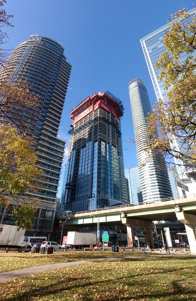
Toronto Ten York Street Condos | 224.02m | 65s | Tridel | Wallman Architects

Ya it will be different. But let's be honest white doesn't really count as colour. Cleansing and refreshing sure. But I want like deep red, dark emerald green, purple. The mirrored colour glazes of the late 80's/90's. Black. Gold. A deep dark blue would be nice. Just something very saturated.
 
Last edited:
Yes, they should have moved on to another aesthetic 15 glass buildings ago. That area west and northwest of Skydome is even worse. At least in Southcore there are a few interesting designs to somewhat break up the monotony and soullessness of the place.

It's bad when you're waiting for re-development (Maple Leaf Square, Pinnacle 1, Pinnacle 2, PWC, Infinity 1, Infinity 2, 120 Bremner, 10 Yonge St, 16 Yonge St, 10 Queens Quay, Waterclub 1, Waterclub 2, Waterclub 3, etc.) before they've even topped out. I do like this one though.
 
Last edited:
In what reality is Ten York white? It's mostly blue, just like almost every tower in the area. Now Harbour Plaza... those are white.

In this one, thanks. Look, it's obviously not the Taj Mahal, but I don't think it's totally genuine to lump this one in with the Maple Leaf Squares and Pinnacles of the world.

There are lots of offenders in the blandness category down around here but my opinion is that this won't be one of them.

upload_2016-11-16_15-52-4.png


upload_2016-11-16_15-52-36.png

photos from skycandy on this thread.
 

Attachments

  • upload_2016-11-16_15-48-16.png
    upload_2016-11-16_15-48-16.png
    341.6 KB · Views: 406
  • upload_2016-11-16_15-50-27.png
    upload_2016-11-16_15-50-27.png
    181.5 KB · Views: 432
  • upload_2016-11-16_15-52-4.png
    upload_2016-11-16_15-52-4.png
    410 KB · Views: 1,574
  • upload_2016-11-16_15-52-36.png
    upload_2016-11-16_15-52-36.png
    1 MB · Views: 1,589
^^^
That's only if you look at it from a very oblique angle. The vast majority of the surface area of this tower is blue.

"Very oblique"? It looks almost exactly like that from directly in front of the thing.
 
Love watching the skyline fill in. Crane visible from the NE. 10Y should fill in nicely between 1Y and L Tower.

TEN-1.jpg


TEN-2.jpg


TEN-3.jpg


TEN-4.jpg


TEN-5.jpg


Quite the maze of plumbing. Perhaps the pool above has something to do with that?
TEN-6.jpg


TEN-7.jpg


TEN-8.jpg

(from Janet Rosenberg & Studio)
 

Attachments

  • TEN-1.jpg
    TEN-1.jpg
    900.6 KB · Views: 1,310
  • TEN-2.jpg
    TEN-2.jpg
    1.4 MB · Views: 1,302
  • TEN-3.jpg
    TEN-3.jpg
    1.9 MB · Views: 1,291
  • TEN-4.jpg
    TEN-4.jpg
    1.6 MB · Views: 1,325
  • TEN-5.jpg
    TEN-5.jpg
    1.6 MB · Views: 1,256
  • TEN-6.jpg
    TEN-6.jpg
    1.1 MB · Views: 1,297
  • TEN-7.jpg
    TEN-7.jpg
    860.9 KB · Views: 1,235
  • TEN-8.jpg
    TEN-8.jpg
    100.5 KB · Views: 1,259
A continuous wall of blue-glass has given South Core a sterile look. It also makes it look like a McDevelopment. This is the fault of both the developers building with only the dollar on their mind but ultimately the city for allowing it to happen.
 
A continuous wall of blue-glass has given South Core a sterile look. It also makes it look like a McDevelopment. This is the fault of both the developers building with only the dollar on their mind but ultimately the city for allowing it to happen.
They are not building with as little money as they could use. They all market their condos as if they were all superior to the other developer's condos. The city also likes to have these types of towers spring up all around these areas. However, it is wrong to say this is the worst development in the area. Whatever I think is right, and in fact, I have the complete opposite of "this is the worst development in the area." If I hear that phrase is right from one of the Urban Toronto members, I will report it and have a dislike for it.

Perhaps the pool above has something to do with that?
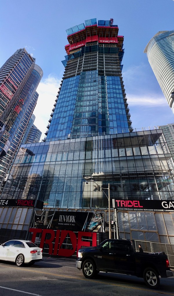
Yes, it has to do with the pool functioning properly, or at least that is my guess.

TEN YORK is exactly what the city badly needs. In fact, I may be nearing the point where it has fully grown on me. This is far from your typical Toronto condo.
 
I am so disappointed by this project.

I am also surprised by the number of UTers who gave the renders a pass, with most users impressed by its sharp street-level presence. Other than the base and decent appeal from the eastbound Gardiner, the project is a typical Tridel mess - cheap spandrel, uninspiring early 00s crown, and will cover the far more interesting Ice condos. And the worst part is its prime postcard placement in the skyline.
"cheap spandrel"
Incorrect. The vertical fins haven't yet been seen on any other condo yet, and the glass is reflective.
"uninspiring early 00s crown"
Incorrect.
upload_2016-11-19_17-36-31.png

Maybe they'll cap it at 26 floors. ;)
You were just joking.
 

Attachments

  • upload_2016-11-19_17-36-31.png
    upload_2016-11-19_17-36-31.png
    26.7 KB · Views: 2,374

Back
Top