Toronto Tango2 at Concord Park Place | ?m | 20s | Concord Adex | P + S / IBI

chanch5

New Member
Member Bio
Joined
Jun 16, 2010
Messages
24
Reaction score
0
Tango II will be locate right next to Canadian Tire store. VIP sale will start in early June. VIP offer only $2000 off for 1 bed/1bed+den and $3000 for 2 bed/2 bed + den. Pretty expensive!
 
Tango II will be locate right next to Canadian Tire store. VIP sale will start in early June. VIP offer only $2000 off for 1 bed/1bed+den and $3000 for 2 bed/2 bed + den. Pretty expensive!

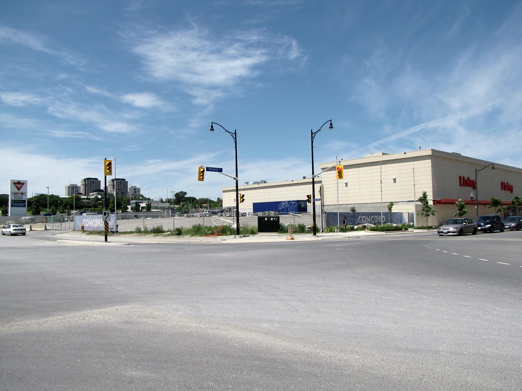
right next to the store? do you mean that dinky location right by the shipping?
 
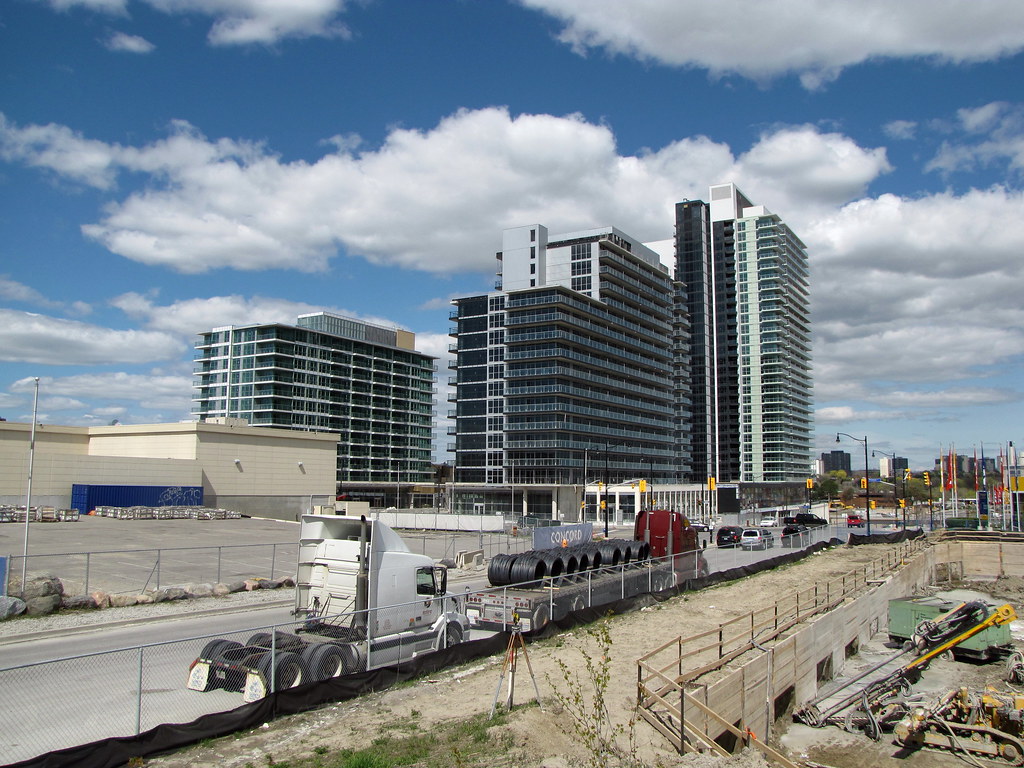
There a shot from May 8 of the site or most of it
5702431969_fec4ef2d8d_b.jpg
 
Intersting that Concord decided to market this building as Tango 2, even though it is not even connected physically to Tango 1 (it is across the street) ... I would have thought they would be developing the next adjacent building to the south instead first, which would have continued the built form sequence from Tango 1 ... anyhow

Site plan
masterplan.jpg

BTW ... website for Tango 2 is now up:
http://concordadex.com/parkplace/tango2/

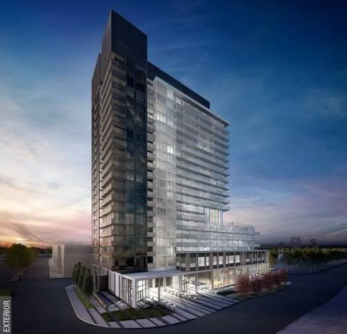
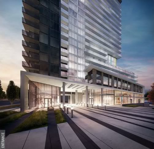
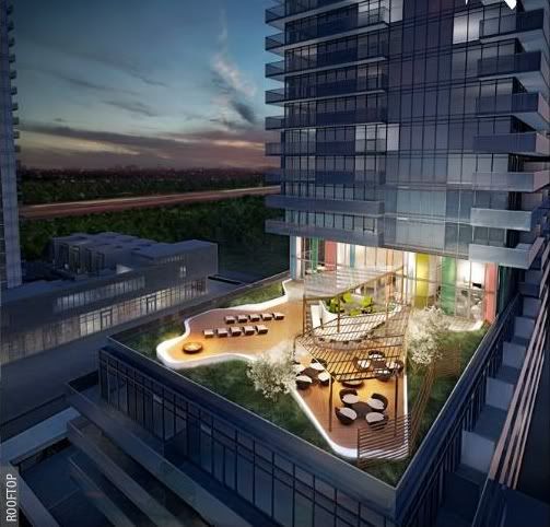
Couple renderings from that website (kind of reminds of me Pears on the Avenue):
Tango2_render1.jpg
Tango2_render2.jpg
Tango2_render3.jpg
 
Park Place is certainly looking a lot more refined than CityPlace. While I like some of CityPlace, I can't help but think that these designs translated to CP's heights would look a lot better (especially for the early phases east of Spadina). The two-tone facades and coloured glass at the bases are my favourite touches so far.
 
Park Place is certainly looking a lot more refined than CityPlace. While I like some of CityPlace, I can't help but think that these designs translated to CP's heights would look a lot better (especially for the early phases east of Spadina). The two-tone facades and coloured glass at the bases are my favourite touches so far.

Couldn't disagree more ... for the early early pages, east of spadina, and I'm not including harbourview estates or whatever they're called then sure, but for the rest, they're by far and large more interesting then what has gone up at sheppard.
 
Park Place is certainly looking a lot more refined than CityPlace. While I like some of CityPlace, I can't help but think that these designs translated to CP's heights would look a lot better (especially for the early phases east of Spadina). The two-tone facades and coloured glass at the bases are my favourite touches so far.

Not too fond of what has already been built at Park Place. ZZzzzz
 
If built as rendered, Tango 2 will look far better than anything at CP. Neo, Montage, and Luna look great, but even in its early stages Park Place is showing a more "grown-up" look. Some more height would be nice though, especially on Tango, to slim out the proportions. CP's problem is its overbearing use of different shades of grey. Concord has learned here; the black glass looks a lot more sophisticated, the two-tone facades add nice contrast, and the colour at ground level enhances the pedestrian realm.
 
It's one thing to compare between Concord's building designs at CityPlace with Park Place, it's another to compare the buildings at Park Place with the other developments in North York, and specifically along Sheppard. I prefer the Park Place buildings over the majority of the condos in North York, especially those at Bayview/Sheppard (all of the Daniels and Shane Baghai buildings) and Aria. Of course they are of different styles and appeal to different market segments and it just might be my own subjective view. Park Place's buildings are more fresh, while those along Sheppard are really drab.

I like the two-tone design of the Discovery buildings, though the green side does not go well with the black side, imo. I think if they had used a similar colour as the CityPlace buildings (west of Spadina) for the green side then it would have matched better with the black. Think of south elevation of Montage with the black on the bottom 1/3 and clear/blue (or however it would be described as) on the top 2/3. Based on the renders it looks like Tango will incorporate the two-tone design with black and the clear/blue, which I hope is to be the case and not the green like with Discovery. That would be really repetitive within Park Place. Perhaps with each "phase" they use a different colour to go with the black.
 
I agree with the above that Park Place provides something more fresh on Sheppard. The hints of purple/white/black for Tango 1 will look awesome. I just hope that the podium they create will have enough height to boost the Tango higher than Discovery. This place definitely needs more height.
 

Back
Top