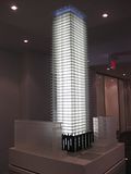
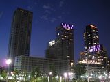
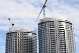
Toronto Tableau Condominiums | 124.05m | 36s | Urban Capital | Wallman Architects

Not so bizarre. Rather clever.
Soho has long stood for the area north of Queen.
By saying its South Soho, it starts to brand
the neighbourhood south of queen, yet north of
King.

The area has a name. It's called The Club District. And it's dangerous.
 
@ Junctionist:

You make a point, though to be honest the mechanical penthouse on this one never really stood out to me. Who knows upon completion though, so you raise a good point. If it were clad in glass like the floors below it, it would work well here because it is the same floorplate as the other floors (minus the balcony.) Would look just fine!
 
Well, I guess that's the point, isn't it? Modernism isn't about hiding functionality at all costs, whereas faux historical mish-mash is.

I respectfully disagree

Modernism does not have to equal ugly expose rooftop mechanical boxes ... more times than not, developers opt to not hide these utilitarian elements strictly based on costs / bottom line / value engineering (new term I recently learned), as we have witnessed at X Condos where the window wall was supposed to have extended up to cover the mechanical floor, whereas in the end Great Gulf just plunked a black box on top because a planned penthhouse unit never materialized ~

a modern glass tower can easily incorporate the rooftop mechanical into the design as architectural features (fins, parapet spandrels, trellis, faux storey etc) if the developer tries ... several examples of modern (non Kirkor historical mish-mash) towers with well design rooftop mechanicals that comes to mind include 18 Yorkville, Casa, Mercer, One Bedford, Luna / Parade, Ritz, WideSuites, Ellipse, and Solaris (biased ... I know)

Click to Enlarge


I respectfully disagree

Modernism does not have to equal ugly expose rooftop mechanical boxes ... more times than not, developers opt to not hide these utilitarian elements strictly based on costs / bottom line / value engineering (new term I recently learned), as we have witnessed at X Condos where the window wall was supposed to have extended up to cover the mechanical floor, whereas in the end Great Gulf just plunked a black box on top because a planned penthhouse unit never materialized ~

I didn't say modernism always exposes the functional, but that modernism is more supportive of exposed mechanical boxes than a historical mish-mash is (look at all of the commie blocks). In this context, X and Tableau are more honestly modernist than 18 Yorkville because they don't have a frippy little hat (even if that lack of hat, in your mind, indicates "cheapness"). I'm just saying - slapping a doodad on a roof because you don't like a box is pretty much saying you are against modernism's core idea, which is that functionality should drive form. And isn't that what all those anti-modernists hate? Simple boxes?

But you are correct, most of the recent "modernist" or neomodern condo buildings are often much more concerned with style than functionality. Whether that means the neomodern has run its course, is another argument...
 
Last edited:
The mechanical boxes seen on many towers are often afterthoughts. Modernism is a deliberate aesthetic, not just a design philosophy. Good Modernism integrates the mechanical room with the rest of the architecture. It's either integrated with the rest of the building for a sleek, flat roof, or it can be designed in a way that fits in with the rest of the building. Cheap Modernism is when no attention is paid to the aesthetic of that element of the building.
 
I am not sure you can always blame Cheap Modernism on the architect however. It sounds more like Cheap=developer Modernism=architect to me.
 
But who ever said this mechanical box IS tacked-on? It looks deliberately like an extension of the rest of the glass section to me... Same shape as the rest of the tower's floors.

It's way too early to decide if its a good part of the design or not. You are being very black or white about this. Not to mention that a CASA/1 Bedford/18 Yorkville roofline wouldn't work with this design and is not what the architect intended. It doesn't mean he's being cheap or that the developer wants him to be. It means that this tower is not CASA/1 Bedford/18 Yorkville, but some of you seem to want it to be.
 
I am not sure you can always blame Cheap Modernism on the architect however. It sounds more like Cheap=developer Modernism=architect to me.

I could see it now.

Developer: We have to cut costs somewhere, lovely design though.
Architect: Well, we can't go any cheaper on the glass since we got that great deal on green glass
Developer: Can we somehow cut the jr 1 bedrooms in half and make 2 1 bedroom suites out of them?
Architect: What? No
Developer: Do we really need operable windows?
Architect: Yes
Developer: think of something then
Architect: Well, we can remove all this cladding from the mechanical penthouse and just leave it bare. The building will look awful, though.
Developer: Deal!
 
Developer: Glad we got this to market in Fall 2010.

Brokers: Glad we sold this building to suckers.

Buyers c. 2014: What the ??? No one told us they were gonna block our southern views with 328 Adelaide St West aka that aA stunner!

Me: Ha, serves you right for not reading about it on UT!
 
But who ever said this mechanical box IS tacked-on? It looks deliberately like an extension of the rest of the glass section to me... Same shape as the rest of the tower's floors.

It's way too early to decide if its a good part of the design or not. You are being very black or white about this. Not to mention that a CASA/1 Bedford/18 Yorkville roofline wouldn't work with this design and is not what the architect intended. It doesn't mean he's being cheap or that the developer wants him to be. It means that this tower is not CASA/1 Bedford/18 Yorkville, but some of you seem to want it to be.

There are just so many cheap-looking mechanical boxes across the city on new condos. Right now, what I see at the top of this structure is large grey structure that hardly extends any design motif seen in the building, except for the crease, which is absolutely the bare minimum. It's there because no investment will be made to integrate the mechanical components into the building, and probably won't be more than that prominent grey block. There's nothing else to it, design-wise. If you don't like "hats" resolving the architecture, I think Yorkville Condominiums sets the standard, doing a beautiful of integrating the mechanical room into the architecture, rather than leaving a massive grey box up there as an ugly focal point for a minimalist glass tower. With such design as Yorkville Condos, I feel comfortable using the more dignified term "mechanical penthouse".

Good architecture means attractive design from bottom to top. Designs where the architecture stops near the top leaving nothing but a generic grey box begins are inferior, especially on minimalist towers, where the eye is simply drawn to anything that distinguishes the building.
 
Last edited:
Meanwhile across the street a sidewalk is added on Richmond Street. Photo taken a few weeks back.

POTD-NewSidewalkRichmond.jpg
 
Trees are also in place now as well. Significantly better than what was there before! Also, on the west side (at Richmond+Spadina, south-east corner) where the pizza place parking was before has also been converted into sidewalk. I like it, though I'm surprised at how long it took for them to finally get to it.
 
Someone from 401 Richmond documented the sidewalk construction with photos here: http://thesidewalkfiles.blogspot.com/

The tree installations look really good. There're protected from bike chains by black metal cages of a simple and non-cheesy design. There's also space for rain water and room for the roots to grow without being compressed by the weight of concrete slabs, so with luck, these should grow to be more sturdy than wimpy stick trees.
 
Last edited:
Wow. That's really impressive. Thanks for the link. Is Toronto finally gettng serious about sidewalk trees? I hope this is replicated everywhere.
 

Back
Top