Sugar Wharf Condominiums (Phase 1) | 231m | 70s | Menkes | a—A

canarob

Senior Member
Member Bio
Joined
Apr 24, 2007
Messages
1,532
Reaction score
756
Location
Markham
I think this is really turning out nicely.

Yes, I know it's just a box with a balcony treatment. And I know it's no Aqua (arguably another box with a balcony treatment...), but it's definitely shaping up to be nicer than most of our other boxes (like 1 Bloor East). Plus, IMO, it's much nicer than any of the condo high-rises just South of Front (excluding 10 York and Monde).
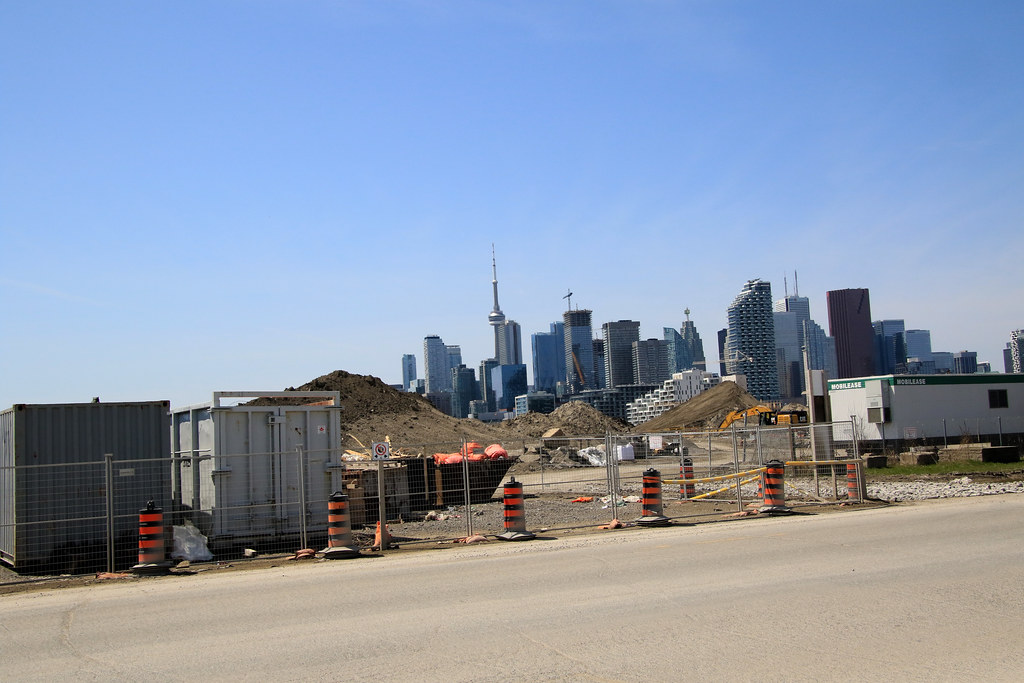
Whoever came up with the balcony design did a great job. The renderings don't do it justice.
 

spaced

Active Member
Member Bio
Joined
May 7, 2007
Messages
613
Reaction score
236
From cherry beach.
20220422_134457.jpg
20220422_134452.jpg
 

daptive

Active Member
Member Bio
Joined
Jun 14, 2018
Messages
716
Reaction score
3,507
The balcony pattern is much more noticeable from a distance. This pic is giving me more hope this will turn out looking quite nice.
Not only that I think, the random gaps of missing panels is breaking the illusion. I think (hope) it’ll be a bit like the Magic Eye pictures where the full image snap into focus once all the pieces are installed.
 

Rascacielo

Senior Member
Member Bio
Joined
Jun 5, 2017
Messages
3,252
Reaction score
22,264
Location
Toronto
From the shots above, the pattern only makes sense (as in looks like the rendering) when viewed from quite a distance, like from Cherry Beach. It's like watching a movie on a giant screen, you get a headache when you sit in the front rows.
 

ushahid

Senior Member
Member Bio
Joined
Sep 26, 2013
Messages
3,342
Reaction score
4,629
Location
Vernon, BC
The subtle boldness of these towers are really winning me over...It's sad that phase 2 will literally overshadow the redeeming qualities of them from the west side.
View attachment 395527View attachment 395528

They're gonna look especially great through the Bremner Blvd valley:
View attachment 395529
Black and white balconies make sense. but why they had to use the grey ones, instead they could have gone for neon colors like green, orange, yellow etc.
 
Last edited:

Top