Toronto Sugar Wharf Condominiums (Phase 1) | 231m | 70s | Menkes | a—A

Looking from the south west taken this morning.
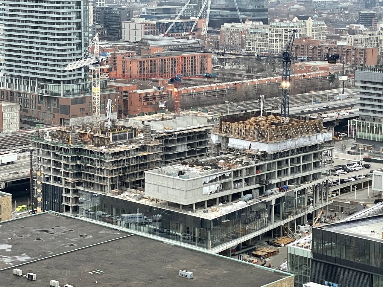
IMG_2851.jpeg
 
The site is massive and you'd think Menkes would have done something much more imaginative with the site. But I digress, it's too late.
 
Not the best design but the quality is nice. Good quality makes it less suffering. Lol! 🤣
 
An unexpected walkthrough between the condo towers and the southern office building this afternoon. Solo worker who happened to be leaving invited me in to snap photos. (He would have been fired if he tried this on the Hyatt Place site where rudeness prevails)! He couldn't stop talking about the project explaining the two types of curtain wall to go in, enabling a different look from what we see. Also the aluminum balcony guards which he saw tested at the Ontario Tech University in Oshawa on fast spinning machines to test wind effects on the disparate textures. The idea is to emulate a wave effect overall (hopefully better executed than Daniel's next door). (He also expressed excitement about Phase II of One Yonge, and CIBC Tower. I couldn't agree more).

P1210573.jpg


P1210574.jpg


P1210577.jpg


P1210578.jpg


P1210583.jpg


P1210584.jpg


Sugar Wharf Pano.jpg
 
Last edited:
An unexpected walkthrough between the condo towers and the southern office building this afternoon. Solo worker who happened to be leaving invited me in to snap photos. (He would have been fired if he tried this on the Hyatt Place site where rudeness prevails)! He couldn't stop talking about the project explaining the two types of curtain wall to go in, enabling a different look from what we see. Also the aluminum balcony guards which he saw tested at the Ontario Tech University in Oshawa on fast spinning machines to test wind effects on the disparate textures. The idea is to emulate a wave effect overall (hopefully better executed than Daniel's next door). (He also expressed excitement about Phase II of One Yonge, and CIBC Tower. I couldn't agree more).

View attachment 285735

View attachment 285736

View attachment 285737

View attachment 285738

View attachment 285739

View attachment 285740

View attachment 285741
Wow! I really like someone who’s genuinely interested in their work and industry, sounds like a knowledgeable fella you should definitely keep in touch with.
 
design is boring but the quality is top notch.
...more like they try to make the conservative glass box requirements by Toronto developers a tad more interesting and easier to look at.
 
I have to agree. As much as something innovative would be awesome "innovative" with cheap materials and poor execution is worse than something that's generic but high quality and nice to look at, a la the QQ building in this development.
 
No amount of high quality glass will ever get me on board with this area. If the Sugar Wharf complex were built anywhere else in the city then I could care less, but this is right on the waterfront and blocking out much better architecture so I'm way more biased toward these developments than anywhere else.

Now if you took developments like Sugar Wharf, Pinnacle, Daniels, etc. and plopped them down further north near Aura or Bloor/Yonge for example, it would add density without destroying classic skyline views.
 

Back
Top