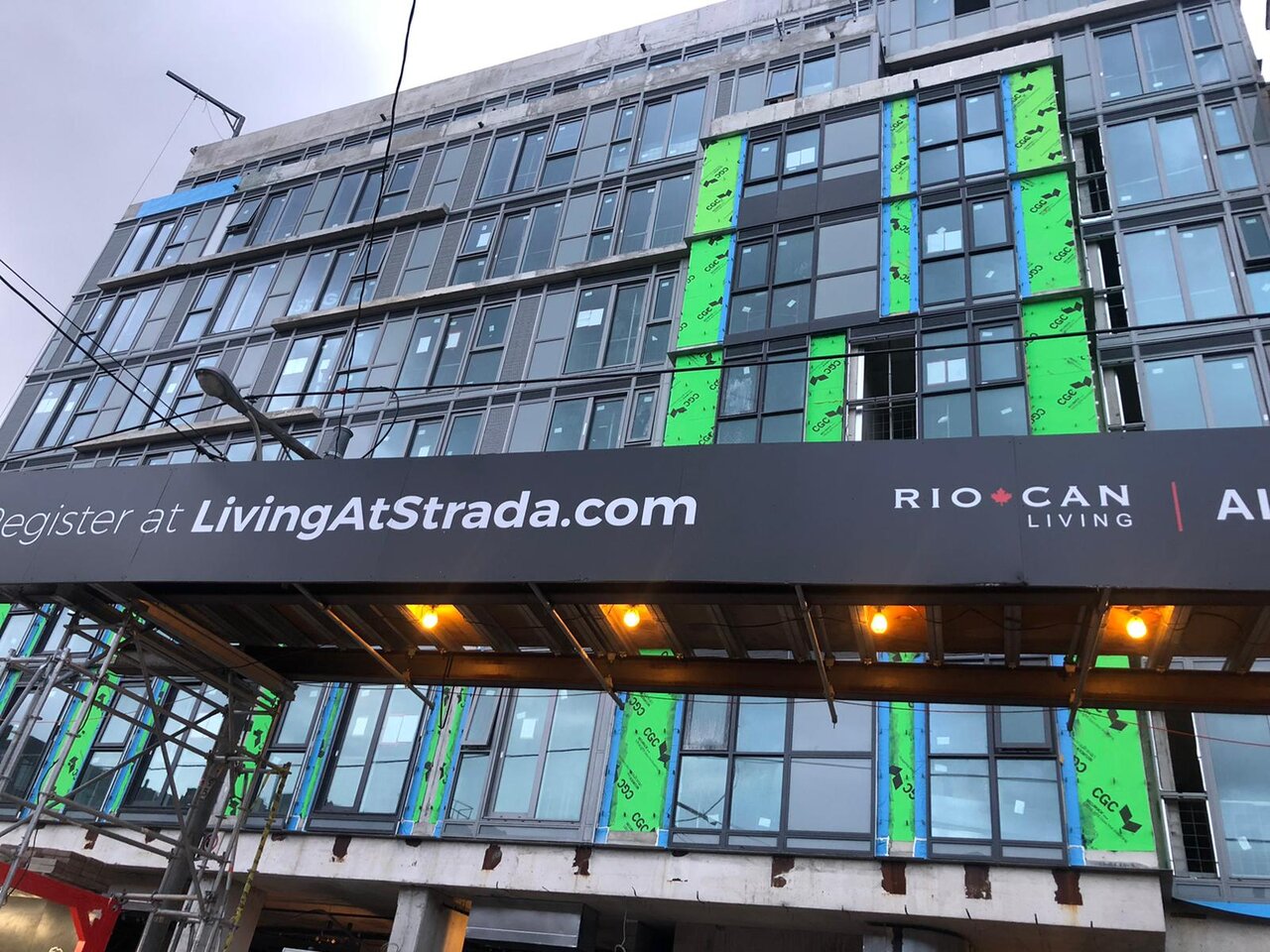
To add to my earlier
post and hope some developers stumble upon this: I feel like some Toronto architects and developers need a crash course on how to use window wall correctly, because it feels as if it's done wrong the most here (I swear I can recognize a Canadian city simply based on the look of the window wall). To the developers out there:
Consumers actually notice it, and any developer trying to pretend they won't notice is only perpetuating the problem. It's not even an expensive fix; just stop with the ugly spacing and weird colors, take my example below as a guide.
I don't know if it has to do with the window wall suppliers in Toronto, the architects not understanding their materials, or developers just not caring about the end product, but man everybody in the process needs to be trying at least a little bit harder. If they want to use cheap materials, go for it,
you don't need expensive materials to create a worthwhile product; but at least use spandrel panels and mullions in an elegant + symmetrical way... There's many ways to do this, it's really not that hard to color match and pick a color other than a weird in-between cool grey tone (if you want to use grey, stick to one cause yikers.)
Here's a great example (below) of how this
could have looked if anybody on the team sat down for five minutes and ordered the window wall correctly.
(Note: I'm not sure if this specific building is using window wall as I think it's using aluminum paneling, but the point still stands as
this would be super duper easy to do with window wall. The only key differences are color matched white mullions that only go black for the window frames. Strada is obviously not an all glass building, the windows are like punch outs, so why not just accept that's what it is and make the materials enhance the windows rather than making them blend away.)
TLDR: If you can't afford highly reflective spandrel panels for an all glass effect, stop pretending that you have an all glass looking build with cheap spandrel, your building would look much better with punched out windows.
(
Photo source)
