You are using an out of date browser. It may not display this or other websites correctly.
You should upgrade or use an alternative browser.
You should upgrade or use an alternative browser.
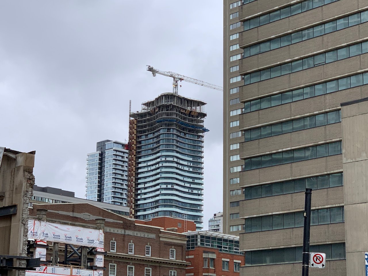
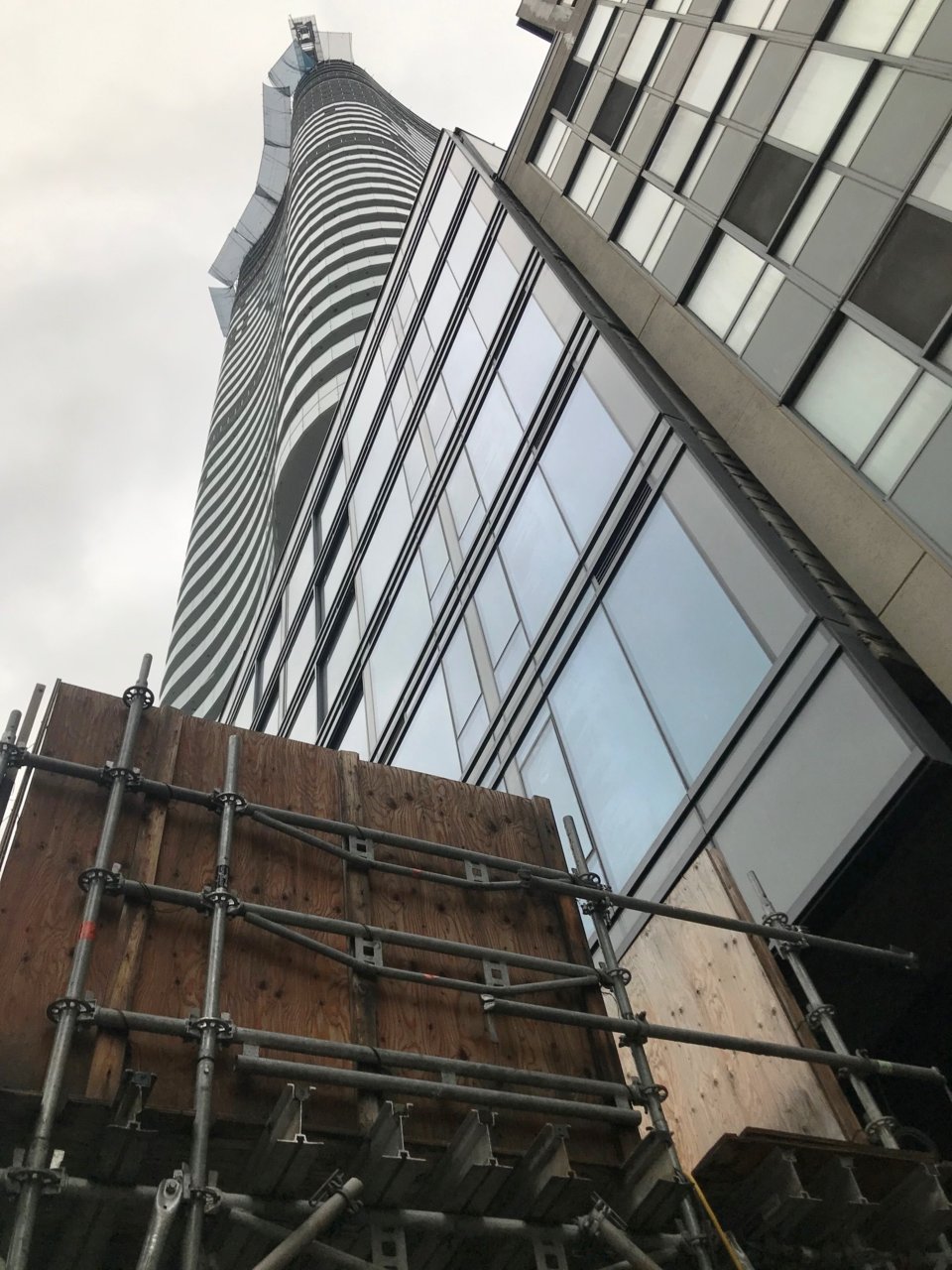
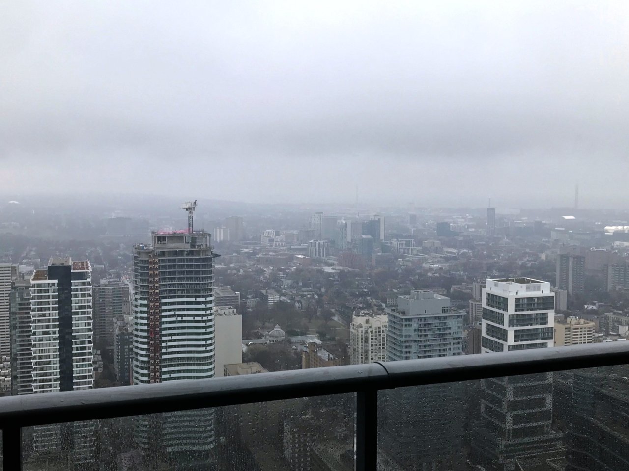
Toronto Stanley Condominiums | 138.37m | 41s | Tribute | Core Architects
- Thread starter CanadianNational
- Start date
Rascacielo
Senior Member
Today

Benito
Senior Member
Today.

Jasonzed
Senior Member
Jasonzed
Senior Member
DarkSideDenizen
Senior Member
ushahid
Senior Member
it's obviously not as pretty as 411 church but it's not that bad. i like it.
AlbertC
Superstar
yatics
New Member
yatics
New Member
japrologue
Active Member
Today


AlbertC
Superstar
condovo
Senior Member
For me, architecturally, this is more successful than big brother Wellesley-on-the-Park. The balcony railings and the curves look substantially better here. Wellesley-on-the-Park is kind of lifeless by comparison.
Miscreant
Senior Member
Member Bio
- Joined
- Oct 9, 2011
- Messages
- 3,616
- Reaction score
- 1,795
- Location
- Where it's urban. And dense.
Yep, I agree. The 'ribbings' on Wellesley's balcony glass looks clunky and it distracts from the curved, wavy look it seems it was going for.For me, architecturally, this is more successful than big brother Wellesley-on-the-Park. The balcony railings and the curves look substantially better here. Wellesley-on-the-Park is kind of lifeless by comparison.