Toronto St Regis Toronto Hotel and Residences | 281.93m | 58s | JFC Capital | Zeidler

The new face of Bay & Adelaide

trumpj31.jpg
 
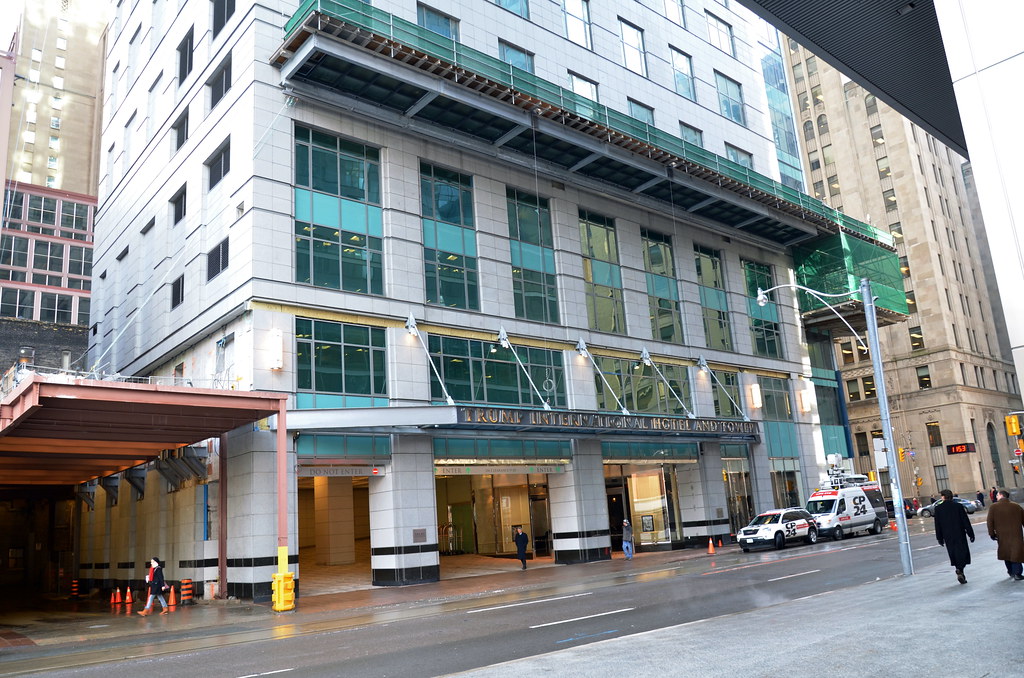
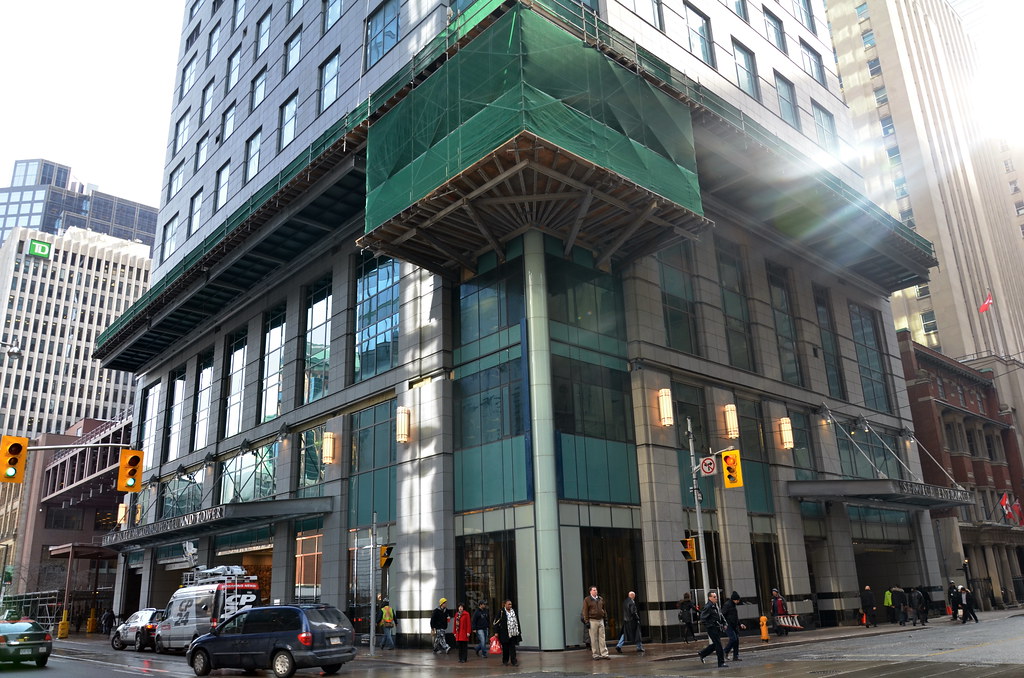
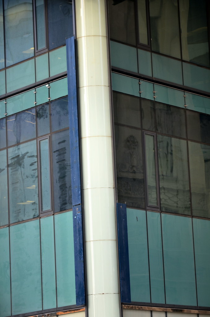
The heavy use of spandrel at street level is incredibly tacky. It would have looked much classier with clear glass (though that's true of the entire tower).
 
Last edited by a moderator:
I'm not impressed at all. Trump has been such a flop overall. The results are extremely disappointing considering the hype it had back in the day of supposedly being the highlight of this construction boom.
 
This place didn't want to tie into the PATH because it wanted to preserve its special guest treatment at entry, but to me the street level looks odd. It's a catwalk for cars in an area of town where you're better off walking, taking transit or hailing a taxi. I do like the awning and the type on it, it's unique and sort of retro to my eyes, but the impact is diluted by the same treatment being used around the corner for the Service Entrance. Anyway, I don't understand the attraction of the Trump brand. The man is a loudmouth ass. I associate the name with being showy and tasteless. I can see how some real estate agents or pharma salespeople might want to splurge for the weekend at a Trump building, but who with millions to spend on a condo want that association? Dodgy off-shore money, probably.
 
Jan 31
My only comment on people going up onto roofs of buildings under construction, I hope you have a good lawyer and bail money as a well a good insurance policy for your love one.

When you work on these roofs in the first place, you are doing under safety condition and supervision. Even when you have permission to shot, safety comes into effect.

I would love to be on top of a number of buildings considering I have all the safety gear in the first place, but don't have the contacts like others do.

The building was in the condition I thought it would be, when I saw it Friday. 2 police offices and 4 security personnel at the Bay St entrance. The main entrance have one security personnel and a number of Trump employes waiting for guess. This was about noon. All the currents were close, but you could see some of the restaurant through the current, but no way to get a good shot.
6799660445_878ba7c0be_b.jpg


6799659501_1b952e765f_b.jpg


6799661531_f697c20d1e_b.jpg


6799668305_aa6d46db1f_b.jpg


6799668887_1af7e7e879_b.jpg


6799666833_5cfe33eac4_b.jpg


6799670119_5594760139_b.jpg
 
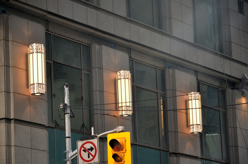
I've enjoyed reading C. Hume's rant about this building in today's Toronto Star online. He gave a similar opinion a few months back but this is a fleshing out of his feelings. I sometimes agree with C. Hume and I sometimes disagree with him. In this case, I disagree. But honestly, it's taken so long to build this sucker and I want to see it finished. I think the lighting column on n/w corner is excellent.

Here is Hume's piece:

http://www.thestar.com/news/article/1124413--hume-one-trump-short-of-a-deck?bn=1
 
I do agree that at ground level, from the photos, the building does look good, but it really infuriates me when you step back from the building and see how small the site is. It is just the wrong building for this site.

Other small details that are annoying:
- it isn't symmetrical.
- the overhangs are painted i-beams.
- service entrance on a main street!
- where's the entrance for people?

You can hype this building as much as you want, but in the end, Toronto got a second-rate Trump Tower.
 

Back
Top