Toronto St Regis Toronto Hotel and Residences | 281.93m | 58s | JFC Capital | Zeidler

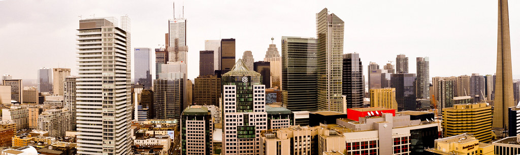
Its massing is another thing I enjoy. Skinny relative to its neighbours, the tower stands out in its projection of height while being quite different from the built form of the adjacent towers. Postmodern setbacks rise in stone from the concrete of the street and taper into glass - mirroring the history of the city. Stone reaches upward into the sky in the material of glass, the great symbol of the contemporary - despite the 80s appearance of the tower. This philosophical application is one of the reasons postmodernism appeals.

Well, Trump's height isn't much different from that of the buildings that surround it, so I don't think it'll stand out much at all. And the setbacks are mostly illusory, except on the east side of the building where they are strongest though still modest. Mostly ( and I noticed this earlier today, looking across at Trump from the 54th floor of the TD Centre boardroom ) the setbacks on the south and west sides are the result of changes in materials cladding the surface. Basically, Trump is a box with a prehensile roof feature. If you want to see nice setbacks go a few blocks west and look at the three cubes that form the Richmond Adelaide Centre. Or, better still, go north on Bay to the new Four Seasons Hotel. In both cases the setbacks are expressions of genuine volumes rather than the sort of dithery surface decoration we see at Trump. Philosophically speaking, I find the retro PoMo aesthetic of the Brookfield Place ( formerly BCE Place ) towers more engaging - their setbacks are both more pronounced and based on carving into the box to liberate new forms; done in a way that's modular and coherent, rather than being all over the place as if the builders were were making up the design of Trump as they went along.
 
Last edited by a moderator:
Nice shots! I agree, at this point it definitely looks better from above. That last floor is almost double the height of the previous ones..
 
Yup, by far the least attractive of the buildings shown in the above photos. The lower stone-clad floors possess an institutional quality to them, and the glass cladding is mismatched and the colour is grim.
 
Trump yesterday. this tower is beast.

5772825534_5e497f716e_b.jpg


5772804872_86e50bfc4f_b.jpg


5772709700_2b9eb9a901_b.jpg


5772281521_ed6a6852c5_b.jpg


5772818648_b6d125e6ee_b.jpg


5772274699_f069ba8deb_b.jpg


5772813276_b0e61c8fe9_b.jpg


5772811114_90d9b8f4ae_b.jpg


5772808870_bd8f80c09e_b.jpg


5772265885_d080e0254a_b.jpg


***
5772245369_9f64769f8b_b.jpg


5772248125_bf04227224_b.jpg


5772241331_e99ea23a7b_b.jpg


5772239031_e77f9c361e_b.jpg


5772777194_09210433d9_b.jpg


***

5772260797_1d07776b49_b.jpg


5772258889_044accc394_b.jpg


5772796134_d2657d7d16_b.jpg


All photos by me: steveve
 
Did anyone make out the floor count on that temporary elevator shaft? How many more floors to go?
 
Mark me down as one who likes this building - a lot !!! This goes for everything about it, with one exception - I'd love to see it go ten storeys taller. That alone would take it from "welcome addition" to "statement". It's too bad that they didn't go for it.

The teal colour is great. The the uneven floor heights don't bug me a bit (strange that those bother some folks so much), and the varying of the exterior around the building, well, that is one of the things I like most of all. A slender plaid rabbit amongst the stolid, broad-shouldered, (and sometimes boring) neighbours is a welcome thing for these eyes.

I think this building's design will have at least some influence on neighbouring developments in the future. Toronto's King/Bay skyline needs some sparking up. As for blocks, I appreciate Mies' work at TD, but frankly, TD Centre stands alone.

Oh, for some real height at Bay/Adelaide, though ...
 
Last edited:

Back
Top