Filip
Senior Member
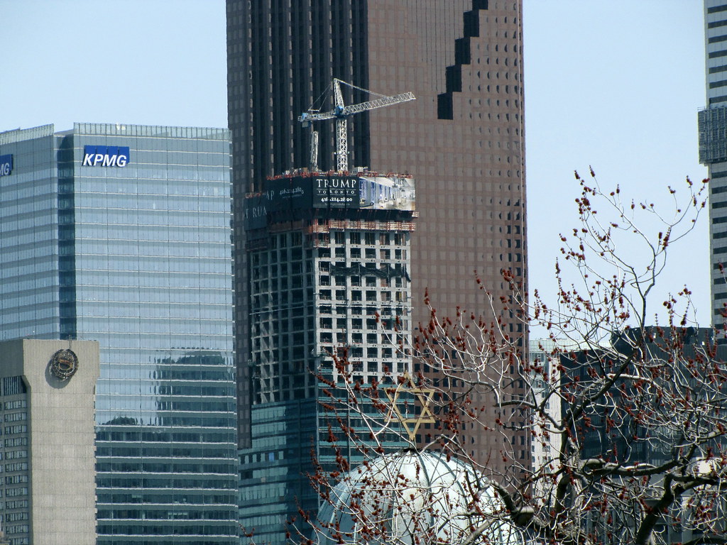
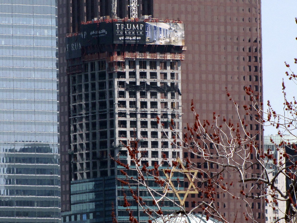
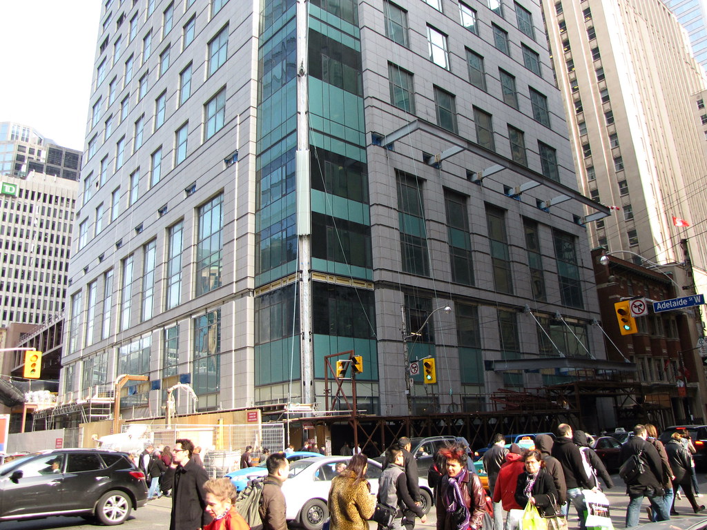
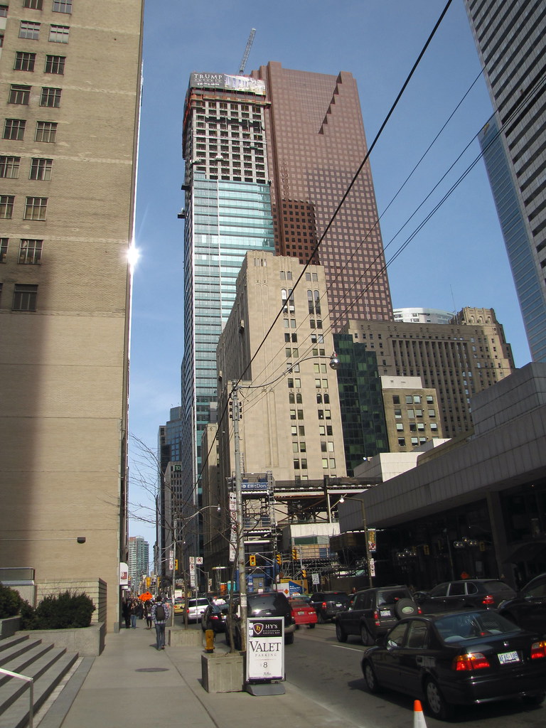
Scotia Plaza's wall is pretty monolithic from the east eh?
Agreed


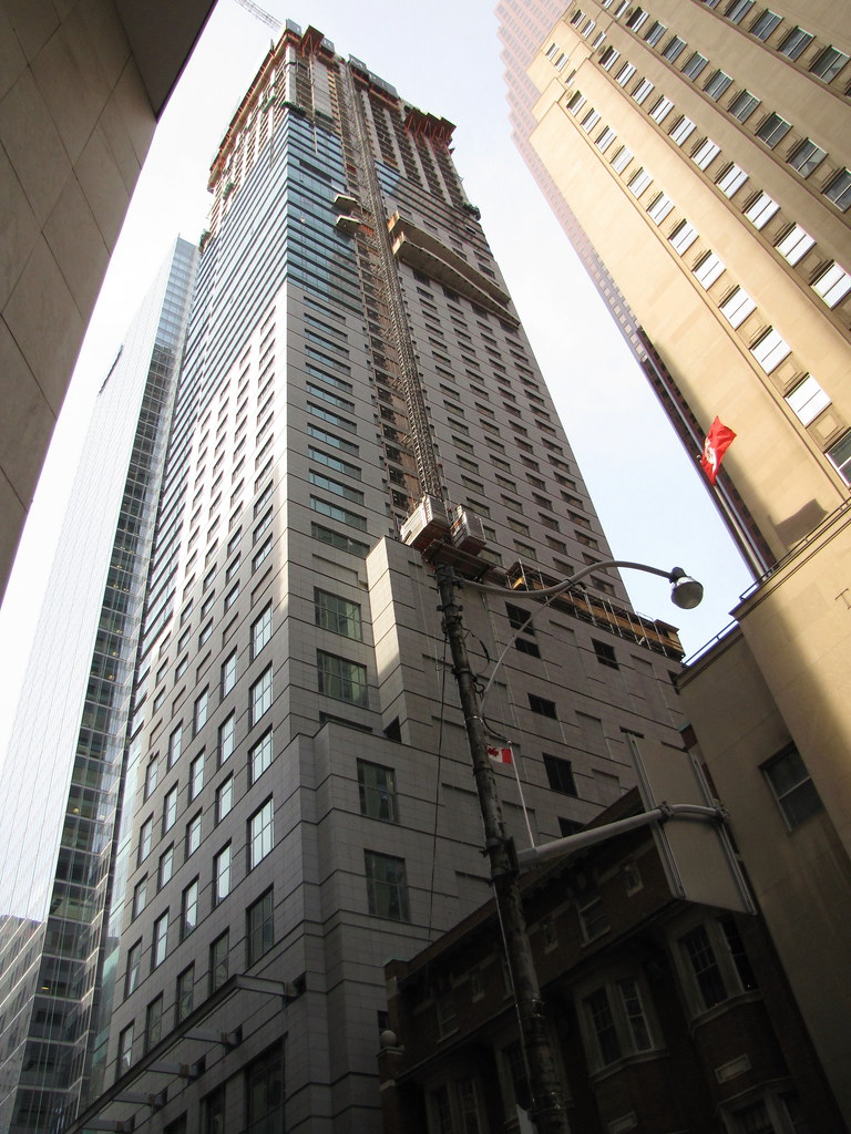
What the hell was wrong with the architect who designed this thing? Did he quit near the end of the job and some low-level intern doing a co-op from college at the architectural firm, just finished it off, without looking at the details?
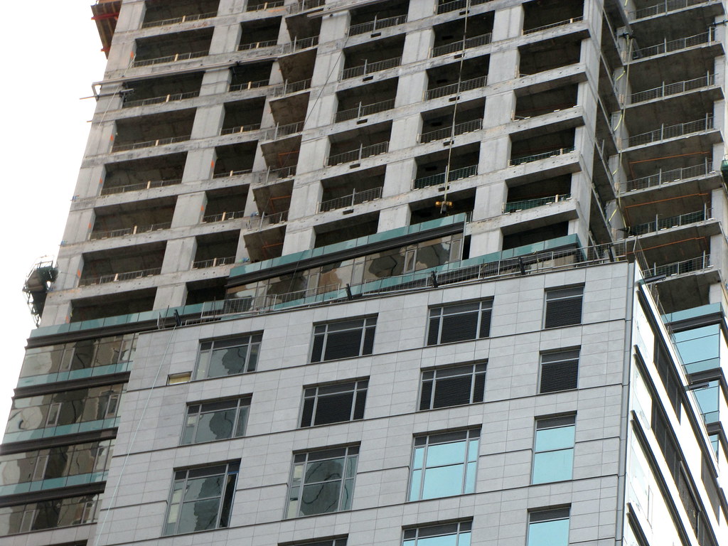
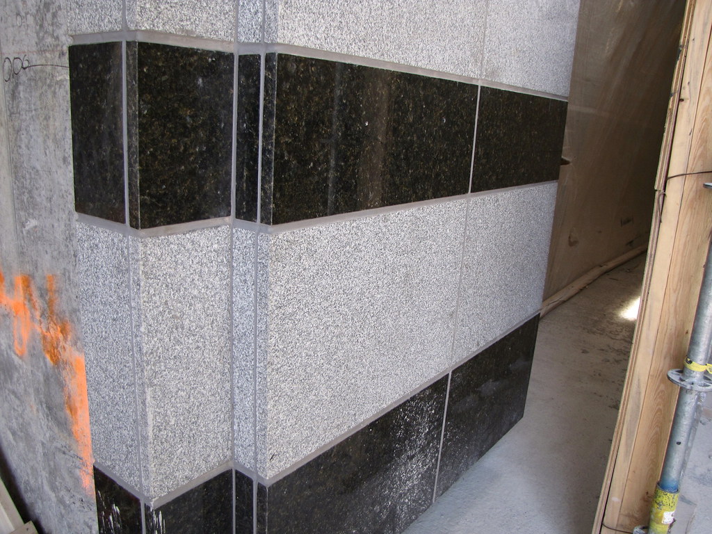
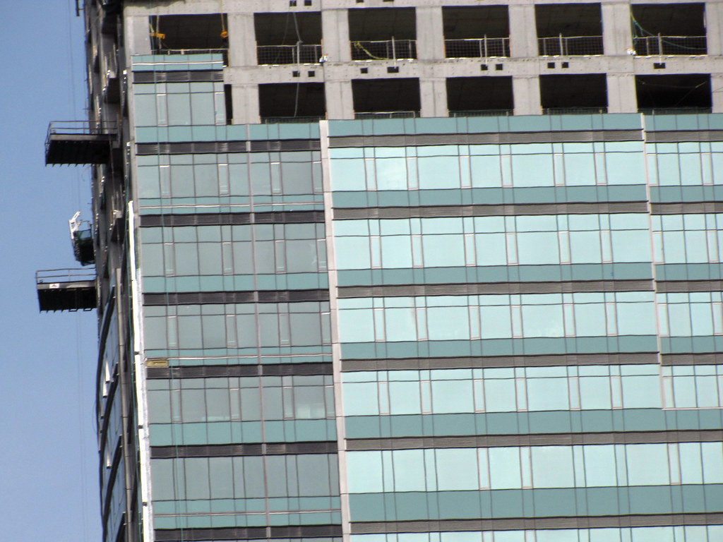
The lower floors of the South facade are as much as a mishmash as the ones on the East Facade. These are the floors that are most visible when standing at King and Bay or walking up the West side of Bay. Yes, we all know it is just a parking garage behind this banal, beige granite monstrosity, but with all the so-called "high-end" finishes the developers are bragging about, have they not heard of faux windows? Or at least some coordinating darker granite colour? They managed to place some fake glass on parts of the mechanical floors 35 floors up, where no pedestrian will see them, but miss all these punch-outs on the South and East walls.
My inner designer is almost apoplectic at all the incongruencies of Trump.

(Image by drum118 found above ^^^^ )

The building looks like it was designed in 1985. Even more so when they put the onion on top. The thing I really don't is the varied floor height differences. It looks cheap. Perhaps the building will match the cheesiness of trumps hair.