Toronto St Lawrence Centre Redevelopment | ?m | ?s | CreateTO | Hariri Pontarini

Preferred choice for the St. Lawrence Centre Redevelopment Competition

  • Brook McIlroy, Trahan Architects, and Hood Design Studio

    Votes: 11 13.9%
  • Diamond Schmitt, Smoke Architecture, and MVVA

    Votes: 12 15.2%
  • Hariri Pontarini, LMN Architects, Tawaw Collective, Smoke Architecture, and SLA

    Votes: 39 49.4%
  • RDHA, Mecanoo, Two Row Architect, and NAK Design Strategies

    Votes: 16 20.3%
  • Zeidler Architecture, Diller Scofidio + Renfro, Two Row Architect, and PLANT Architect

    Votes: 1 1.3%

  • Total voters
    79
  • Poll closed .
In my view Brutalism works best in naturalized or campus-like settings, where greenery and landscaping softens its harshness. In a more urban setting I'd say it often fails, creating a cold and hostile environment. Polls or not, I don't think it's much of a stretch to say the average person doesn't care much for the style. I appreciate my fair share of Brutalist buildings, but even I find walking past the St. Lawrence Centre to be a dreary affair.
 
I'm not saying that stylistically modernism would be more popular. But the questions asked there are of an 'unlimited budget', 'pie in the sky' nature. If they'd asked Americans, many of whom see little to no value in public spending, if their new library or courthouse could be made of marble and feature statuary, but it's gonna be 20-30x the cost, I wonder how they'd respond?

Fair; though I think equally fair, many of the features people find desirable in various forms of pre-modern architectural styles (Deco, Edwardian, Victorian, Romanesque etc etc.) can in fact be emulated in modern form without 3-storey lobbies done entirely in real marble.

As opposed to looking at the grandest of the grand, I would look instead to 55 Mercer for showing that you can deliver a human-scaled, older-style building form, which will have broad appeal and convey warmth.

Likewise, I'm not personally a big 'marble-everywhere' kinda guy; not even with an unlimited budget; that said, if so desired, one can do a pretty good 'fake' these days out of quartz or even porcelain at considerably lower cost, with better long-term performance, in such a way most people would never know the difference.

The point of which is to convey, the argument about much (not all) of Brutalist architecture and likewise much of the Modernist period is that it can read as cold, drab, and unappealing, not merely to a few people, but to a lot of people.

To bring this back to SLC, I just don't see the merit in it. I think both @Urban-Affair and @egotrippin make the case well; and I don't think I can improve further on their collective wisdom.
 
The polling data was reviewed for what questions were asked, what demographics were included etc.

There is no evidence of bias of any significance in the polling.

If you can show me polling data that shows people prefer modernism or brutalism then we can deep dive the comparison; but I imagine thee will be a shortage of those.
...that's the problem though (and assuming this is on the money), is that this all really shows that the people sampled don't really like modernism as an architectural form for the most part. It doesn't say modernism is bad or awful here...it's just not a preferential choice. Which is not really saying a lot, IMO.

Thankfully, the good architects mostly ignore all that. And the rare good ones that don't (ie. Robert A.M. Stern) make it worth everyone's while.

...getting back to the subject line though, the more important questions here should be whether this building is a good form of modernism or not. And whether the proposed alterations take away from it or not if it is.
 
Not sure this is the right thread, but I really enjoyed this Azure piece by Stefan Novakovic on procurement practices.


Plug at the end of the article for tonight’s St. Lawrence Centre design presentations:


First off, thank you for making note of; and sharing the link to this article.

Second, on balance, I think it's a good piece with some good examples of design; in light of the ongoing RFP for the project in this thread, I see no problem with it being here, though I may give it an additional home where we can more appropriately deep-dive the issues raised in the piece.

I do think it missed a couple of things; it hinted at one, which I will phrase this way; "Is the industry's perception of good design in line with the public's perception of good design, and if not, does the industry need to change, in order to get the public behind ponying up more money for projects both public and private?" I would argue very strongly that this is the case. That even with many projects where budget isn't a huge issue, that architects/designers often muss details important to the broader public and create buildings that even when technically well done; leave a broad feeling of indifference from the community. It's hard to get people to pay more for something they don't perceive to be an improvement.

I also think there was a poor close, essentially one dumping on design competitions as 'inherently colonial'. I find that an absurd statement with no intellectual coherence whatsoever; and not one either likely to woo a broader public's sympathy nor offer a path forward.

For the record, architectural competitions go back more than 2,500 years, to the ancient world; the Acropolis was a product of one.

***

Still, the piece has many constructive things to say.
 
Yes I watched it too.

My opinion did not change - I like the Hariri Pontarini proposal - and I grew to like this proposal even more (the programming space is much better than I thought and the team appeared to be knowledgeable and professional in their presentation, details and answers to questions. They seemed to know what they were talking about, as opposed to using empty flowery language to dress up a proposal).

The only presentation that I was not impressed by, was the Zeidler proposal. And they were already 5th out of five, before the public presentations.

I really dislike the exterior of the Zeidler proposal, but l think we will be just fine, no matter the winner.

(Although I am a bit concerned about the practical reality of the flexible spaces in the Brook proposal. They appear to require a lot of mechanics, to move floors and seats and walls etc. And I can just see that all breaking down and being costly to maintain and fix. But I will leave that to the jury to question. And by the way, the jury did not impress with their questions. Let's pray we are in good hands.)

 
Last edited:
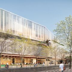
HP's treatment of the corner is definitely fantastic and reminds me a bit of the Canadian Opera Company building in that you can "peer" inside.

However, all the glass does make this feel like another "Toronto" building. Sadly the city already has too much glass everywhere, in particular in the core.
 
A photo popped up on FB feed of the construction of the O'Keefe Centre (as it was then known). Of note is what you do and do not see on the east side of Scott Street.

1678307632924.png


A zoomed in look:

1678307758105.png


I have to say, I prefer the SLC's predecessor to the SLC itself

Granted, we need the space for the arts; in that photo, I see plenty of other spots for such a building.
 
Last edited:
A photo popped up on FB feed of the construction of the O'Keefe Centre (as it was then known). Of note is what you do and do not see on the east side of Scott Street.

View attachment 460539

A zoomed in look:

View attachment 460542

I have to say, I prefer the SLC's predecessor to the SLC itself

Granted, we the space for the arts; in that photo, I see plenty of other spots for such a building.
4C7471D6-908E-4223-99CA-086986F8893A.png
BF621097-1269-4243-BB0A-7021FE3ED95D.jpeg
8A2732E2-FE26-4F43-A0D0-0422448A52C8.jpeg
DB00F3E7-C96C-4DDD-8F8F-3526FA00B941.png
 

Back
Top