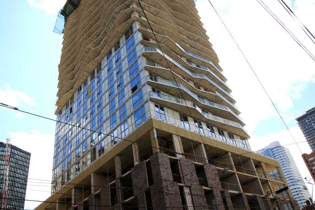
Toronto Social at Church + Dundas | 164.89m | 52s | Pemberton | RAW Design

And if we think it's bad now, just wait till residents move in and add all kinds of stuff onto the balcony. This thing is a hot mess, I definitely wouldnt buy into this disaster of a build.
 
And if we think it's bad now, just wait till residents move in and add all kinds of stuff onto the balcony. This thing is a hot mess, I definitely wouldnt buy into this disaster of a build.


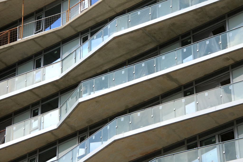
I actually think this might help it. It will distract us from how ugly the actual building is.
 
Today

IMG_1094.JPG


IMG_1095.JPG
 
April 16
More up on my site

Unless Flickr has lost photos or I haven't posted photos since Dec 2019, this is the longest between shots so far. I have a number still to do at that are 14-16 months yet. It could be one of those I will get it the next time, but never did considering I been shooting other sites a block away in that time frame.

Someone loves this green as it found on too many building these days or someone has a extra run on the green, It kills one of the better looking precast panels not seen before that is not a run of the mill look.
52014465796_cf4b3ab0e3_b.jpg

52014980405_c259287618_b.jpg

52014980445_ca0f069f21_b.jpg

52014513778_9a7dc91631_b.jpg

52014513888_aff02b1395_b.jpg

52013435872_d14329d06f_b.jpg

52014713964_b085372af4_b.jpg

52014980950_7867ab6d3f_b.jpg

52014514173_5ce3b9ba65_b.jpg

52014514248_8e4cbd4339_b.jpg

52014466791_e58100cec8_b.jpg

52014981465_d57114698c_b.jpg

52014714624_293d4facb5_b.jpg

52014467431_8f9ac3f9d1_b.jpg

52014467521_462b25f0b2_b.jpg

52014981920_2a1cb758d9_b.jpg
 
The dynamic balcony jag doesn't distract us from that window wall horror show...it only adds to it. /sigh
 
  • Like
Reactions: DSC
This is one of the few towers in Toronto that actually look better up close than from a distance. OK, the mint-green/ light gray (depending on light condition) spandrels and transparent balcony glass are still ugly (maybe even uglier up close), but the podium brickworks and jagged balconies (not visible from a distance) help to mitigate its homeliness.
 
I have mixed feelings about documenting this one.......but as one of the great architectural scars of this or any other century is erected on the Toronto landscape, a record of this unspeakable act should probably be kept.

Photos taken April 22, 2022:

DSC07340.JPG


DSC07341.JPG


DSC07342.JPG


DSC07343.JPG


DSC07344.JPG


DSC07345.JPG


DSC07346.JPG


DSC07347.JPG


DSC07348.JPG
 
Last edited:
Before the balcony glass went in I was worried that the east-side section without balconies would look way worse than the rest of the tower since nothing was gonna hide the awful window wall. And I guess it turns out that's not an issue after all since the balconies don't hide anything!
 
This one is really testing the limits of the "give it colour/texture at ground level and doesn't matter what the tower looks like" theory.

Does that strategy ever work? They're more little lies some people tell themselves to justify cutting corners.
 

Back
Top